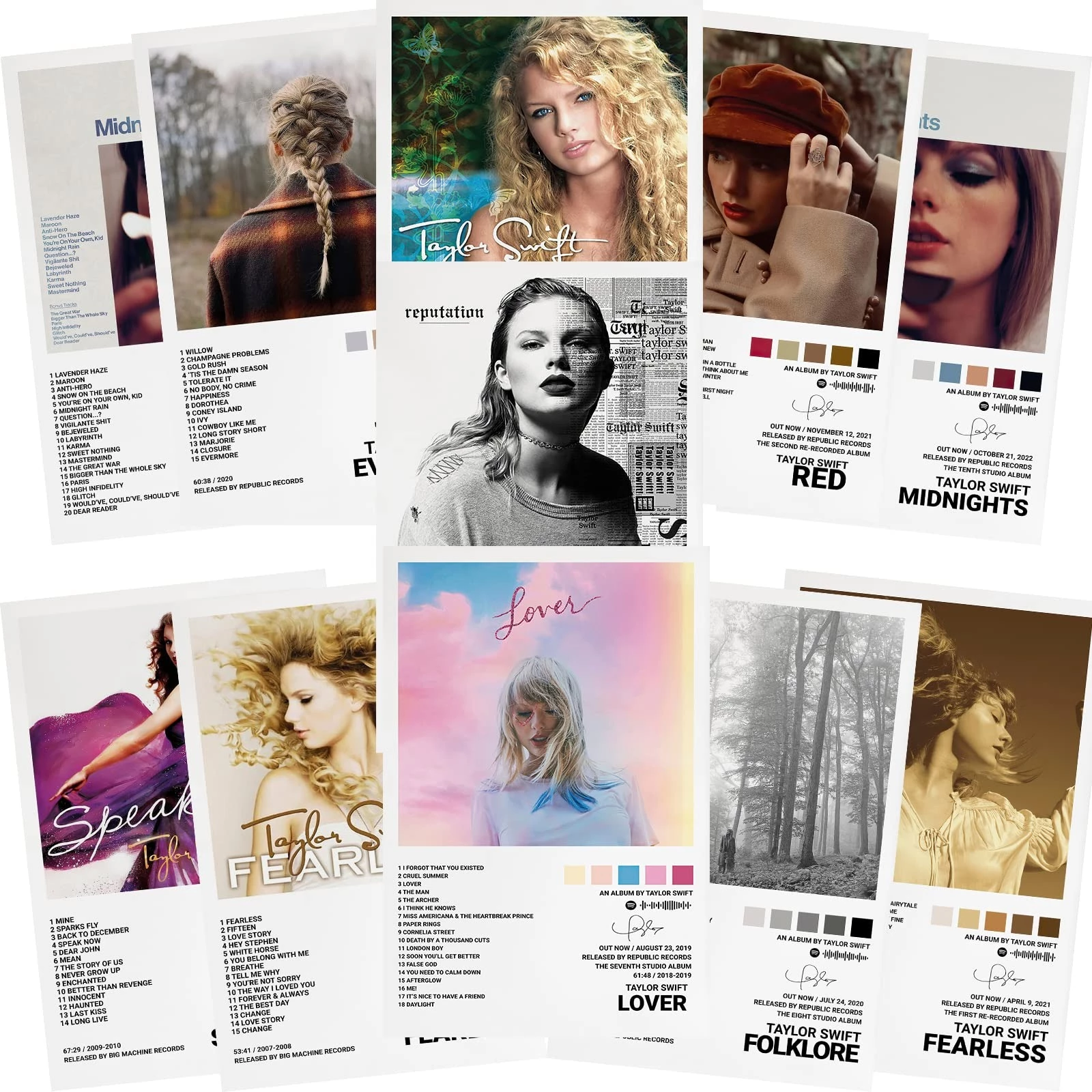
Taylor Swift Album Ranking Based On Covers: From The Least To The Most Aesthetic
You have seen Taylor Swift album ranking from the best to the worst everywhere. To me, there are no “worst” albums, just better ones, and it is so hard to define which is the best. Yes, that sounds indecisive, but I know I love them all equally so who cares?
Instead of album quality, I would rather rank her album based on covers, this one is a little bit easier for me as I’m a visual person. Remember, this is only a personal opinion so don’t take it seriously. Let’s go.
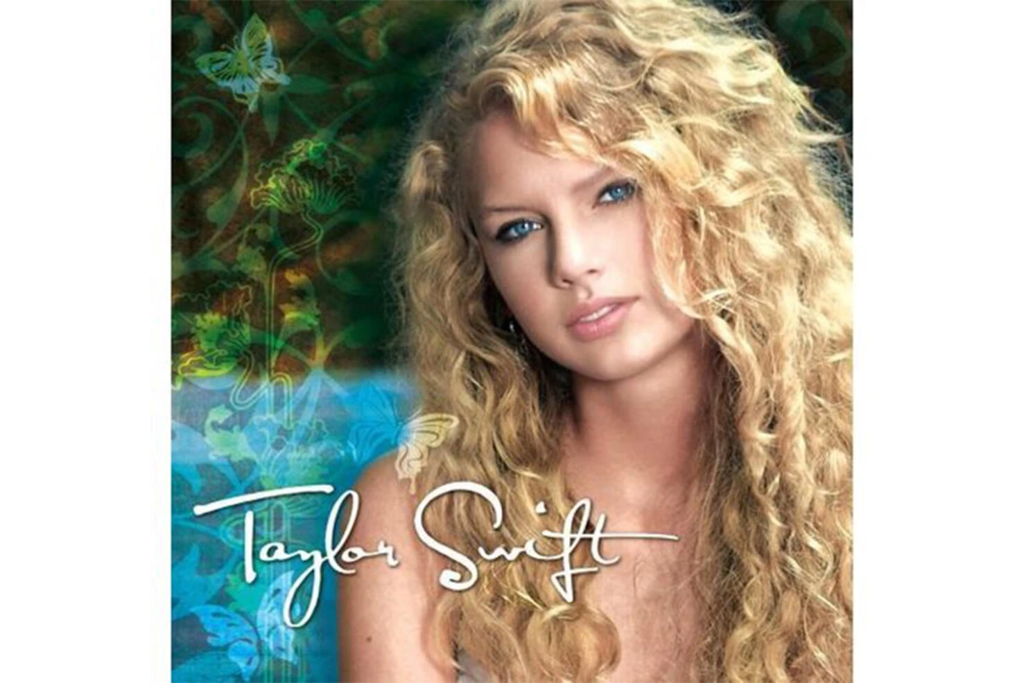
#10: Taylor Swift (Debut album)
 Source: Google Images
I guess this is something we can all agree on. It is the album that set her name to global success in the following years, but the cover design is just… meh. It looks 2000-ish, of course, but I guess she could have done better since its edgy and cursive typography is just hard to read and not up to par.
Also, what’s with the hair, eyeliner, and over-saturated background? The cover is nostalgic, but aesthetic? Not so much.
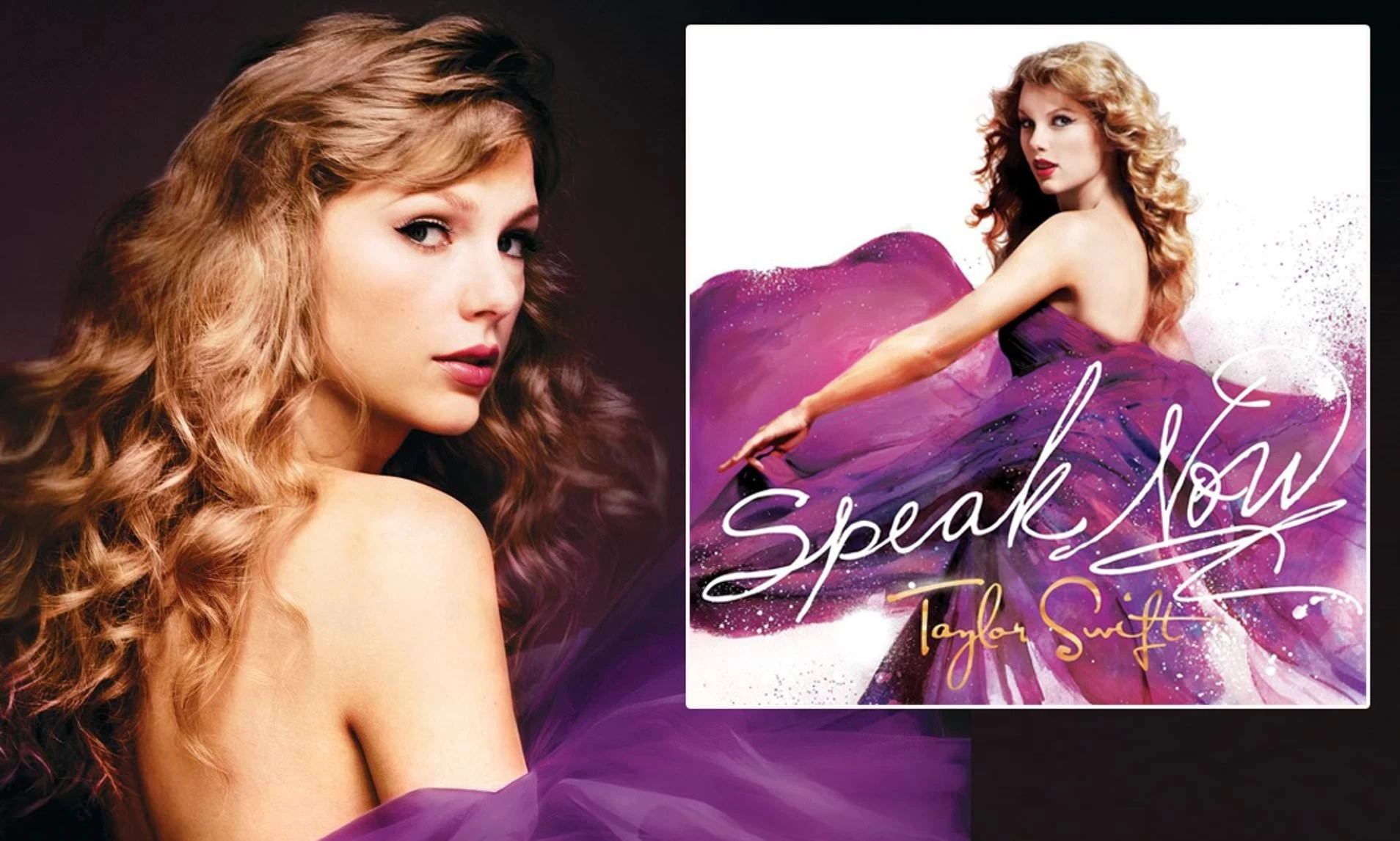
#9: Speak Now
 Source: Google Images
Fight me, but I don’t really fancy the 2000s aesthetics in her first albums. Taylor Swift's third studio album, "Speak Now," marks a significant milestone in her artistic journey and growth as a songwriter.
The album cover itself is a striking representation of Taylor's evolution as an artist. In the cover image, Taylor Swift is a captivating vision, showcasing her with curly hair and bold red lipstick, exuding confidence and self-assuredness. She is adorned in a flowing, deep-purple gown that carries a symbolic message of passion and uninhibited self-expression.
It's a visual statement that signifies her readiness to "speak now" and share her deepest emotions with the world. Yet, the pink dress is kinda too much and makes the album a little too “teenage” and cheesy, if you may.
#8: Folklore
 Source: Google Images
Contrary to the two mentioned albums, this one’s cover features a black-and-white theme with a rather gloomy vibe. Taylor Swift's unexpected release of the introspective and indie-folk-inspired album, "Folklore," was a delightful surprise for her fans.
The album cover itself is a captivating representation of the album's essence. It’s a photograph of Taylor positioned amidst a tranquil forest setting. Taylor's contemplative expression and her gaze into the distance create a sense of invitation, beckoning listeners to step into a world of storytelling and deep introspection.
However, the design seems rather undistinctive and lacks some contrast, making it struggle to stand out.
#7: Fearless
 Source: Google Images
In her sophomore album, Taylor Swift embarked on an evolution of her image and sound, marking a significant step in her career. The album cover successfully captures this transformation.
The cover features a striking headshot of Taylor Swift exuding confidence and a newfound maturity. Her iconic curls gracefully frame her face as she gazes into the distance. Cloaked in a lavender dress, Taylor embodies a sense of grace and elegance, symbolizing her growth as an artist and person.
Notably, Taylor Swift herself took on the role of the booklet designer for the album, while Joseph Anthony Barker, Ash Newell, and Sheryl Nields were responsible for the photography. Leen Ann Ramey contributed to the cover artwork, resulting in an album cover that perfectly encapsulates the spirit of "Fearless."
Though the picture is stunning, the typography is not that excellent and doesn’t stand out.
#6: Lover
 Source: Google Images
"Lover" signifies Taylor Swift's return to her romantic and whimsical side, capturing the essence of love and joy. The album cover itself is a delightful reflection of this theme.
In the cover image, we see a close-up shot of Taylor Swift set against a soft pastel background. She dons a rainbow-colored sweater, radiating happiness and warmth, perfectly encapsulating the album's themes. Her hair is elegantly pulled back, highlighting her natural beauty and simplicity.
However, I don’t fancy the heart on her eye as somehow it makes the composition cheesy and, overall, a little too much. The colors are great, though.
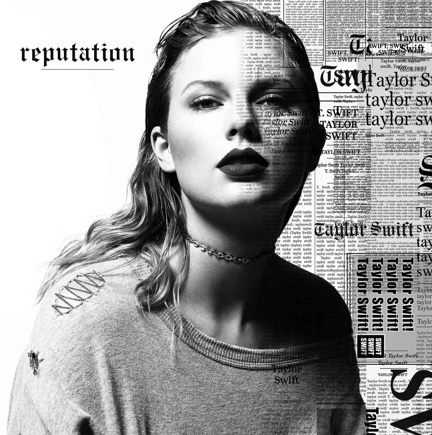
#5: Reputation
 Source: Google Images
Taylor Swift's album cover for "Reputation" marked a significant departure from her previous images, introducing a darker and edgier persona that resonated with the album's themes.
The cover features a close-up shot of Taylor Swift's face, partly obscured by newspaper print. This artistic choice symbolizes the media's portrayal of her, highlighting the scrutiny she faced in the public eye. It's a powerful visual representation of the challenges and perceptions she had to confront.
The bold and assertive font used for her name and the album title amplifies the album's rebellious and defiant nature. Taylor's choice of this cover serves as a statement of reclaiming her narrative and addressing the public scrutiny she endured, presenting a more complex and unapologetic side of her artistry. It signified a bold shift in her career and image.
#4: Red
 Source: Google Images
Taylor Swift's "Red" album cover marked a significant evolution in her image, portraying a bolder and more mature persona that aligned with the album's themes and musical direction.
In this cover image, Taylor Swift is depicted with her hair elegantly pulled back, sporting a black fedora hat and striking red lipstick. This look exudes a sense of sophistication and confidence, reflecting her growth into a more mature version of herself.
The cover's vintage filter adds a touch of nostalgia, transporting listeners to a different era. The use of large and bold letters for "Taylor Swift" reinforces her established identity as a renowned artist, while the album title, "Red," signifies the intense emotions explored throughout the record.
It's a cover that perfectly encapsulates the passion and artistry behind the music, setting the tone for a transformative listening experience.
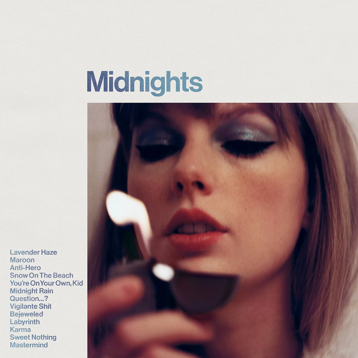
#3: Midnights
 Source: Google Images
The cover art for "Midnights" embraces simplicity, drawing inspiration from vintage LP covers that often featured a list of songs on the front.
In this minimalistic artwork, Taylor Swift is portrayed with distinctive blue eye makeup, bold black eyeliner, and her signature red lips. Her gaze is fixed on a lighter held near her face, casting a radiant glow.
The style of the album's advertising pictures is described as "glam, but a chill, interior kind of glam" by The Ringer. It deviates from the typical big popstar glamour, opting for a more relaxed and understated elegance.
The predominant color scheme is midnight blue, creating a sense of depth and mystery, while retro photos evoke a feeling of vintage upholstery and nostalgia.
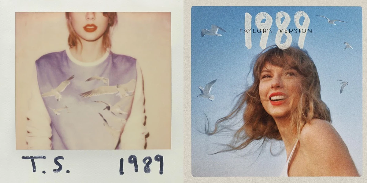
#2: 1989
 Source: Google Images
When I see this, I can only utter “Wow!” "1989" marked a pivotal moment in Taylor Swift's career as she embraced a pop sound and underwent a notable artistic transformation. The album cover itself is a reflection of this change.
In the cover image, Taylor Swift is depicted in a Polaroid-style photograph, her eyes closed, and an expression of introspection and vulnerability on her face. This image captures a shift in Taylor's persona, symbolizing a moment of self-reflection and transformation.
The desaturated colors and the bold, sticker-like "1989" title that overlays the image reflect the album's distinctive aesthetic. It combines a sense of nostalgia with a contemporary pop vibe, encapsulating the essence of the music within—anchored in the past yet moving boldly into the present.
I just love its Polaroid and nostalgic feel so much., and it is really difficult to put it here, behind only…
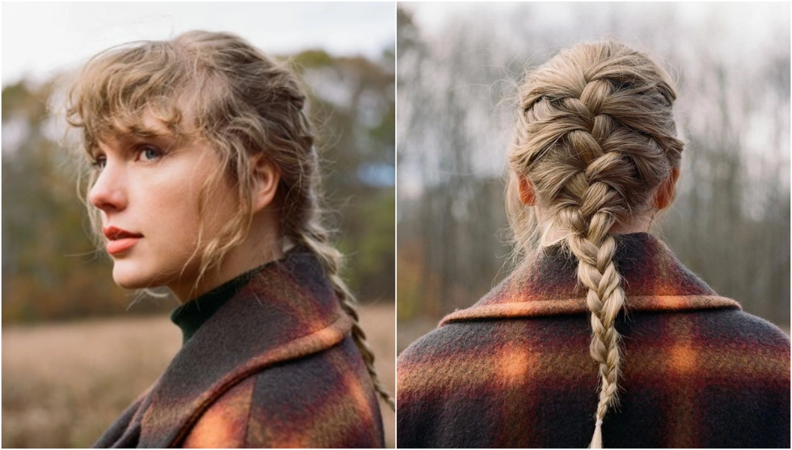
#1: Evermore
 Source: Google Images
I’d argue it would be a close tie with 1989 if not due to her iconic hairstyle here. "Evermore," released as a companion album to "Folklore," carries forward the enchanting storytelling journey embarked upon by Taylor. The album cover seamlessly maintains the aesthetic established by its predecessor.
In the cover image, we once again encounter a photograph of Taylor Swift in a forest setting. This is the only one that shows her back completely, like an invitation for us to join her on a journey deep into her imagination and emotions. It's an image that encapsulates the introspective and contemplative nature of the album's content.
To Recap: Taylor Swift Album Ranking Based On Covers
 Source: Google Images
Taylor Swift’s album covers are not only an excellent visual representation of her growth as an artist and human, but they also reflect her change in aesthetics with time. While enjoying her songs, we can also consider them great capsules for our youth together, so no matter how they look, well done Taylor!
Related Articles
- Have Taylor Swift Tickets Sold Out in Singapore? Updated News
- Is Taylor Swift Pregnant Golden Globes 2024? Debunking The Rumors
- Did CMT Ban Taylor Swift? Is The Award Really Banning Her For Life?
- Are Taylor Swift's Parents Rich? How Much Are The Superstar's Parent Worth Actually?
- Is Taylor Swift Banned from the Super Bowl 2024?
- How Many Bodyguards Does Taylor Swift Have? Can You Guess?
- Did Taylor Swift Get A Boob Job? It's Not What You Think
- Are Taylor Swift's Parents Back Together After the Secret Divorce?
- See Must-See Viral Moments Of The 2024 Golden Globes Award
- Fact Or Fiction: Selena Gomez Really Gossip About Kylie Jenner and Timothée Chalamet At The 81st Golden Globes?