30 Crappy Design Fails: Get Ready To Be Amazed, Appalled & Speechless!
When it comes to design, this profession requires aesthetic sense, creativity, specialized skills, and training. Becoming a designer is not as easy as you imagine because if you don't have those above things, your products might be terrible and ridiculous. You will believe us right after seeing these crappy designs.
They can be found everywhere. You probably notice it until someone else points it out. Then, you can't ignore it. A subreddit called ‘Crappy Design’ is dedicated to collecting and sharing the most terrible design fails in real life. And we have chosen some of the best, newest, crappy design fails from that community.
So, scroll down to check them out. And if you’re considering pursuing a career in design of any kind, might I suggest enrolling in a program that offers it? At least you can determine early on if you're good at it before you mess up everything.
#1. This bad design of spiderman
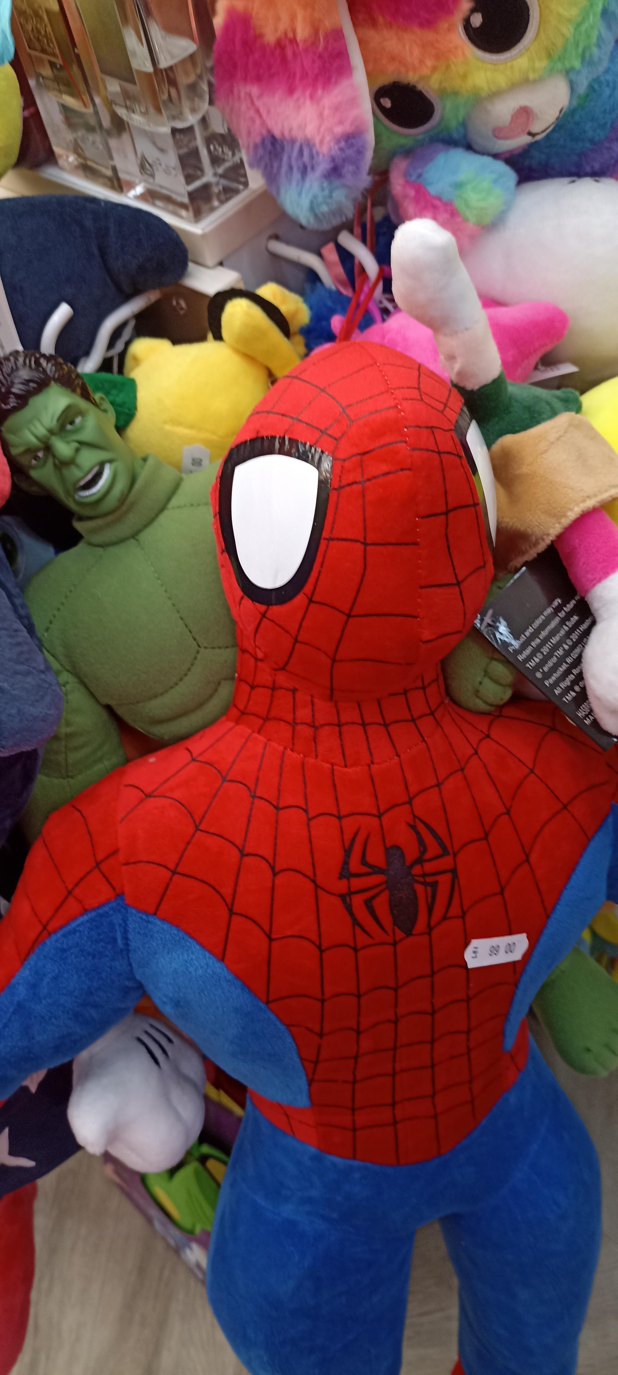 Source: Krane4
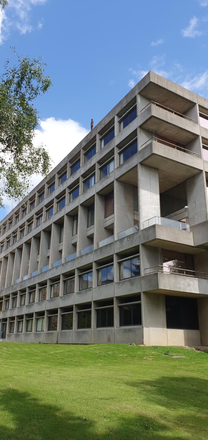
#2. My local university has a number of human sculptures on roofs of high buildings, often mistaken for real people
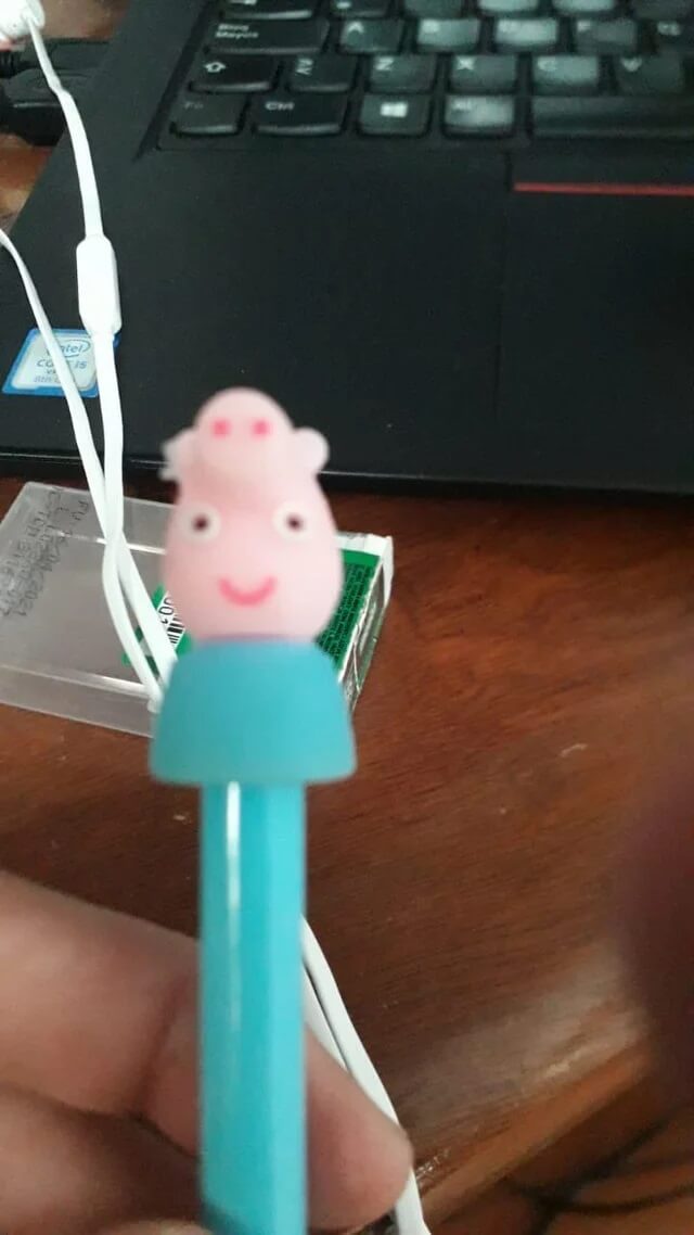
#3. This peppa pig pen with eyes in the wrong place
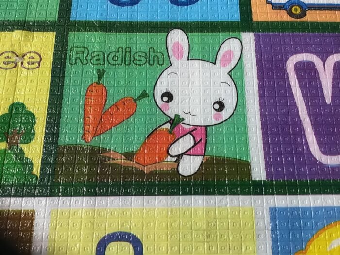
#4. My baby brother’s play mat isn’t correct, or is it?
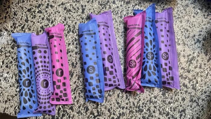
#5. Couldn’t figure out why I kept grabbing the wrong size out of the multipack box… then realized all 3 sizes come in all 3 colors!
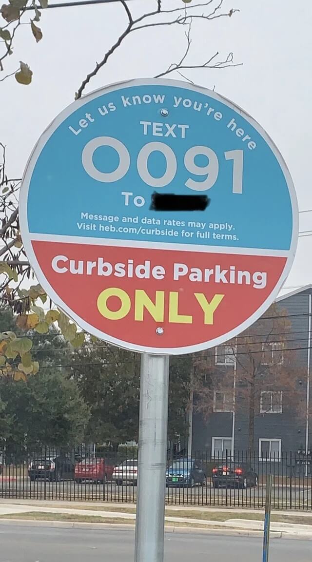
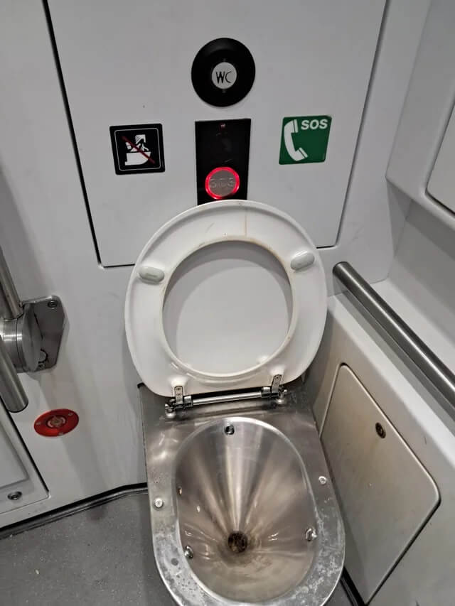
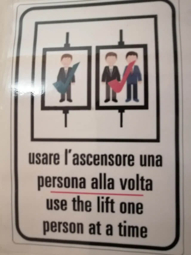
#6. "Let's put the SOS button here so that people mistake it as the flush button"
#7. Putting the helmet on his knee makes it look like there are 2 people in the silhouette
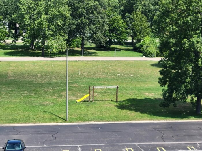
#8. The saddest playground
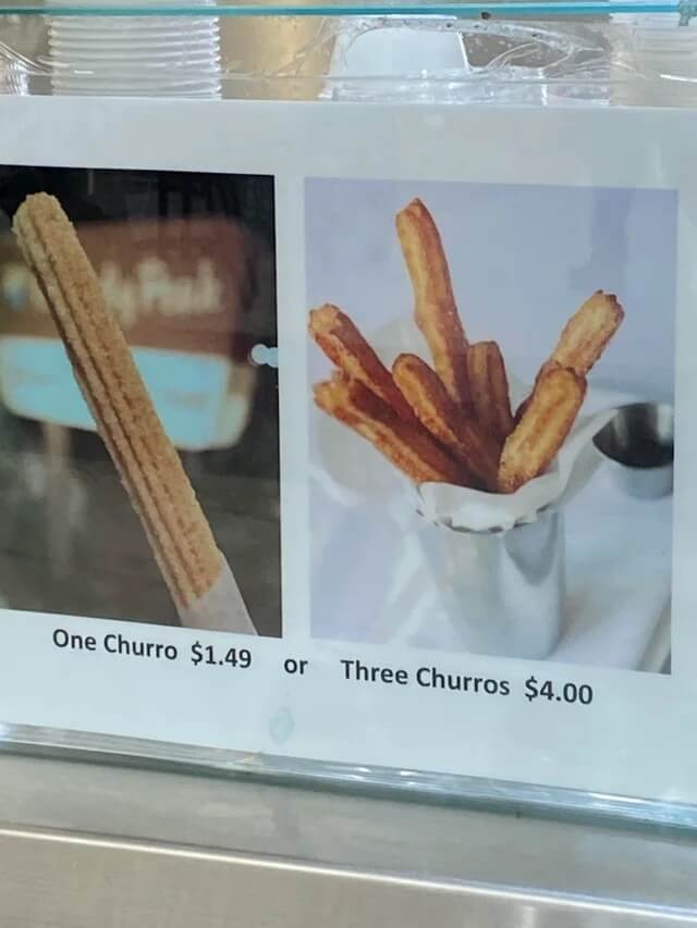
#9. Who thought it was a good idea to put an image of 7 churros for the sign of 3 churros
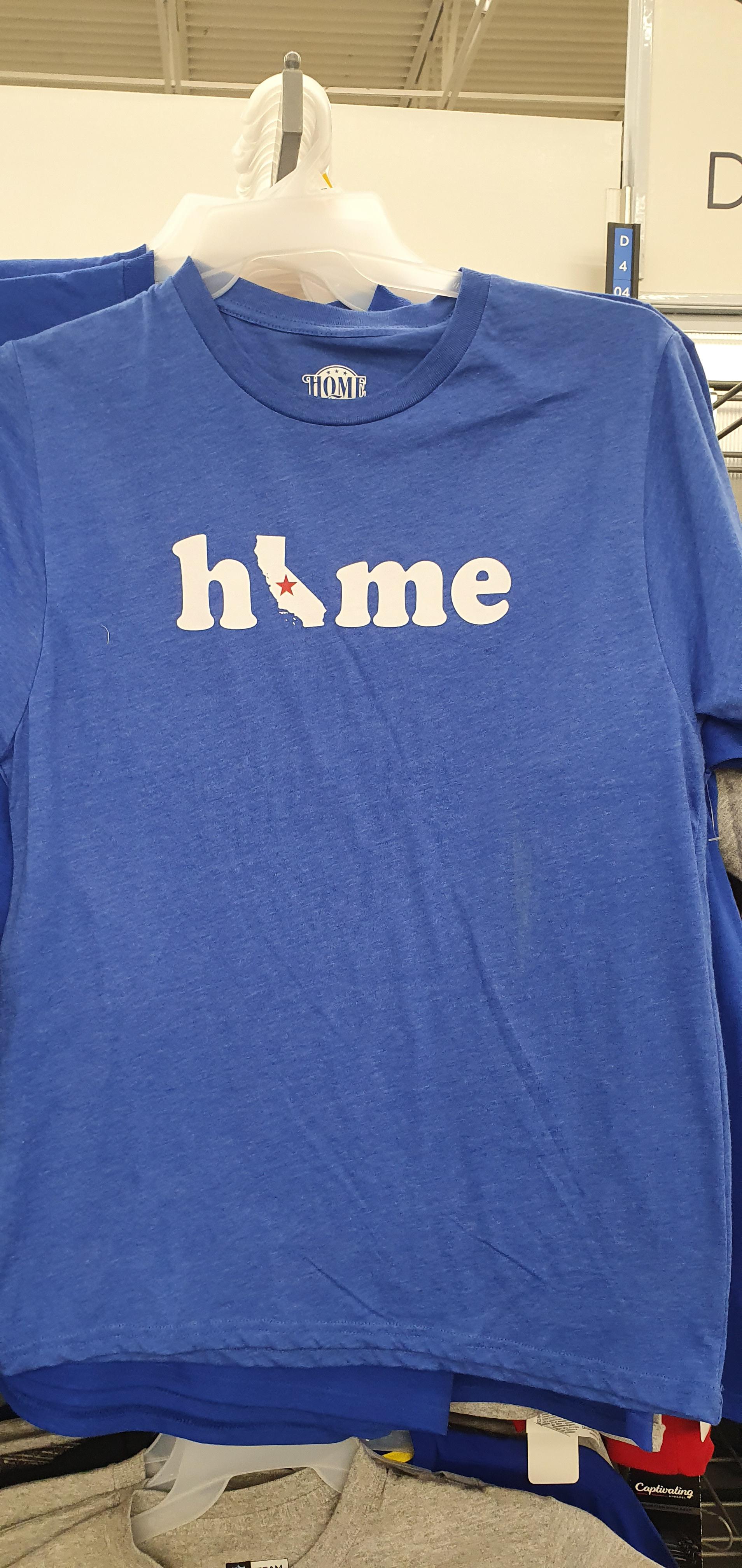
#10. I get what they were going for, but the california just looks like an I
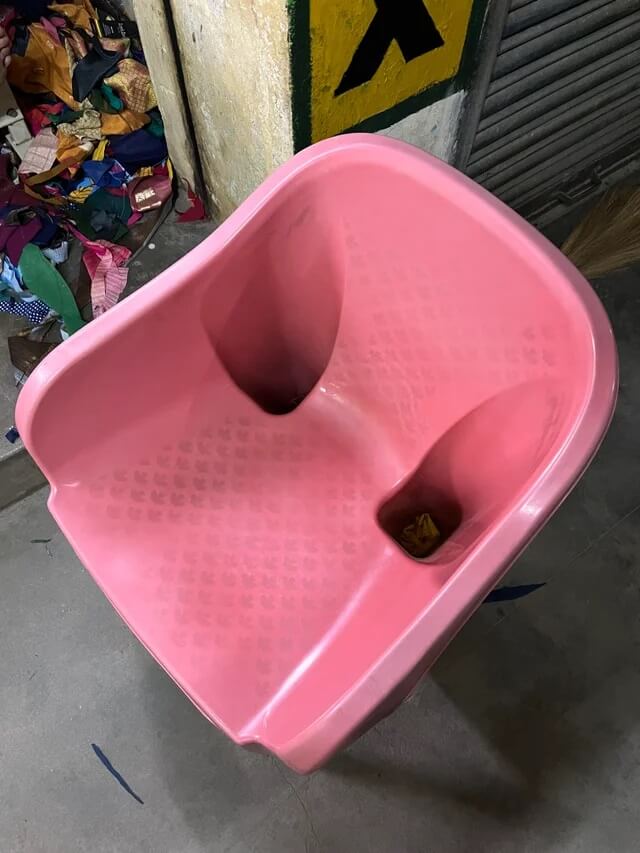
#11. A chair with closed holes. So the dust and dirt that enters it stays!
#12. Ladies and gentlemen, the pinnacle of human stupidity
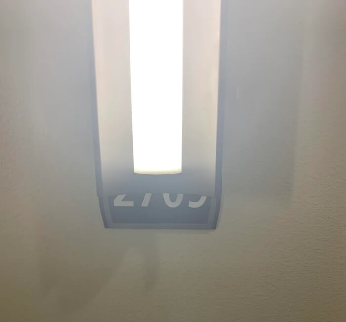
#13. All the apartment numbers in this building are behind the lights
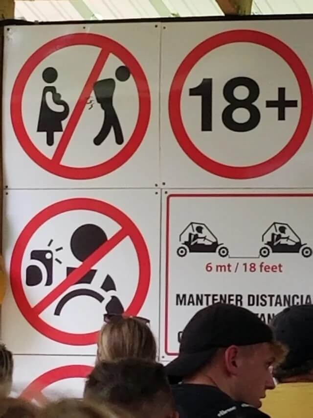
#14. “No farting on pregnant women”
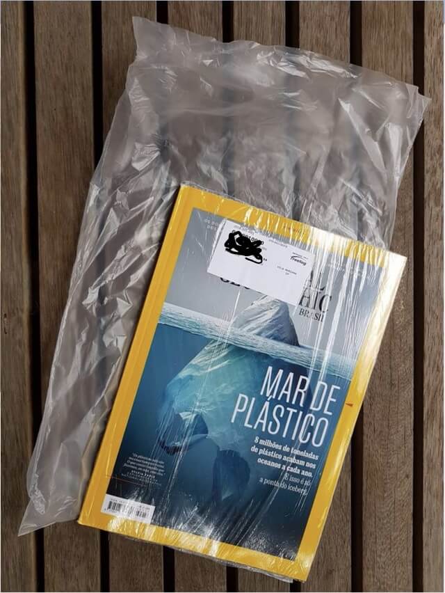
#15. National Geographic magazine that warns about danger of plastic bags comes inside a plastic bag that is inside a plastic bag
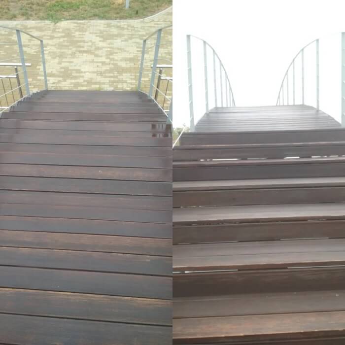
#16. That's how I broke my leg
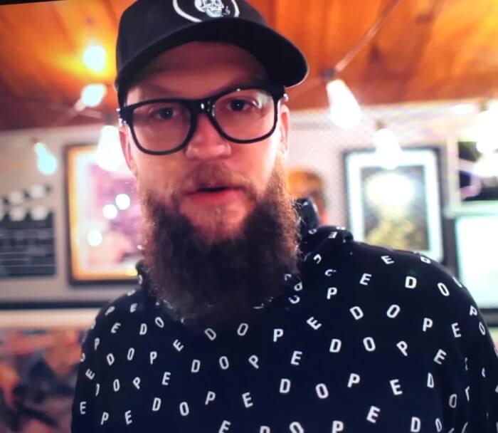
#17. His shirt meant to say ‘dope’ but now I only see ‘pedo’
#18. Why use another symbol when you have colors?
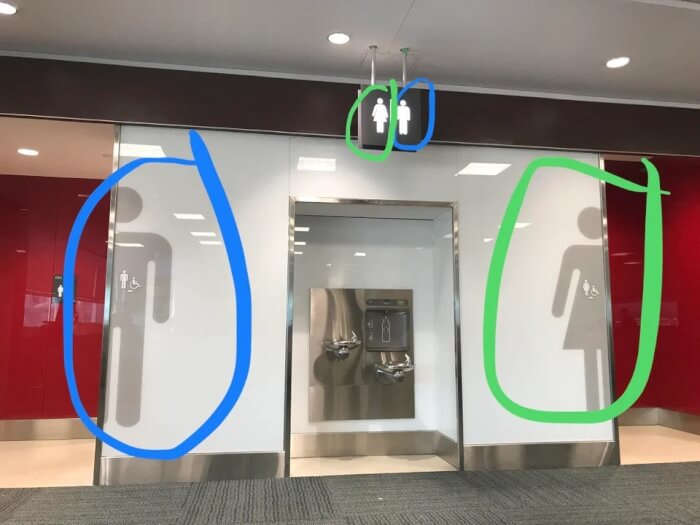
#19. Just watched a guy go into the wrong bathroom at Toronto Pearson Airport. He was looking at the top sign
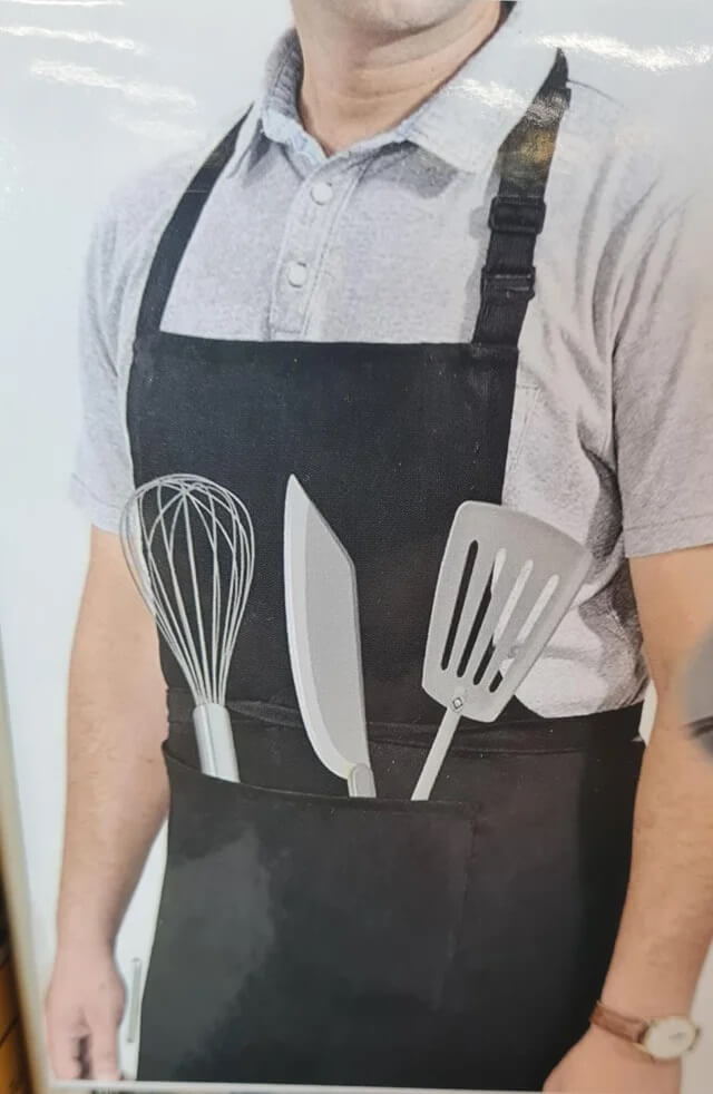
#20. The ad for this apron. Just don't bend over I guess!!!
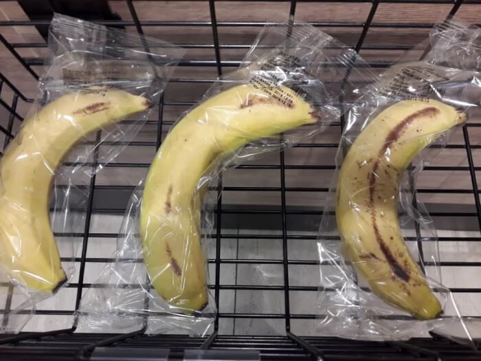
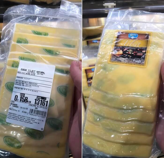
#21. The paper in this sliced cheese makes it look like it has mold spots
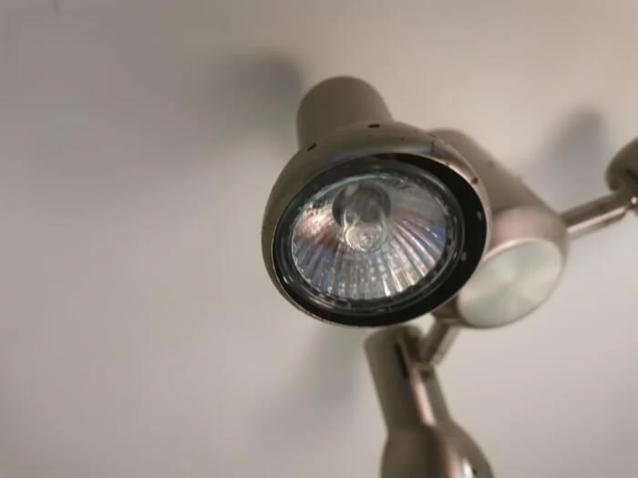
#22. These light fixtures with sharp metal edges and no room to grab the bulb
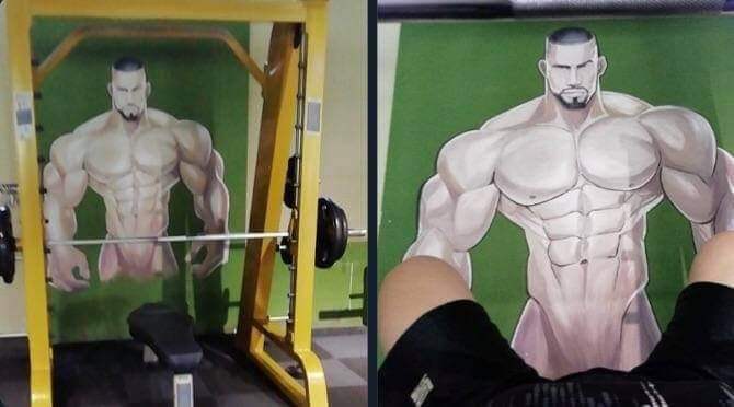
#23. At the local gym
#24. Nothing like the smell of coffee and a good eye-stab in the morning
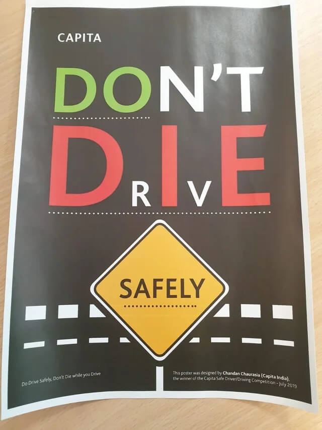
#25. This won the design competition
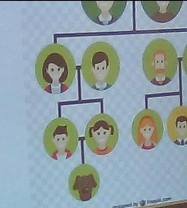
#26. That's not how it works
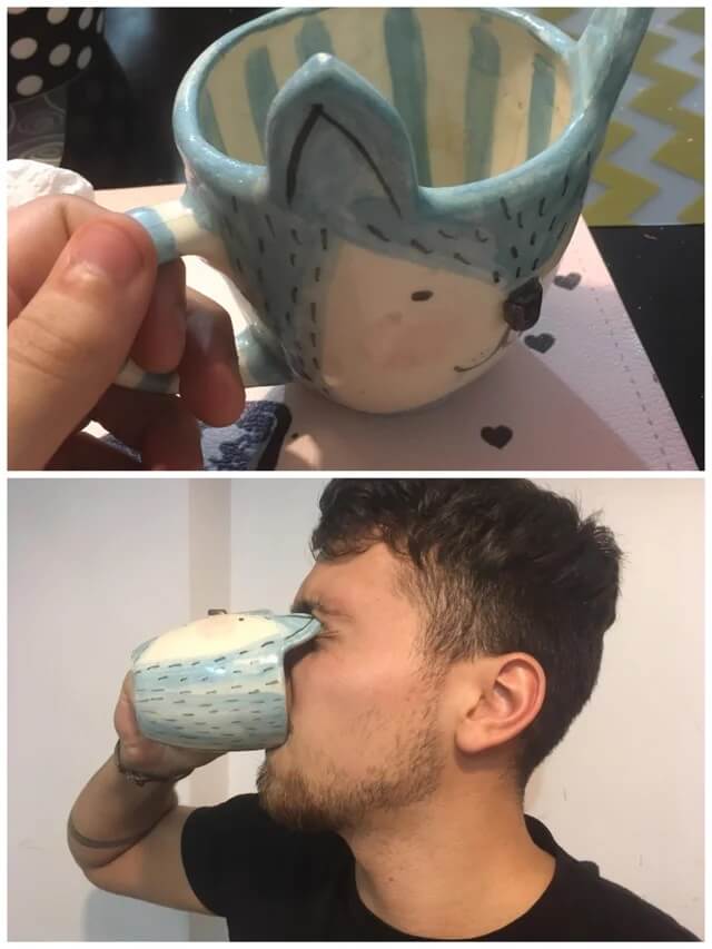
#27. This woman turning into fish roll
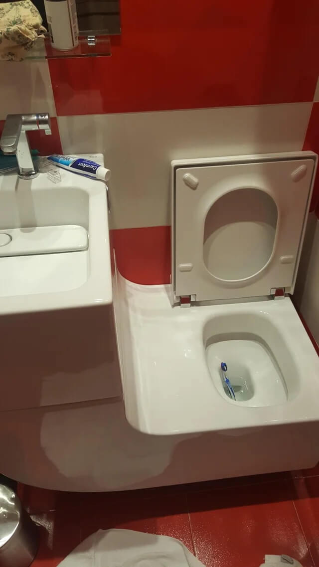
#28. Sink attached to the toilet, forming a perfect slide
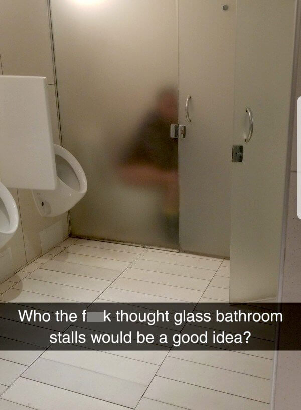
#29. Class stalls in bathroom
#30. I texted two zeros multiple times before I realized that was an O