17 Of The Worst Text Design Fails Ever
Basically, designing a text sign is not hard at all. Sometimes, you only need a pen and a piece of paper or cardboard, and then you can create a sign for your purpose. However, instead of writing in a usual way that everyone can get right to the point, some people opt to make a mess by arranging their words in a very weird order. As a result, nobody on earth can’t even get what the sign is supposed to say. You may want to be creative, but it’s significant to think your idea through, making sure that it will not leave people confused reading it.
We’ve rounded up some of the best examples of confusing text designs in the collection below. You will realize how people screw up their written signs and that some messages will make no sense if we read from left to right. They are just amazingly hilarious. Scroll down to get fun.
We’ve rounded up some of the best examples of confusing text designs in the collection below. You will realize how people screw up their written signs and that some messages will make no sense if we read from left to right. They are just amazingly hilarious. Scroll down to get fun.
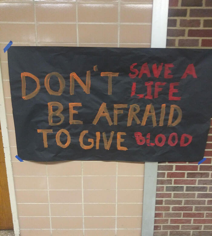
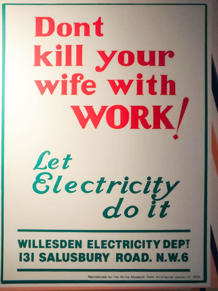
#1. "Don't save a life. Be afraid to give blood..."
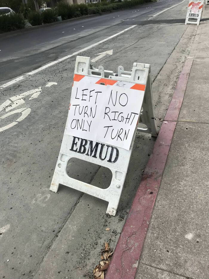
#2. "Honey, I think we're supposed to turn right"
#3. Okay
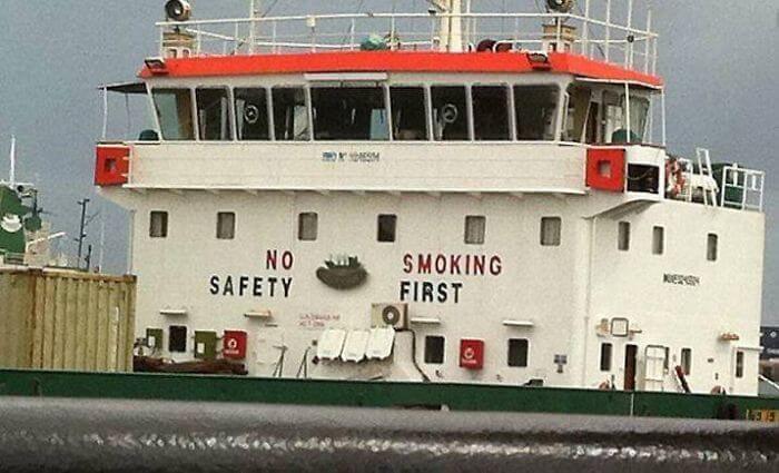 Unknown
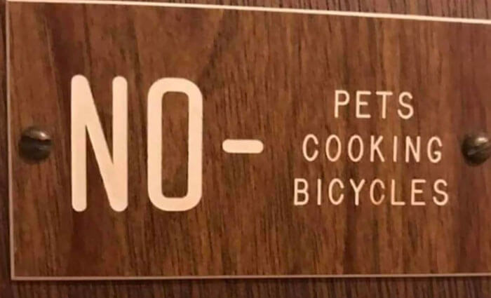
#4. "Sorry guys, you can’t let your pets cook bicycles here"
#5. "Noted"
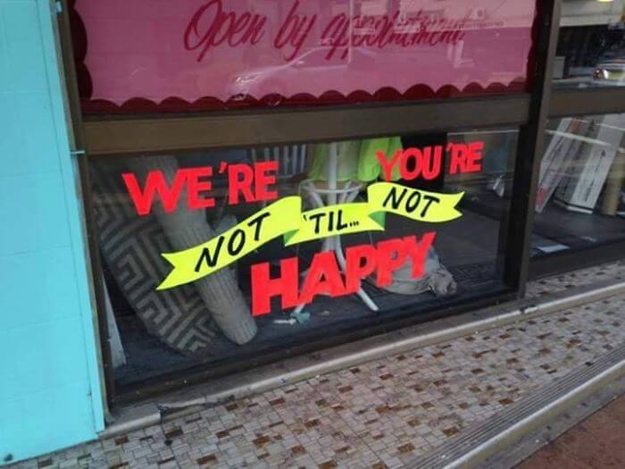
#6. They are happy when I'm miserable?
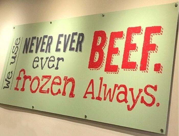
#7. "Never Ever Ever Beef"
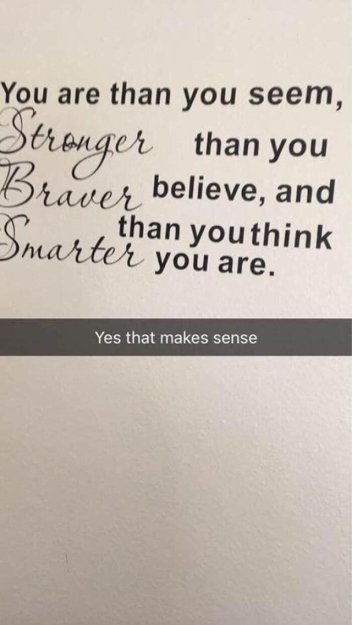
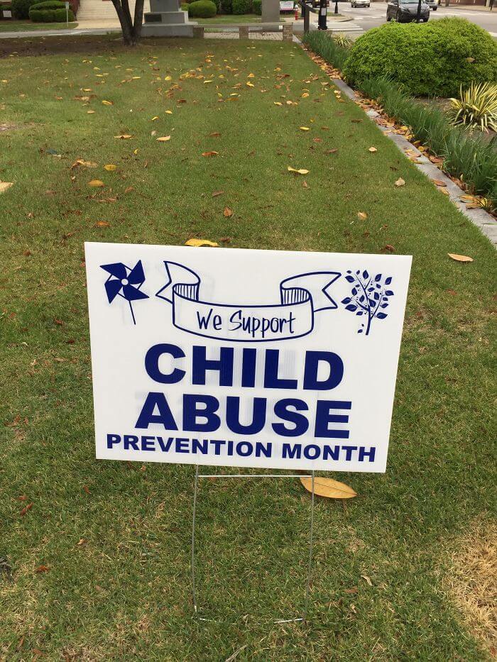
#8. "Truly inspiring"
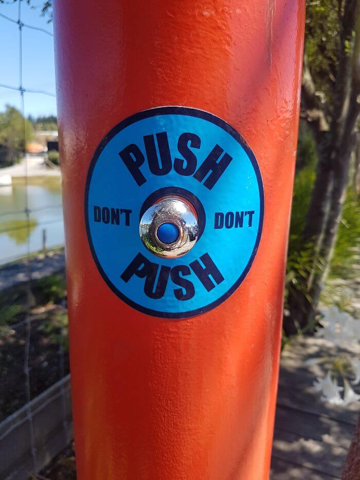
#9. "Do I Push?"
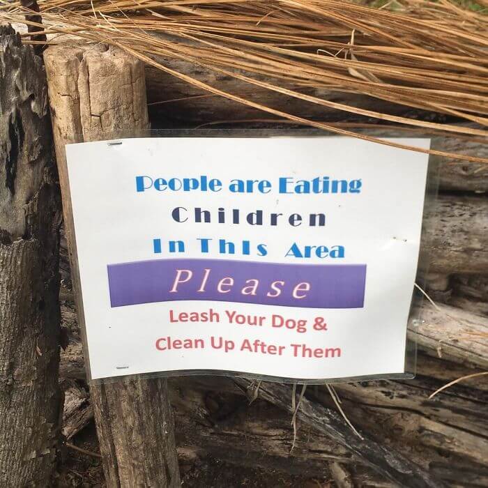
#10. "This Terribly Worded Sign I Saw Today. Sorry, I’ll Pick Up My Dog’s Poop... Wouldn’t Want To Ruin Your Child Eating Experience"
#11. "From Afar, This Sign Has A Completely Different Meaning"
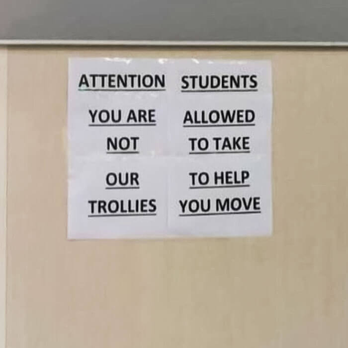
#12. "Our to help trollies you move"
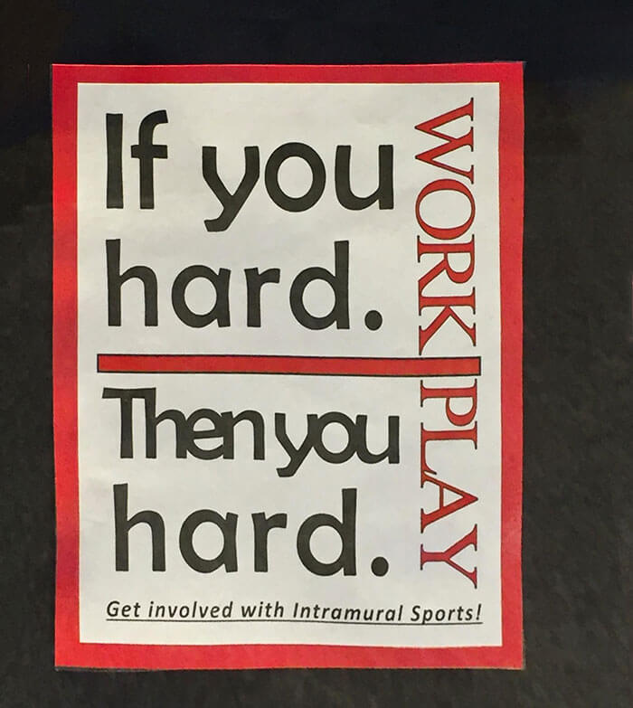
#13. "If you hard, then you hard"
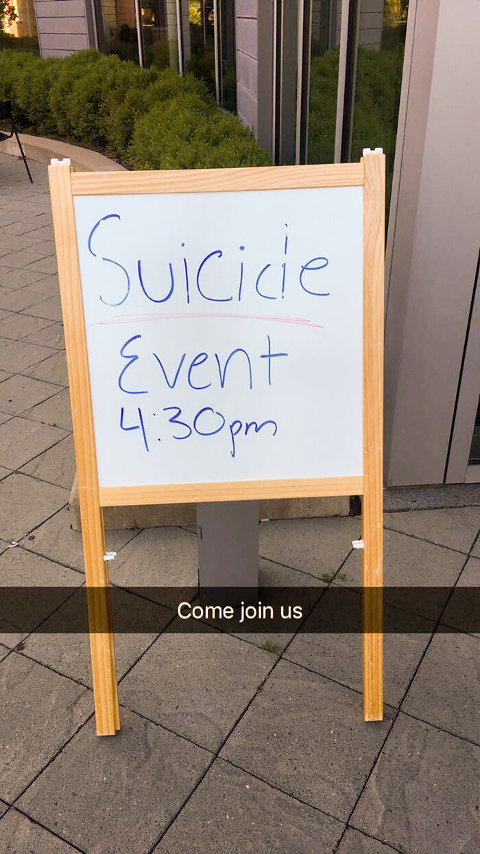
#14. "So My Campus Had A Suicide Awareness And Prevention Day"
#15. "Experience"

#16. In case you'd like to change your mind
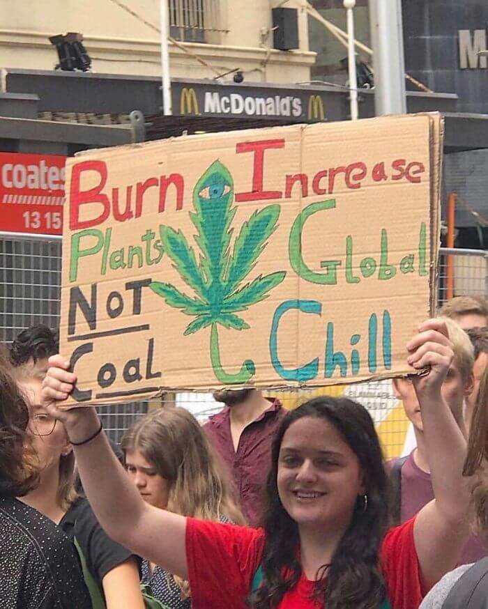
#17. "Burn increase"
Share this article
Advertisement