When it comes to design, it's not just about making new and weird things; it's about making useful and beautiful products. This profession requires designers to have aesthetic sensibility, inventiveness, specialized knowledge, and training. Therefore, being a designer is more difficult than you would think. Many amateur designers are shamed on the Crappy Design subreddit for their awful and ugly items.
We've compiled a list of 30 extremely crappy designs from this group. If you have time, scroll down to check out these tacky designs; then you'll immediately trust us. What do you think about these items? Please let us know your thoughts by leaving a comment in the comment section below. And if you have stumbled upon any bad designs, don't hesitate to share pictures of them with us.
#1. Natural Beauty - four pairs of legs for three enourmous torsos
 Source: JnK85
#2. Very useful and clear
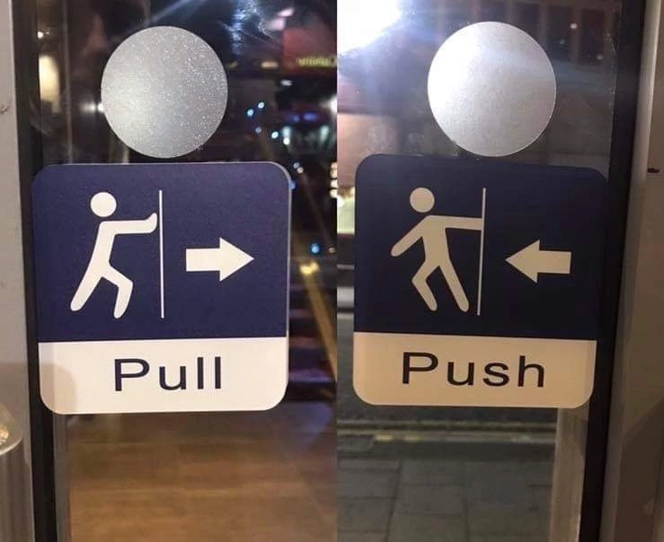 Source: aldopopp
#3. This chandelier looks like a bunch of used jimmies
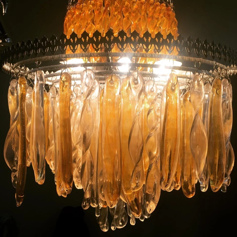 Source: iamadsgnr
#4. I can't tell if the face or the text and warning are the real crappy design...
 Source: SEGAGES1999
#5. An unfortunate alignment
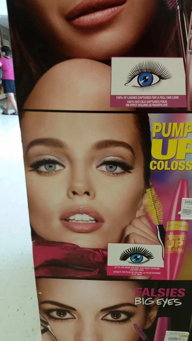 Source: Egg_Dad
#6. Use not Heat resistance material for fried egg mold
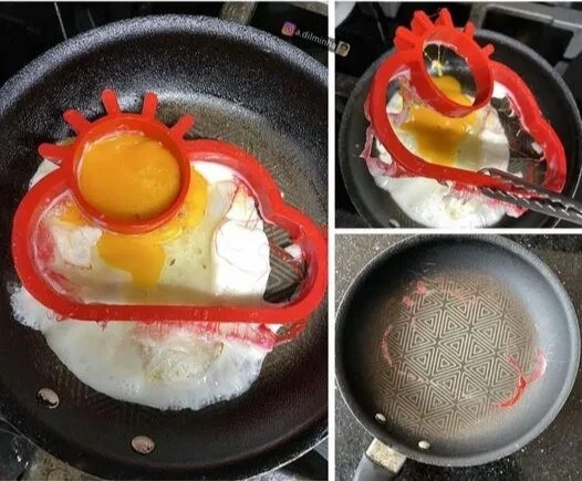 Source: pkkballer22
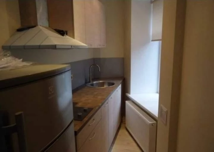
#7. Modern living condo for sale. 2 bedrooms 2 bathrooms 1/4 kitchen
 Source: SlaughterheartMagus
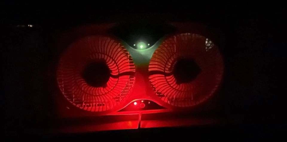
#8. My new bedroom window fan. This is what it looks like when I go to sleep. Why do manufacturers insist on using LEDs that can be seen from space?
 Source: mxt920
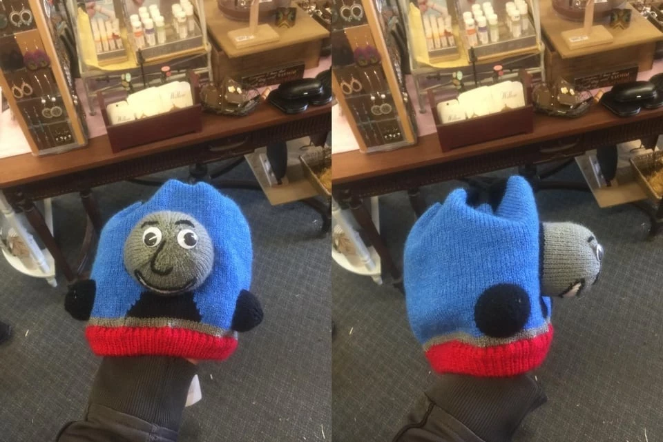
#9. I think the design went a little off the rails here...
 Source: imnotwatchinganyporn
#10. This use of limited space
 Source: Snoo_90160
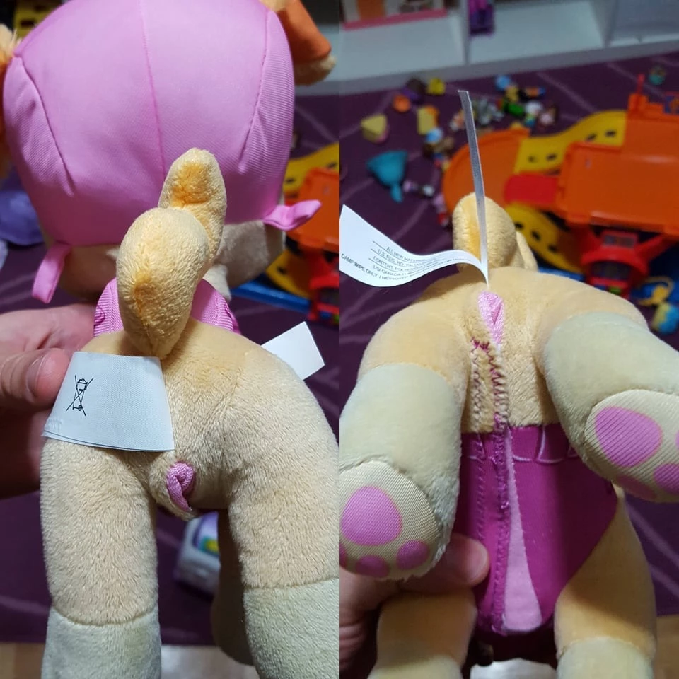
#11. They couldn't have just used the tan color for the inside lining? (Paw patrol talking Skye plush)
 Source: Orcansee
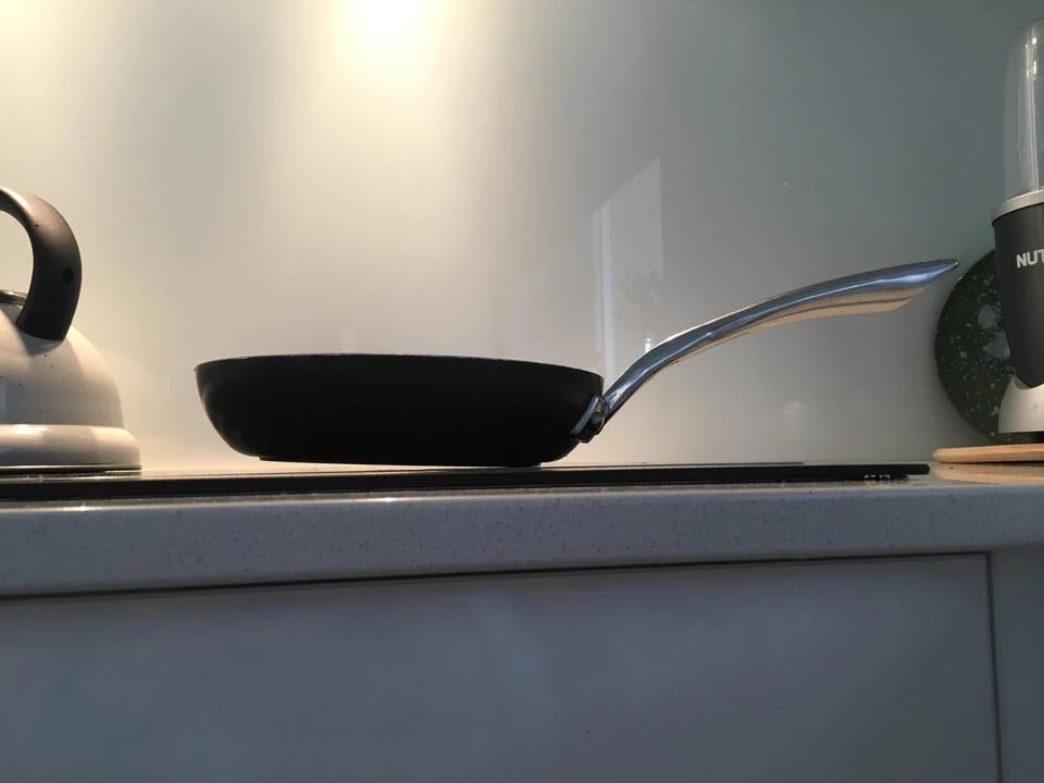
#12. My pan’s handle is too heavy for it to stay flush with the stove top
 Source: Luwazi
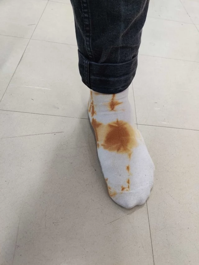
#13. Tie dye socks that look like someone used them as toilet paper
 Source: Professional_Lunch43
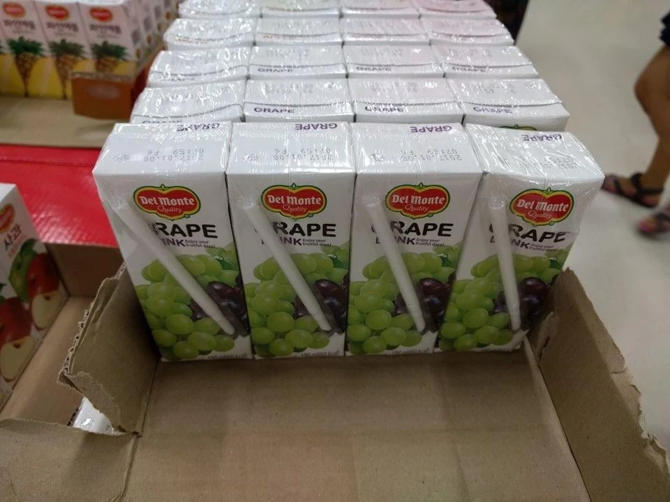
#14. Very unfortunate straw placement
 Source: ricepudding1203
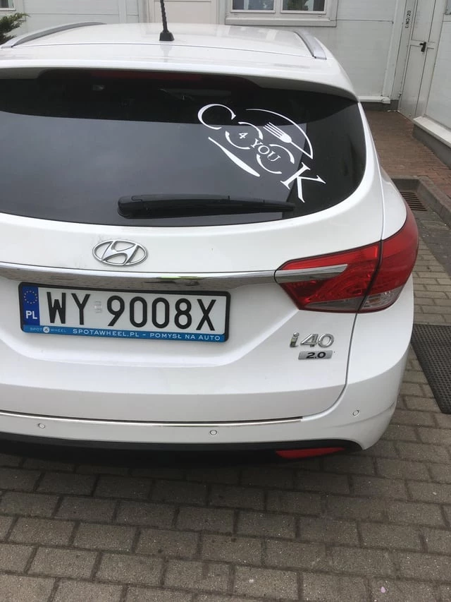
#15. Hungry anyone? Cafeteria name at my work
 Source: marcin0208
#16. Unfortunate name for a knife set
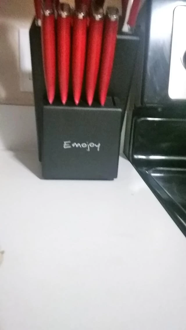 Source: XxX_ZHVP_XxX
#17. Is this trophy for golf, or assault?
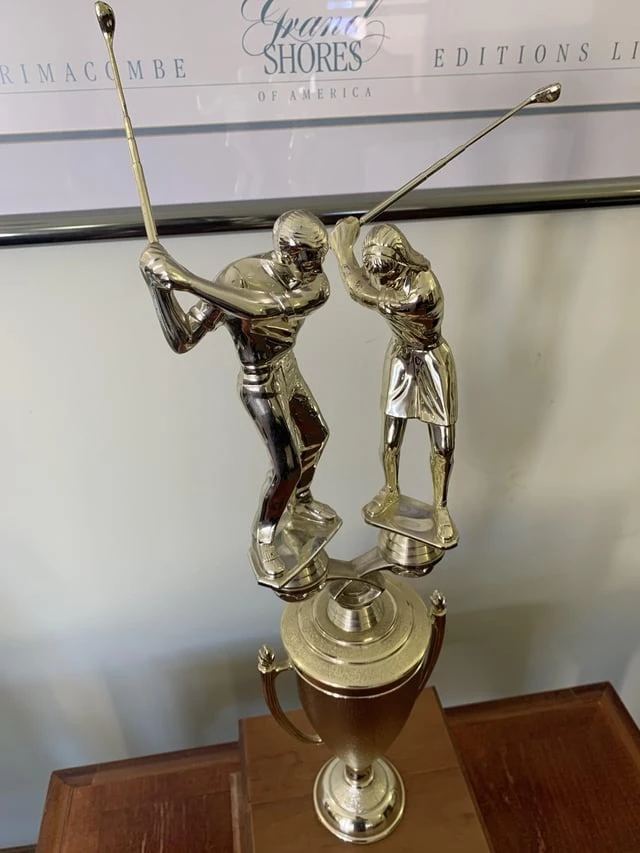 Source: ki4fkw
#18. Even Batman... Wait what?
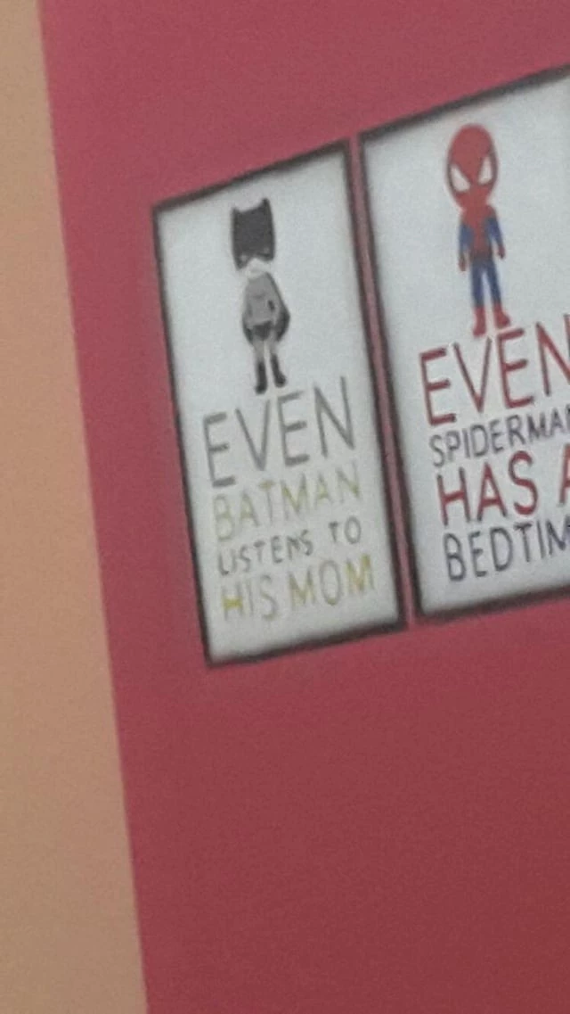 Source: Niels2086
#19. The design for my school’s new uniform
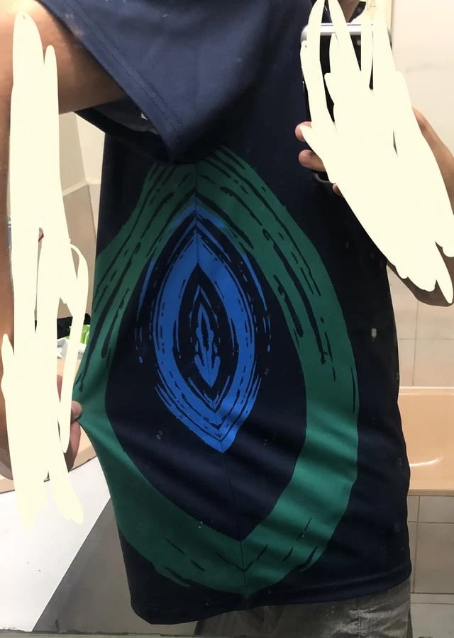 Source: pulpfriction58
#20. This unfortunate placement of a handle
 Source: loselmuh
#21. A 'clever' clock with incorrect math
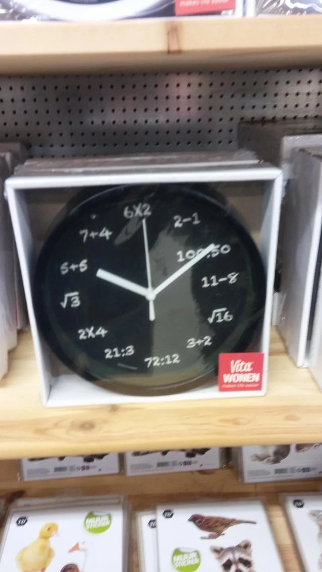 Source: iidaanj
#22. Clever
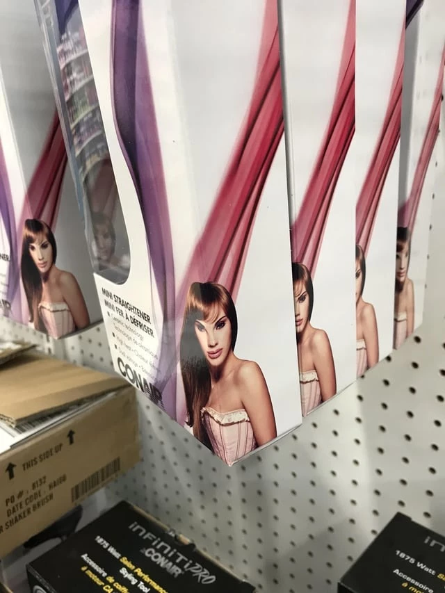 Source: lonelystonerbynight
#23. Imagine being such a bad designer you can destroy a child’s ability to count by them merely looking at your design
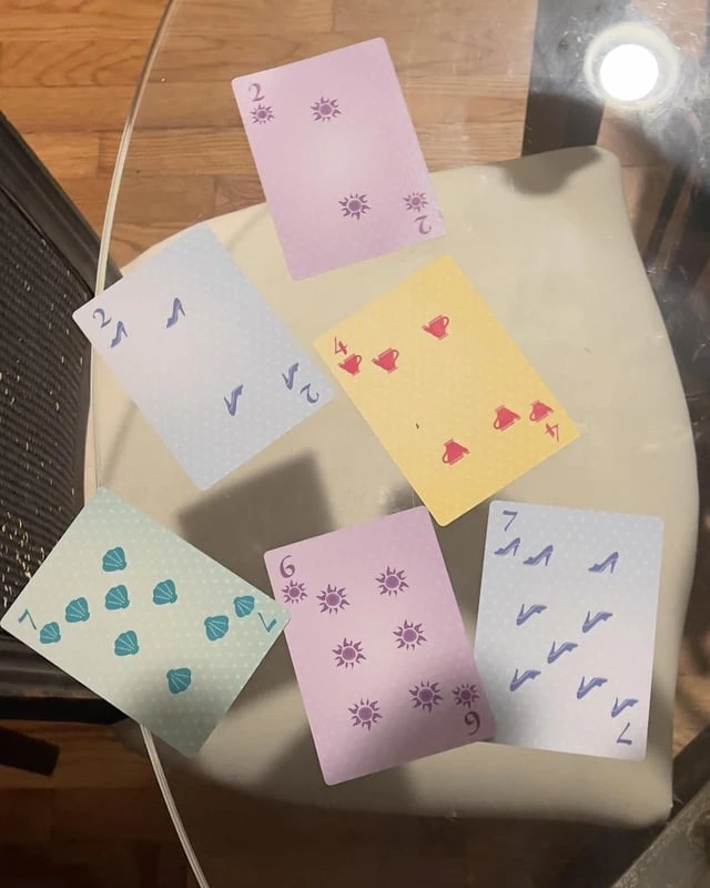 Source: theWildBore
#24. Door knockers on glass
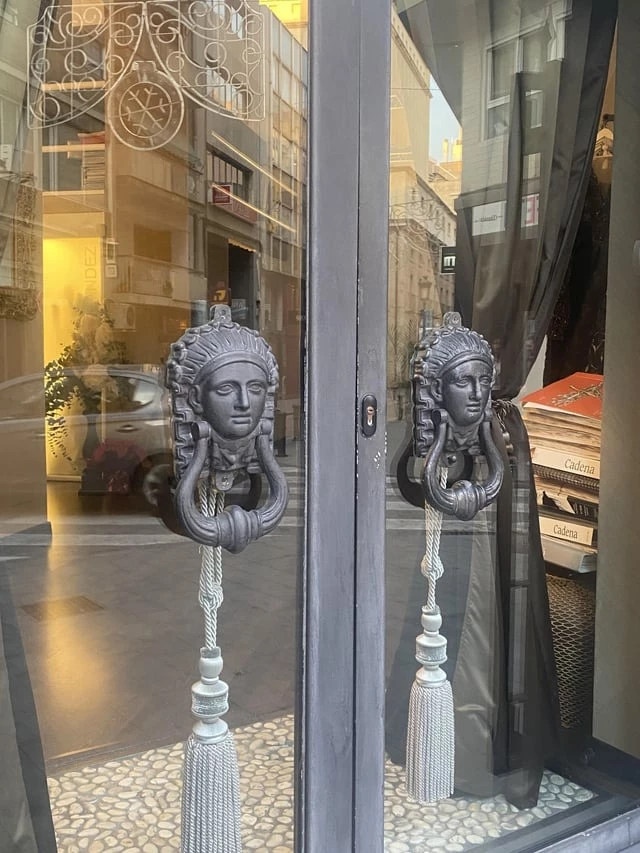 Source: llandbeforeslime
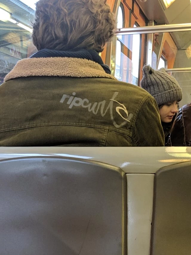
#25. Ripcurl needs to seriously reconsider this design
 Source: bakelywood
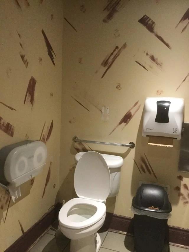
#26. Went to go to the bathroom at a local restaurant and found a literal “crappy design”
 Source: FritoMatt
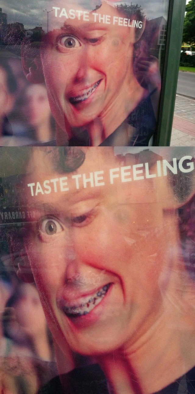
#27. TASTE THE FEELING® of crappy lenticular design
 Source: MosiTheLion
#28. We were in two separate stalls at his company’s unisex bathroom. Nothing but glass!
 Source: freshstart93
#29. Talk about a crappy design
 Source: 1OOO
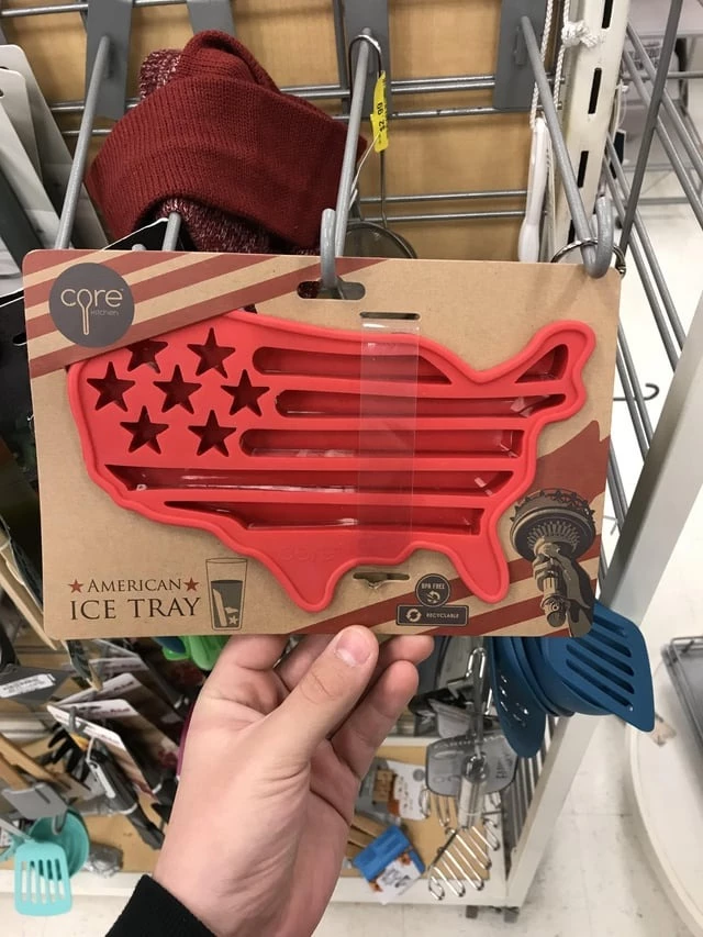
#30. Worst ice tray design I’ve ever seen
 Source: Yeruxium