Is graphic design an easy job? As you can see from the list of crappy logo designs below, we have to say that, becoming a graphic designer is not easy. This job requires designers a combination of audacity and humility, as well as confidence in their talent. And one of the most crucial factors is giving anything considerable thought. Mistakes, though, are unavoidable. When creating logos, graphic designers can't always consider all the possible outcomes.
These crappy logo designs are the best examples of this. They show why graphic designers have to consider all the possible outcomes when creating logos. Although they seem to be beautiful and stylish, but completely inappropriate. And they will have to look twice to not be fooled. Now, scroll down to take a look. And vote for your favs.
These crappy logo designs are the best examples of this. They show why graphic designers have to consider all the possible outcomes when creating logos. Although they seem to be beautiful and stylish, but completely inappropriate. And they will have to look twice to not be fooled. Now, scroll down to take a look. And vote for your favs.
#1. Not the greatest logo...
 Source: 1aappyy
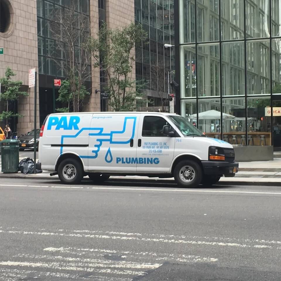
#2. Designer: Can you describe the logo you'd like? Client: It should have a leaky pipe. But instead of fixing it, our plumber just puts his finger in there. And btw, it should still leak after he does that
 Source: nickrosener
#3. An unfortunate logo for a fitness center
 Source: Dingwallace
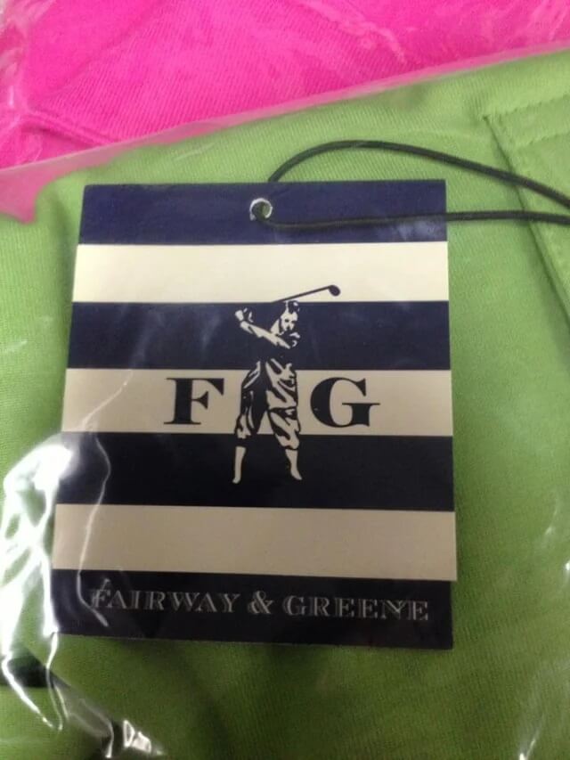
#4. A clothing tag with an unfortunate logo design...
 Source: Samheim
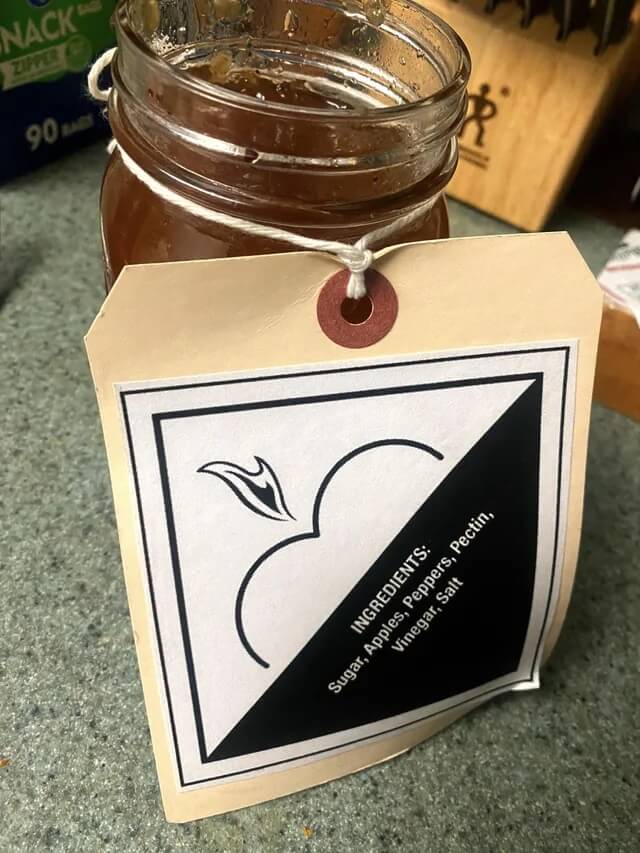
#5. The logo for this spicy apple jelly
 Source: KyleColby
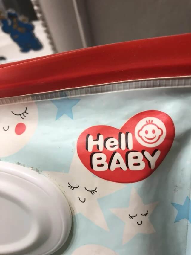
#6. My son who just started to read, “HELL BABY. HELL BABY. HELL BABY!!!”
 Source: Hopeful_Relative_494
#7. This yogurt using biohazards symbol as its logo
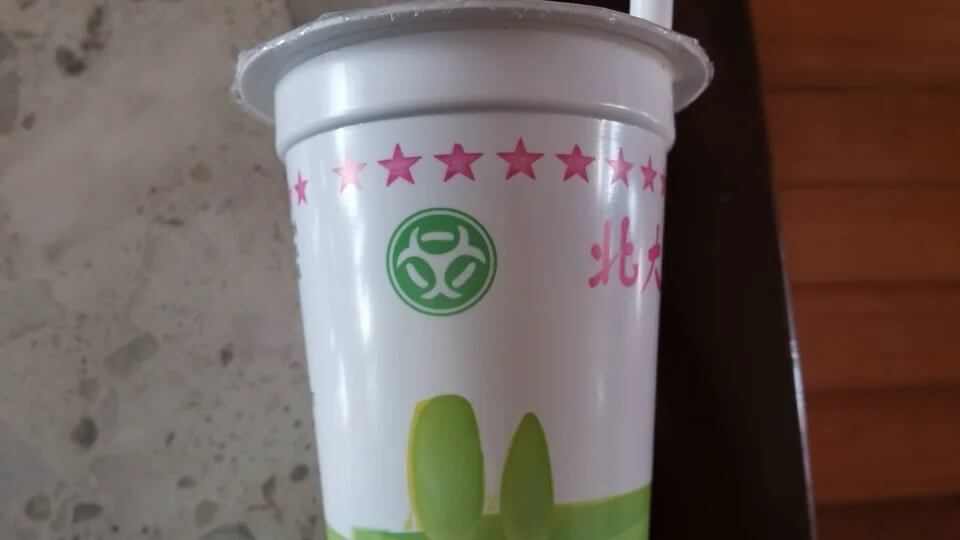 Source: ShermanLiu
#8. They really need a new logo...
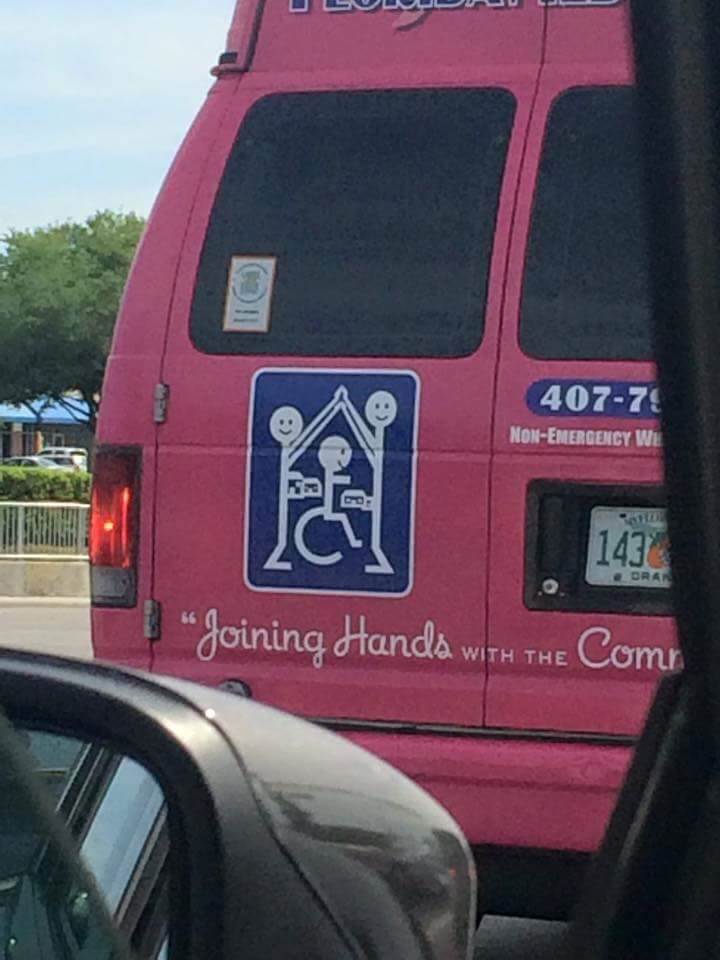 Source: ForeverInaDaze
#9. This medical center’s logo is a flat line
 Source: izyzacov
#10. Unfortunate door/logo placement on this plane
 Source: nthensome
#11. THE TIM HOE USE - supposed to read 'The time house'
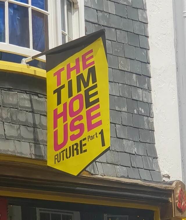 Source: Big_ElMo
#12. Whoever designed this logo made a terrible mistake
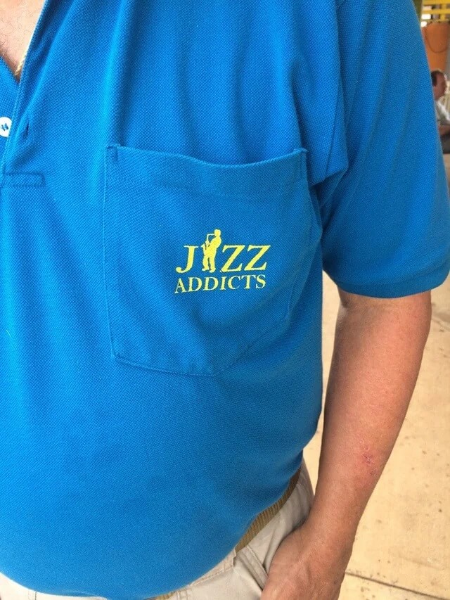 Source: j1002s
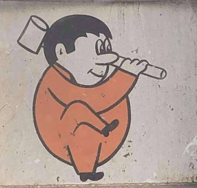
#13. This logo of a company in my city
 Source: Fulla_good_stuff
#14. A "cheerleading" logo in a town close to me...
 Source: Pmray23
#15. We’re going to contact them with a new logo hopefully
 Source: lefuturtle
#16. Girls water polo team logo
 Source: Bacicot
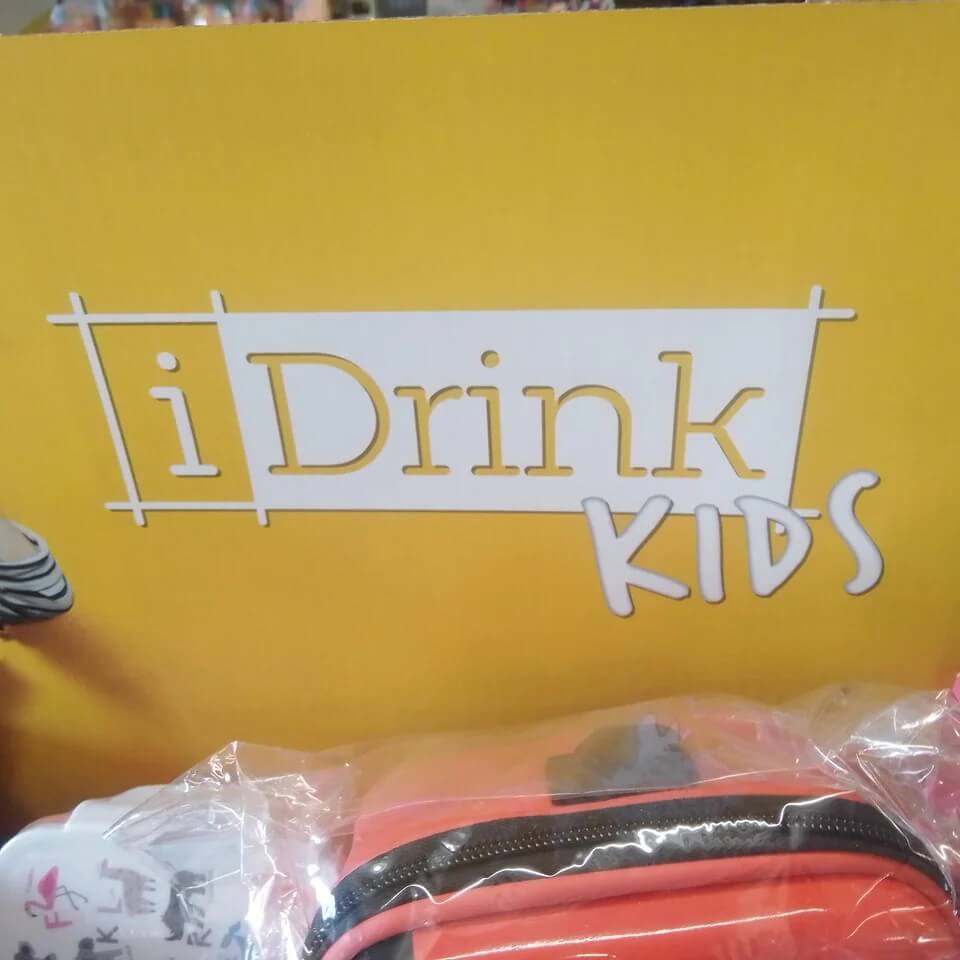
#17. I love drinking kids too!
 Source: RosenRanAway
#18. Design of the bottle and logo looks way to close to a Sunny D like drink. If a kid couldn't read this would go bad
 Source: TheElegiast
#19. The flip zone has a rule of "NO BACKFLIPS" when there is literally a guy backflipping in the logo
 Source: Xx_BaconPlays_xX
#20. Prizes on offer at the clinic
 Source: BaronVonStretchmark
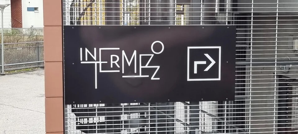
#21. This sign in the office building where I'm attending training...
 Source: Autiosaaren_lautturi
#22. This restaurant’s logo that looks like a health grade
 Source: drobinow
#23. Was stuck behind this unfortunate logo today
 Source: Jackarewb
#24. This companies logo looks like somebody got pulled into a lathe
 Source: Marc815
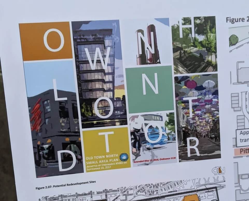
#25. This logo for "Old Town North"
 Source: KittyLikesTuna