Sometimes when we go out in public places, we may spot signboards and posters that will leave us with lots of questions in mind. They either have a stupid look or the craziest idea that no one can ever digest. Those graphic design fails look like a 5-year-old made them or someone was drunk while working on them. Of course, you're not necessarily a professional and experienced graphic designer to shame whoever came up with such terrible ideas for their work because, to be honest, it’s fun to do so. That’s why a special corner on Reddit known as r/CrappyDesign was born with the sole purpose is to roast awful designs that should go straight to hell.
Here we’ve compiled a list of 28 graphic design fails shared by members of this online community. Check them out!
Here we’ve compiled a list of 28 graphic design fails shared by members of this online community. Check them out!
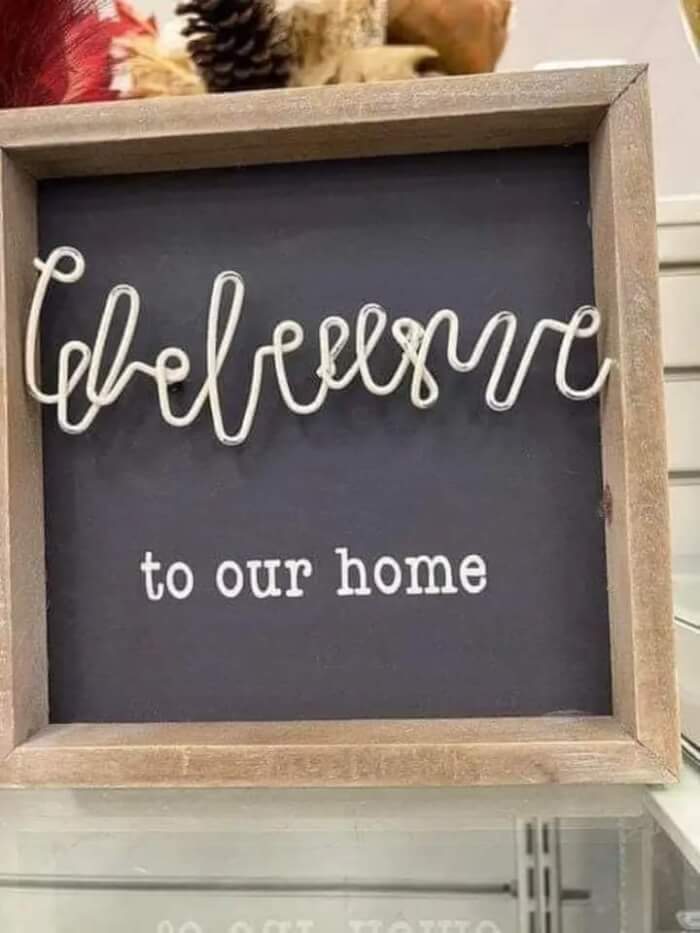
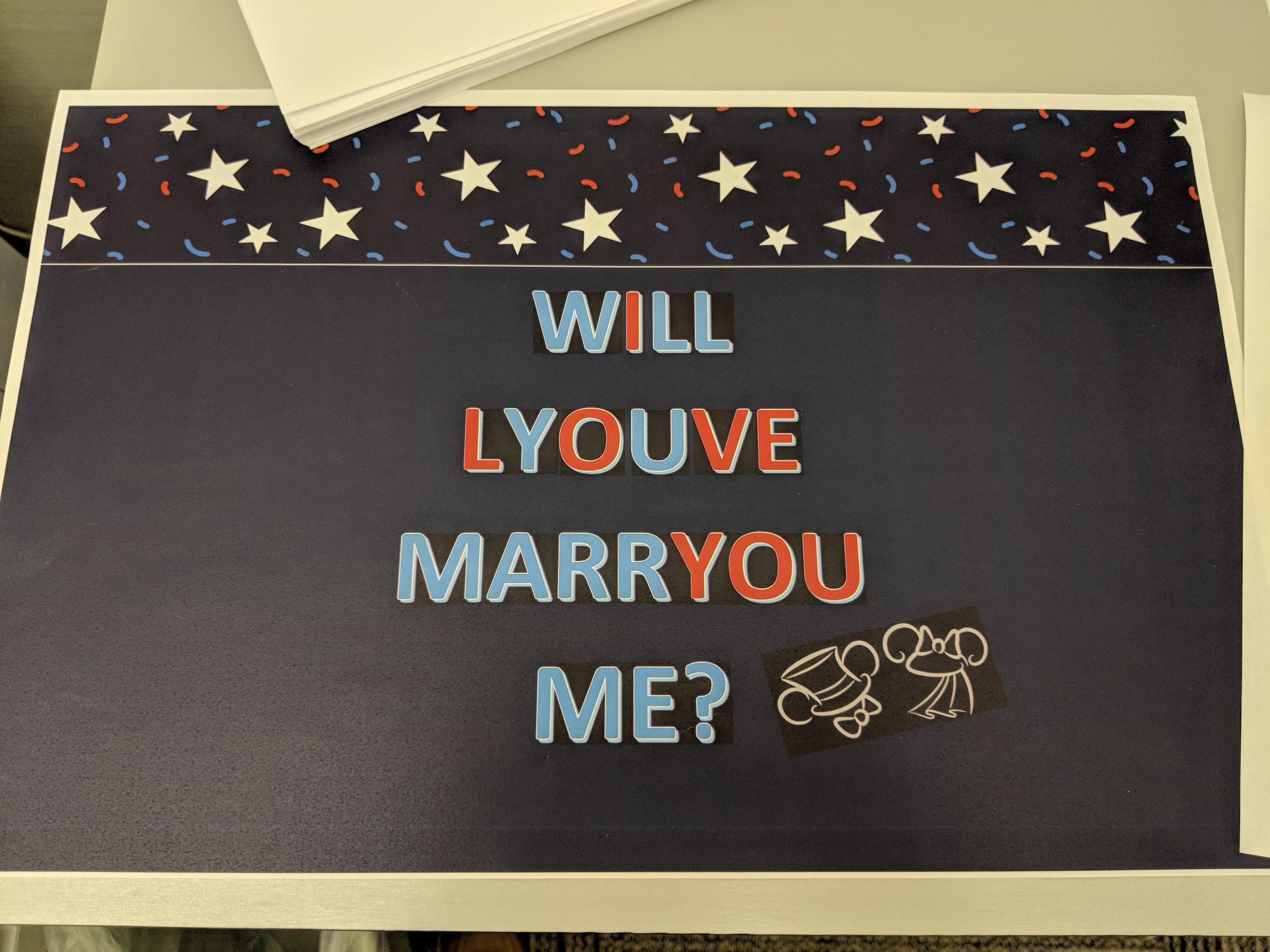
#1. Wbeleusuve to our home
 Source: Singer-Such
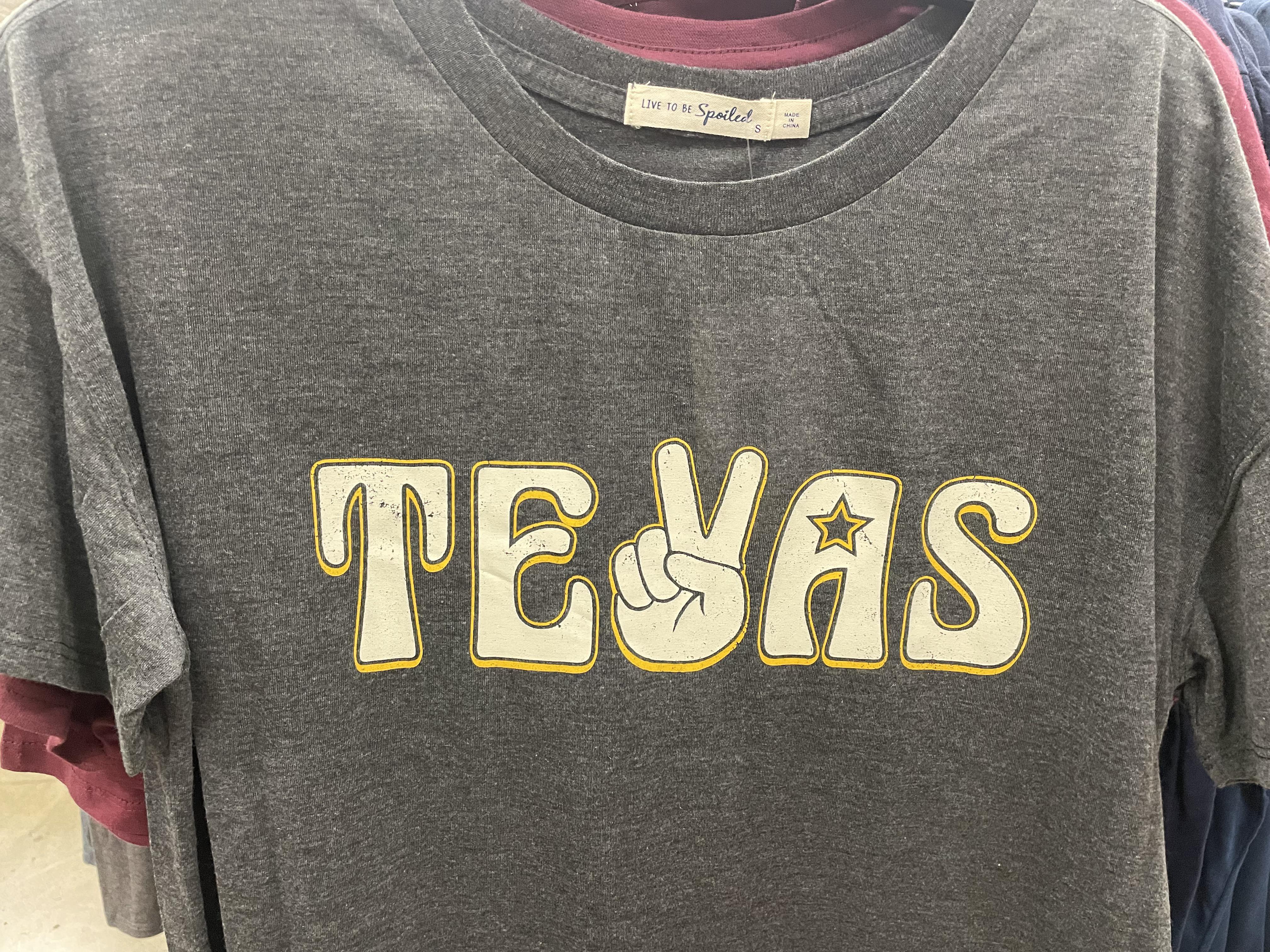
#2. "Mmm yes, I sure do love living in Tevas"
 Source: TheAverageYBAJoe
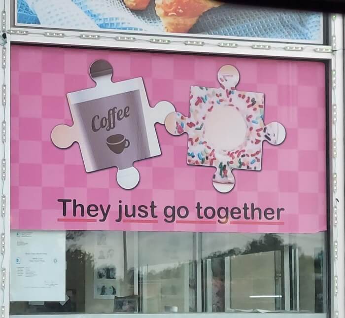
#3. They just DON'T go together
 Source: terbiun
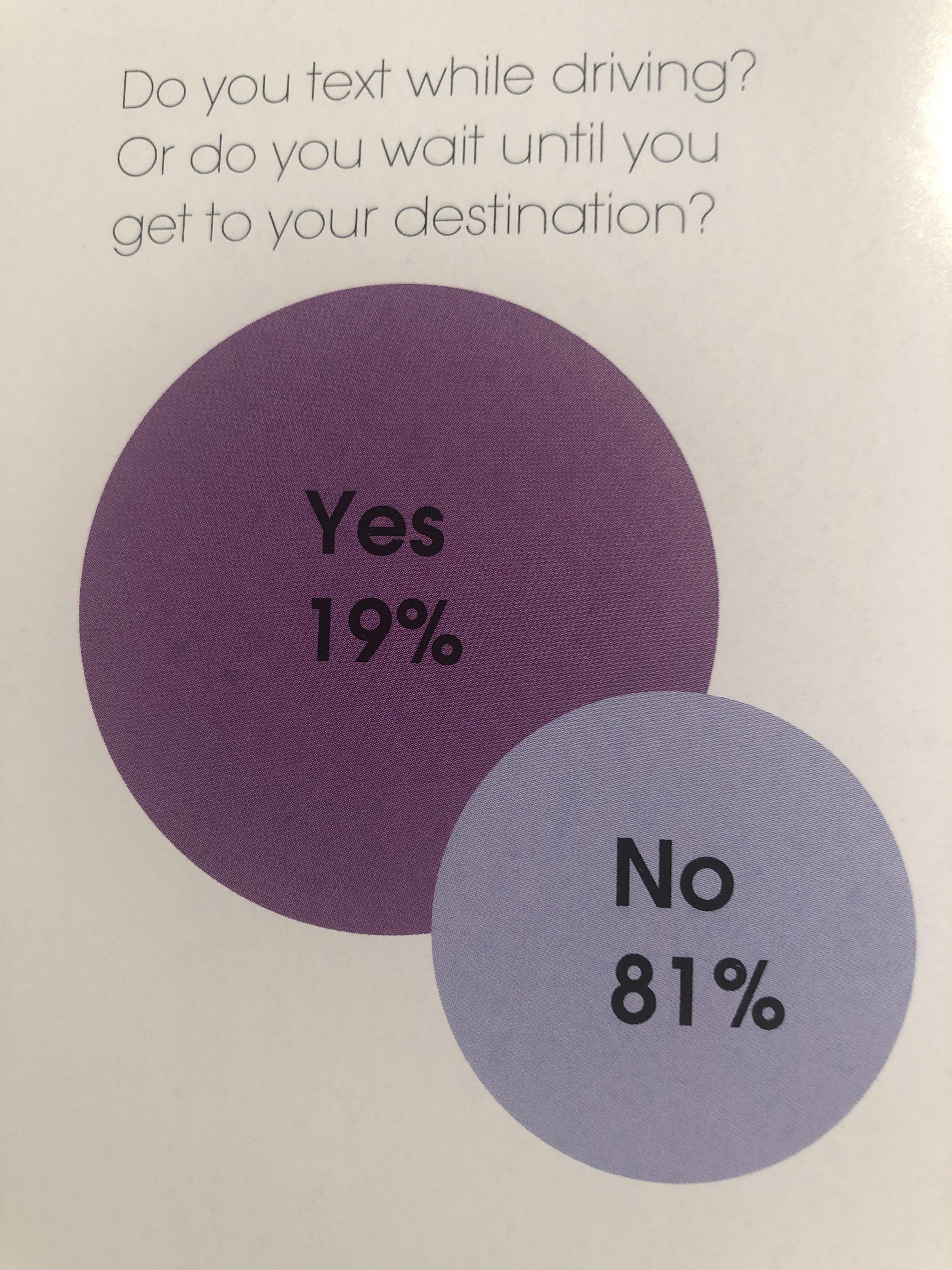
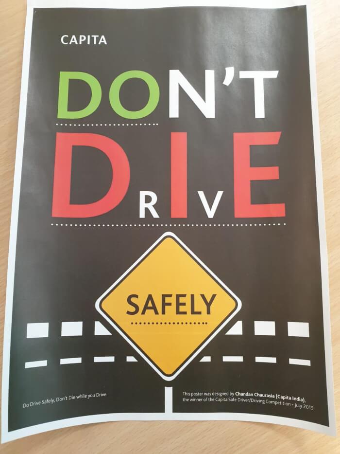
#4. A very easy-to-read graph about texting while driving
 Source: Buddhacream
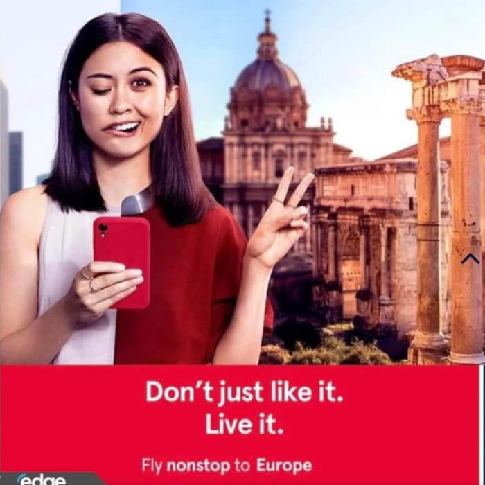
#5. Fly to Europe and have a stroke
 Source: DucksToo22
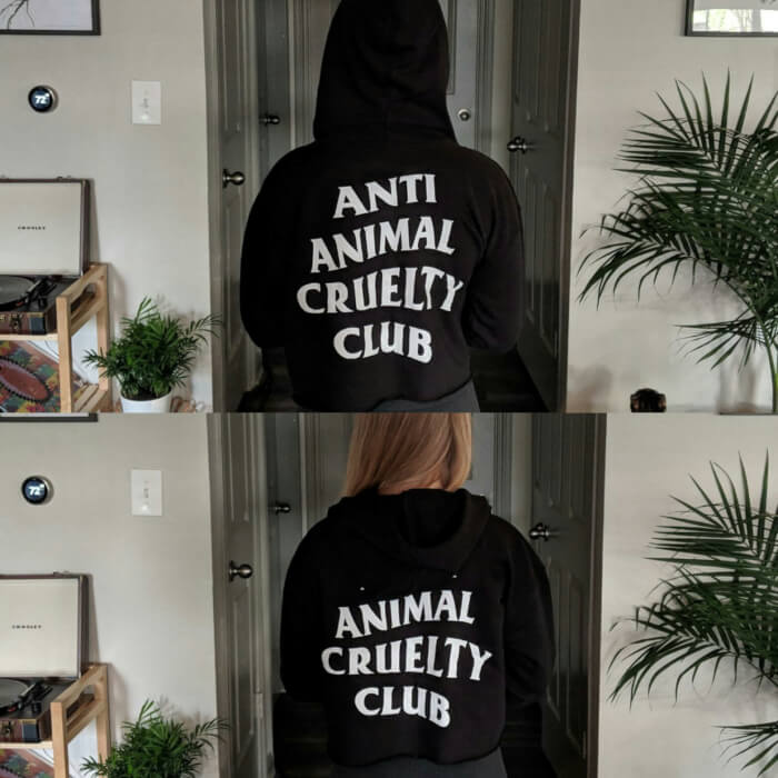
#6. A life-changing experience
 Source: froopy_doo
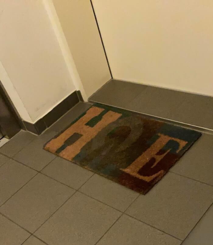
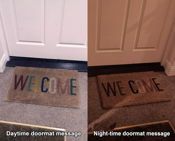
#7. Not the most welcoming door mat
 Source: Kamikapilz
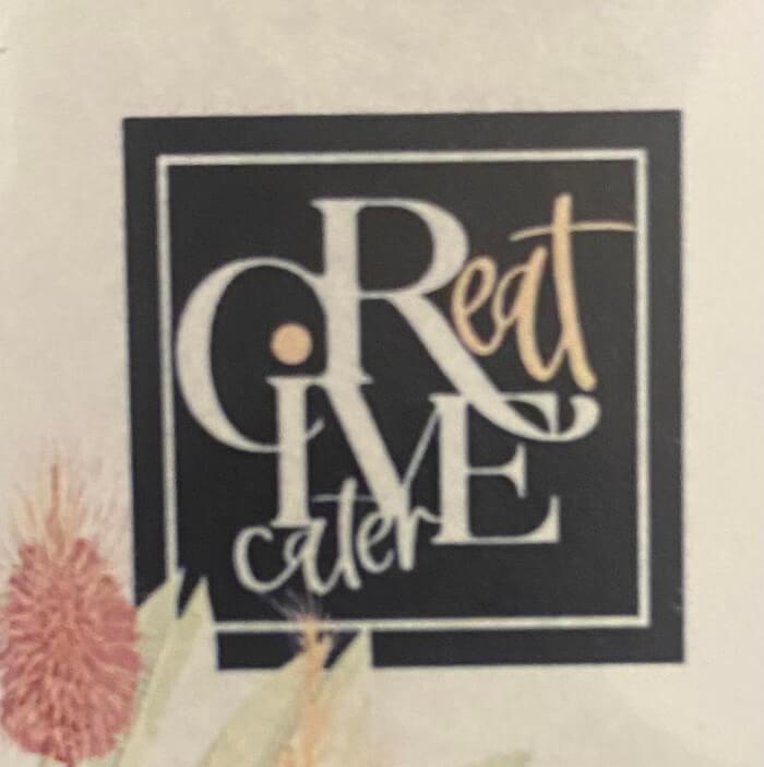
#8. CReatIVE cater
 Source: Lovely_Buns420
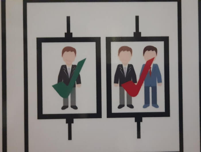
#9. 1 person is OK, 2 people is OK but in Red
 Source: Luis008_
#10. Think inside the box first
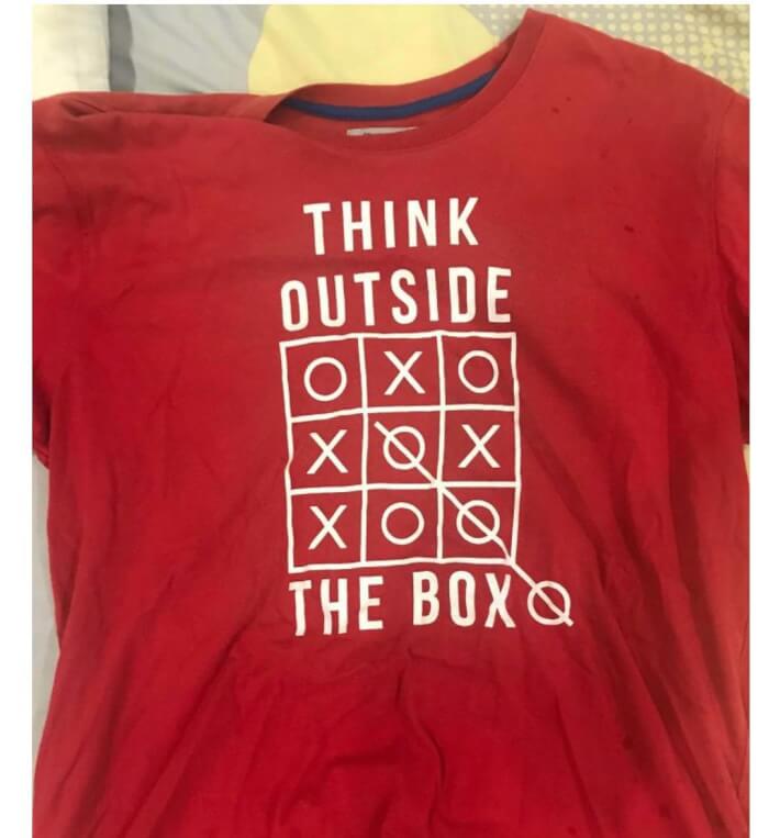 Source: SpeedDreaming
#11. If only there was a letter in flame that could resemble a flame
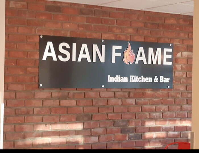 Source: dickb0tt
#12. "It's better than shut up, have a Monday I guess"
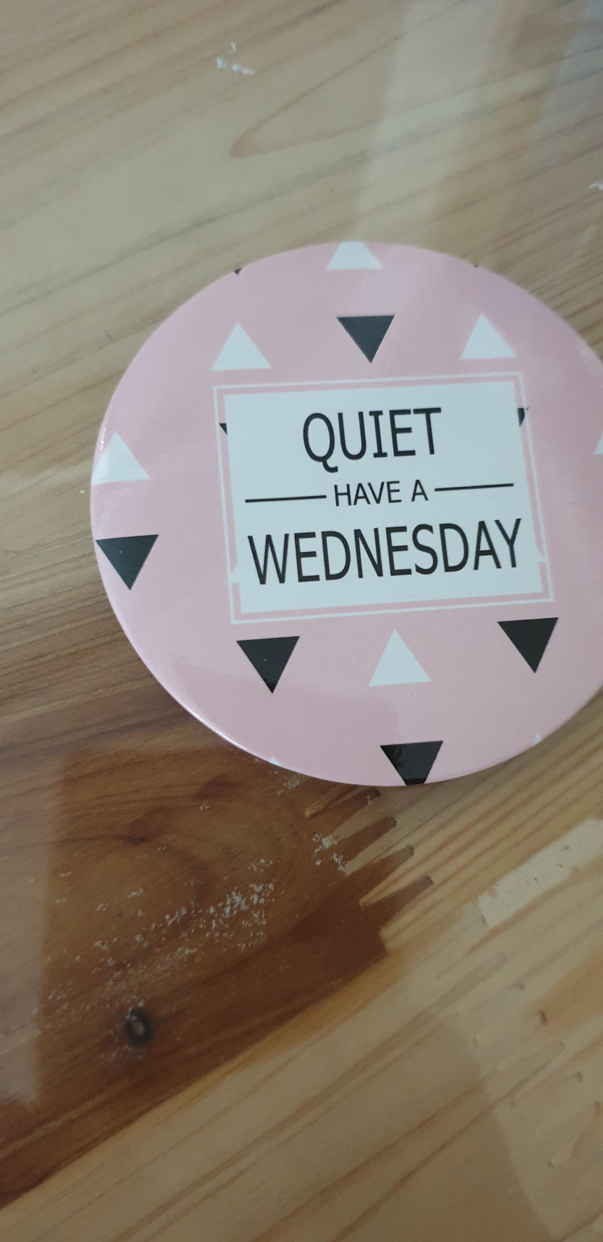 Source: _Goodrandom
#13. "Which floor am I on?"
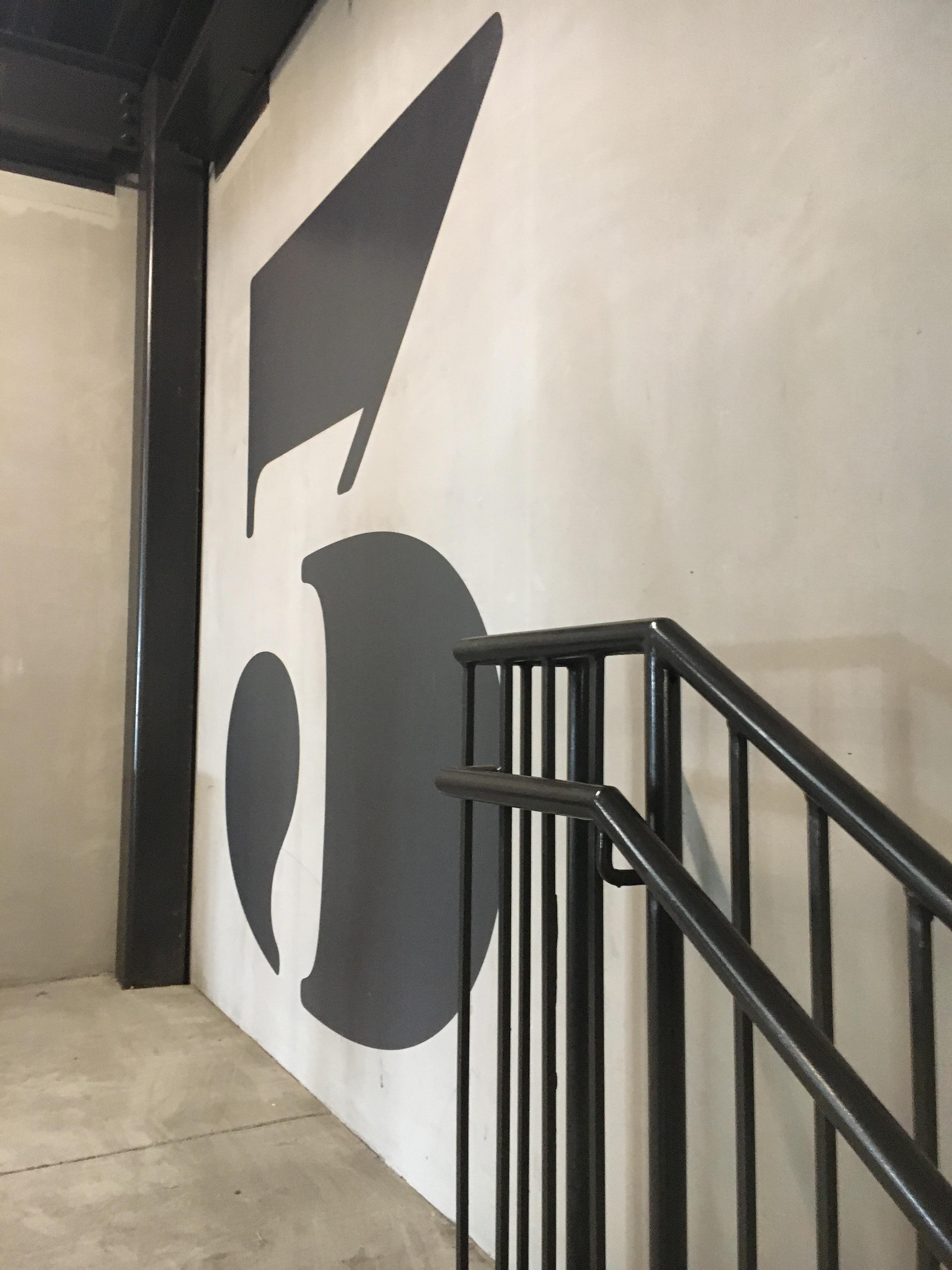 Source: SherbetIndividual128
#14. Orange is the new milk
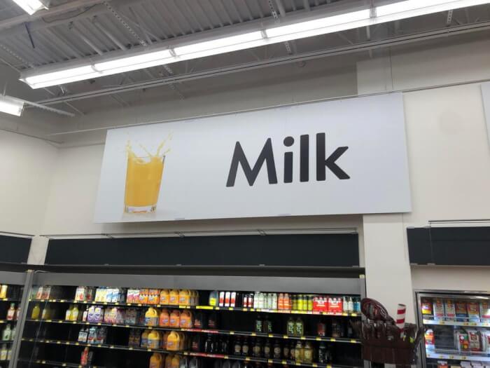 Source: Random_Average_Human
#15. That seems like an "accidentally on purpose" kind of thing, designed to appeal to all those new parents only getting 3 hours of sleep every night
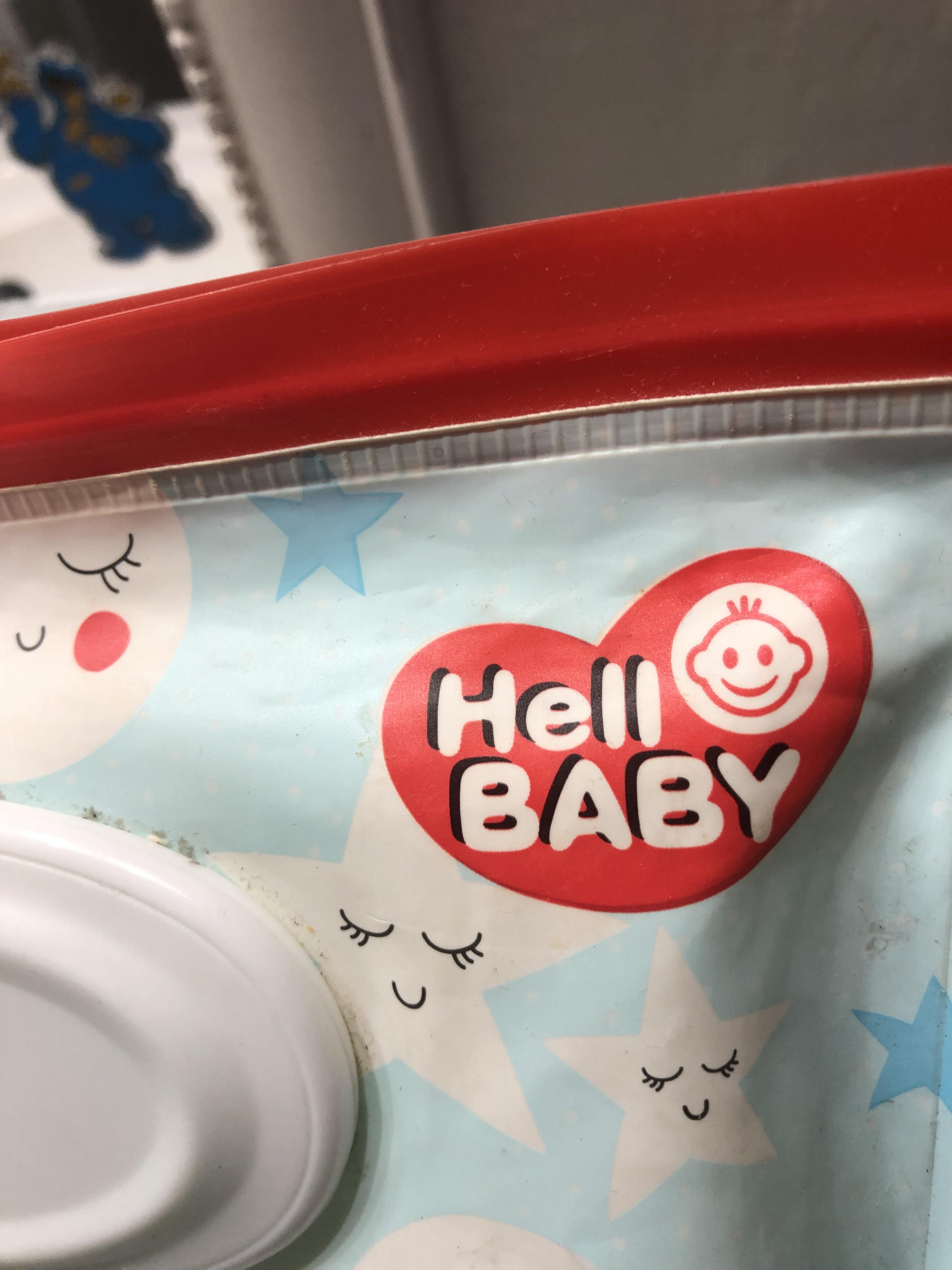 Source: Hopeful_Relative_494
#16. This anatomically correct mural
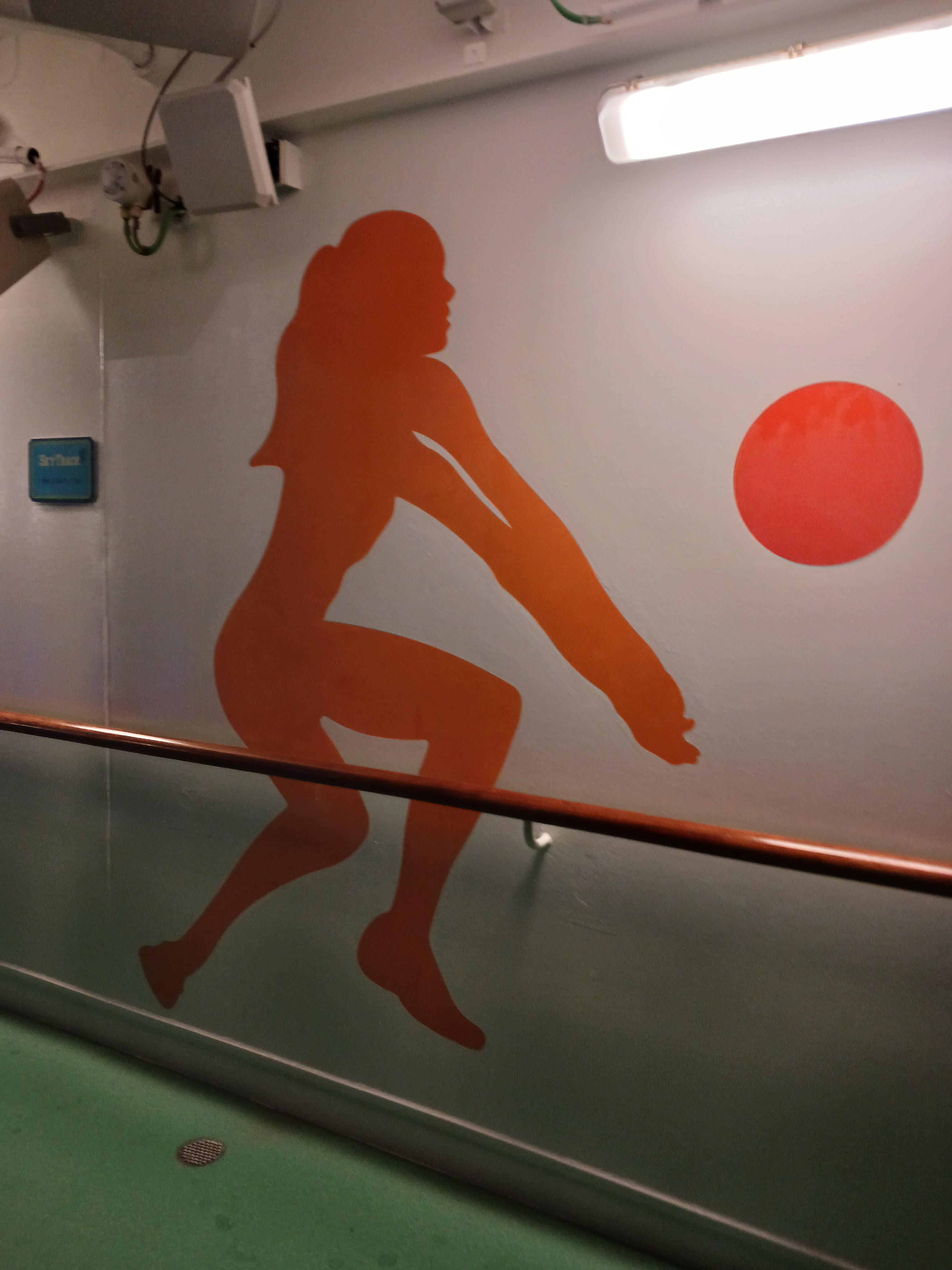 Source: Go_Crazyyy
#17. This shopping bag looks like greasy fast food takeout
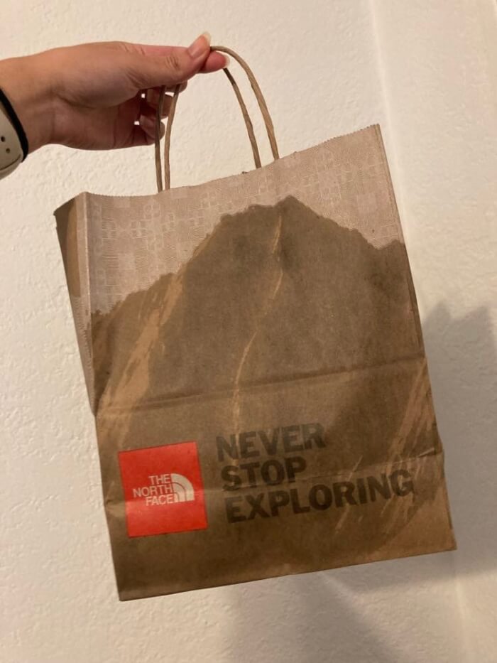 Source: afternoonview
#18. Should PROBABLY put a little more emphasis on the apostrophe
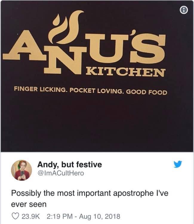 Source: TankRizzo
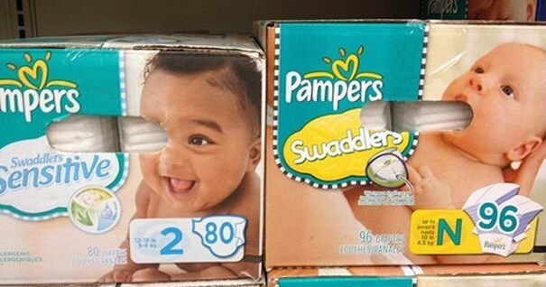
#19. Hood on vs. hood off
 Source: m_delacour
#20. "I appreciate how they felt the need to add the intended interpretation in the lower left"
 Source: chica420
#21. Kix cereal box has a masked out spoon to give the illusion there’s cereal on top
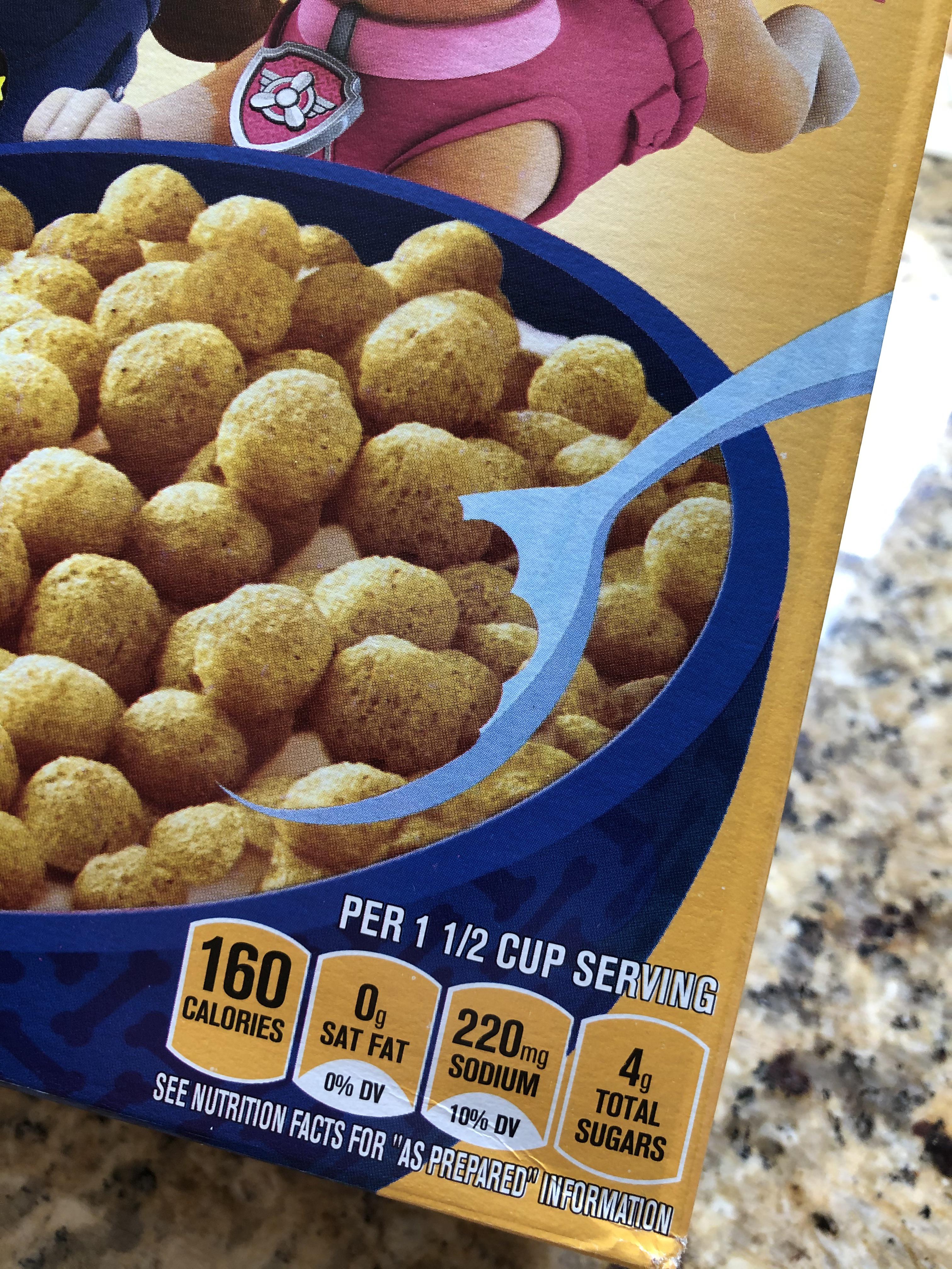 Source: beerguy_etcetera
#22. "I saw this on a box. I don't know how to lift it like the picture said"
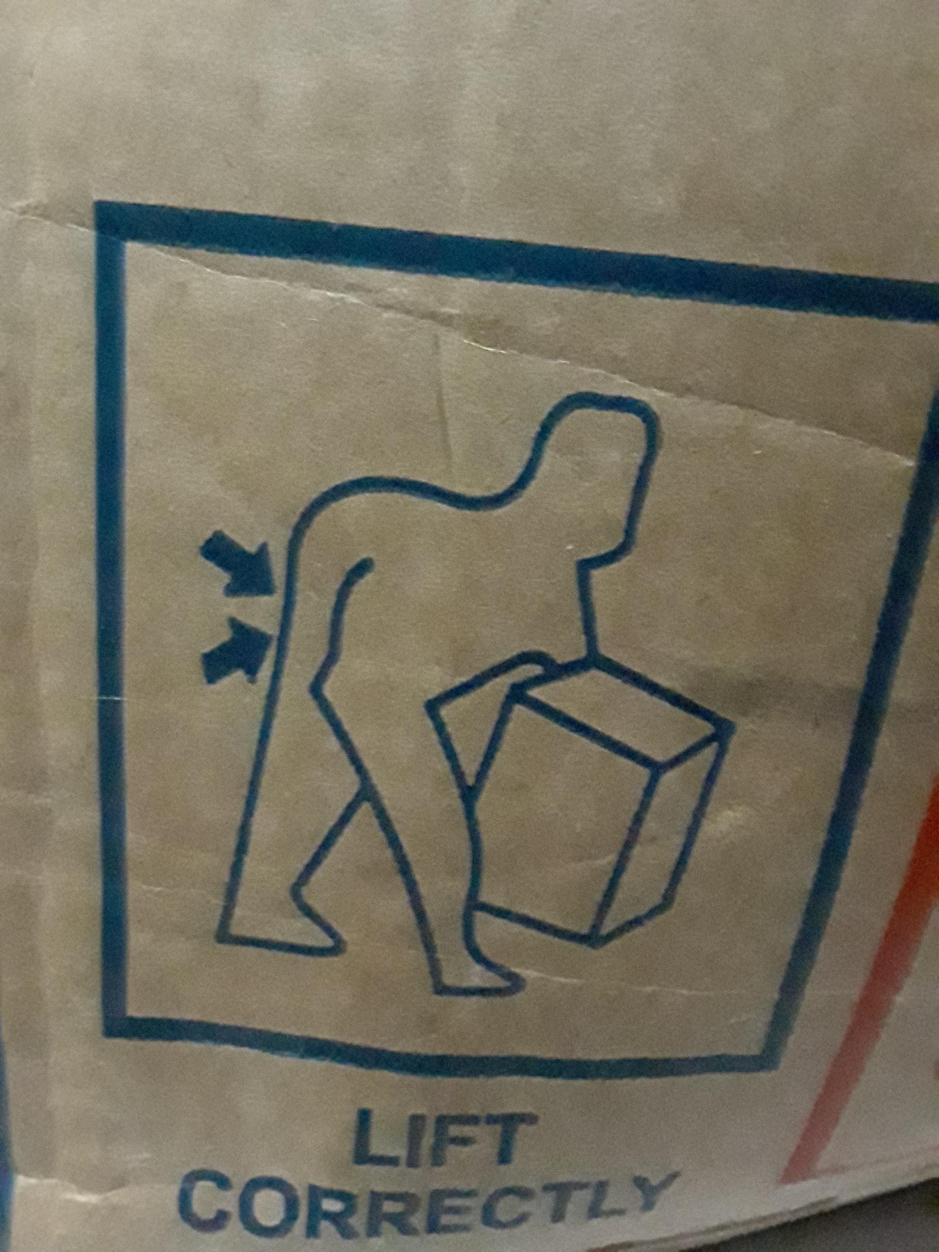 Source: HelloImWeirdo
#23. If you’re going to use the dumbbell as an “I” then you don’t need another “I”
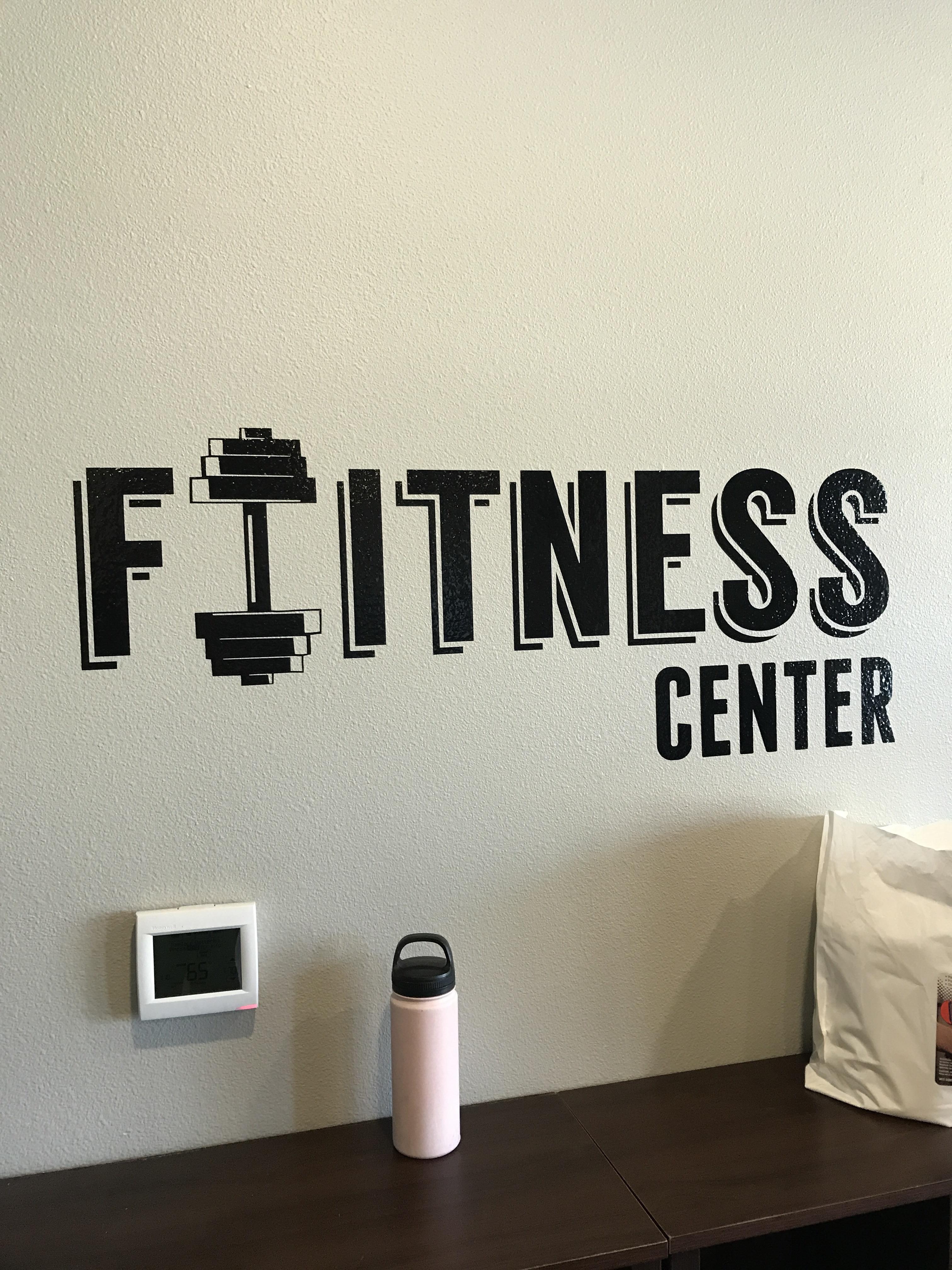 Source: HelloImWeirdo
#24. "This doormat belonging to a couple living in my building"
 Source: maxington26
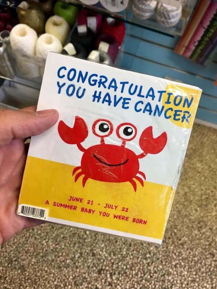
#25. What?
 Source: TakeOnlyFootprints
#26. "I thought the peep was farting. My wife corrected me - it’s cotton candy"
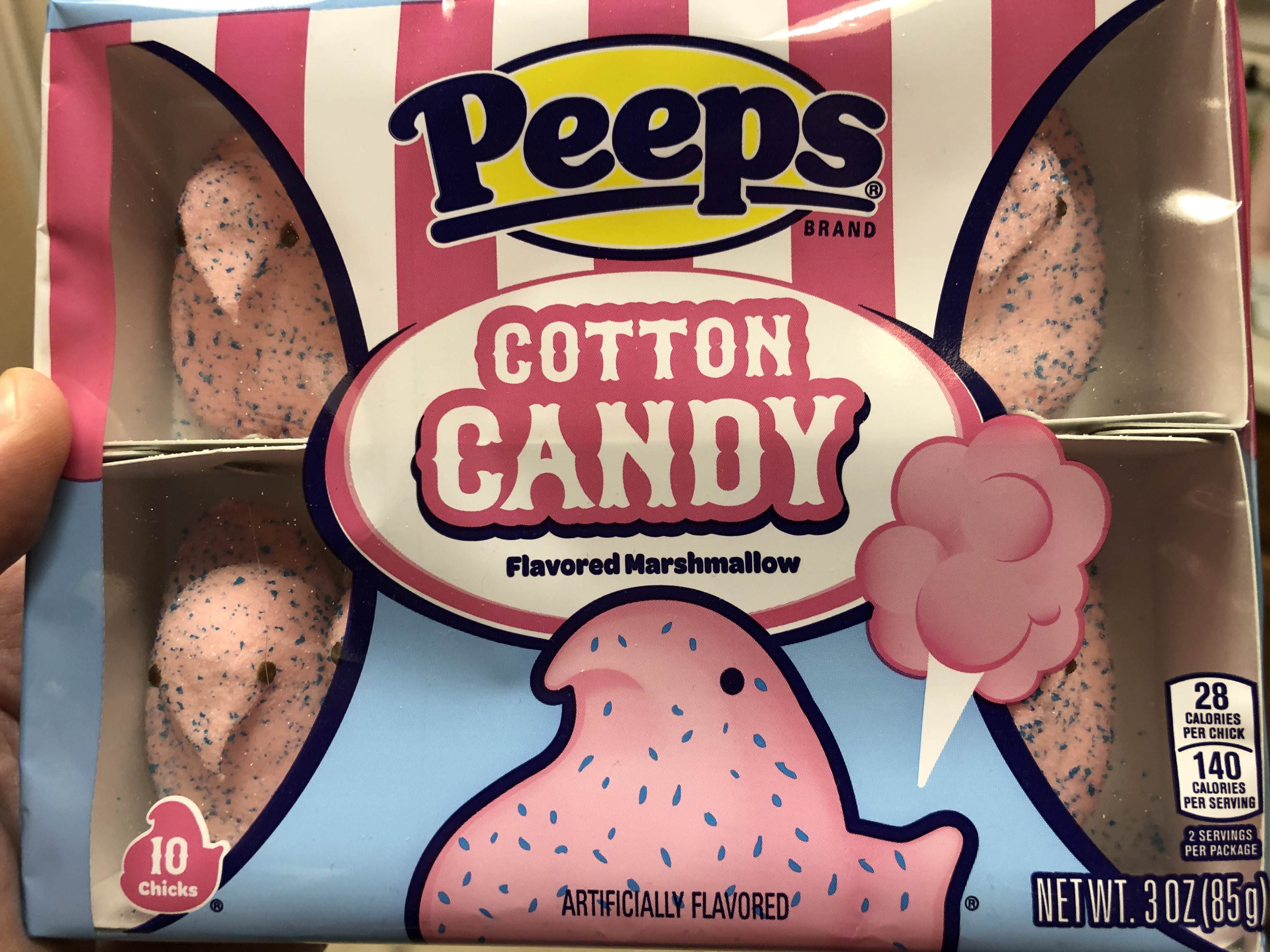 Source: mmcalli
#27. Don't think that could be any worse
 Source: yoziphek
#28. Worst doctor ever
 Source: CosmoInColour