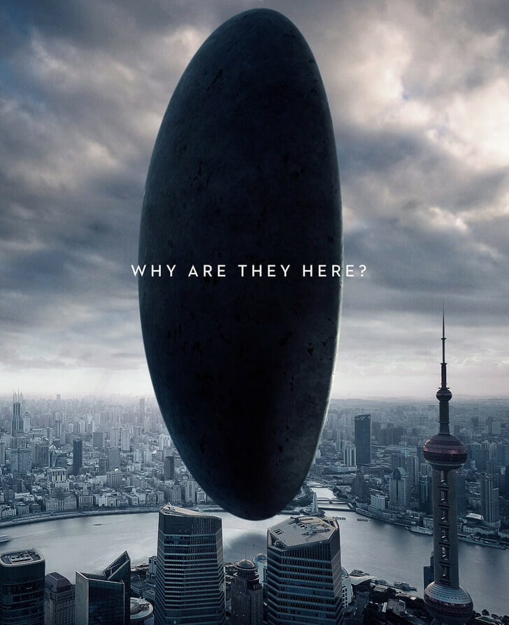
As the audience’s first visual impression to bring attention to the upcoming feature, posters are essential for any movie. As the promotional images for any movie's materials, a lot of work goes into making their posters visually appealing yet impressive to the audience.
A poster describes the movie in one image in order. Without a poster, studios must rely exclusively on words, which can quickly become dull and forgettable.
As promotional materials, these posters are going on the Internet, in theaters, and even on massive billboards. For millions to see. That’s why graphic designers often go the extra mile to make these posters look as flawless as possible.
And sometimes, they go very extra.
… which results in some very facepalming movie posters.
In cinema’s history, there are many movie posters that have become humorous classics, solely due to how badly they were Photoshopped. So let’s take a look at these 10 infamous movie posters and see just how they hilariously fail.
#1 Spider-Man 2 (2004)
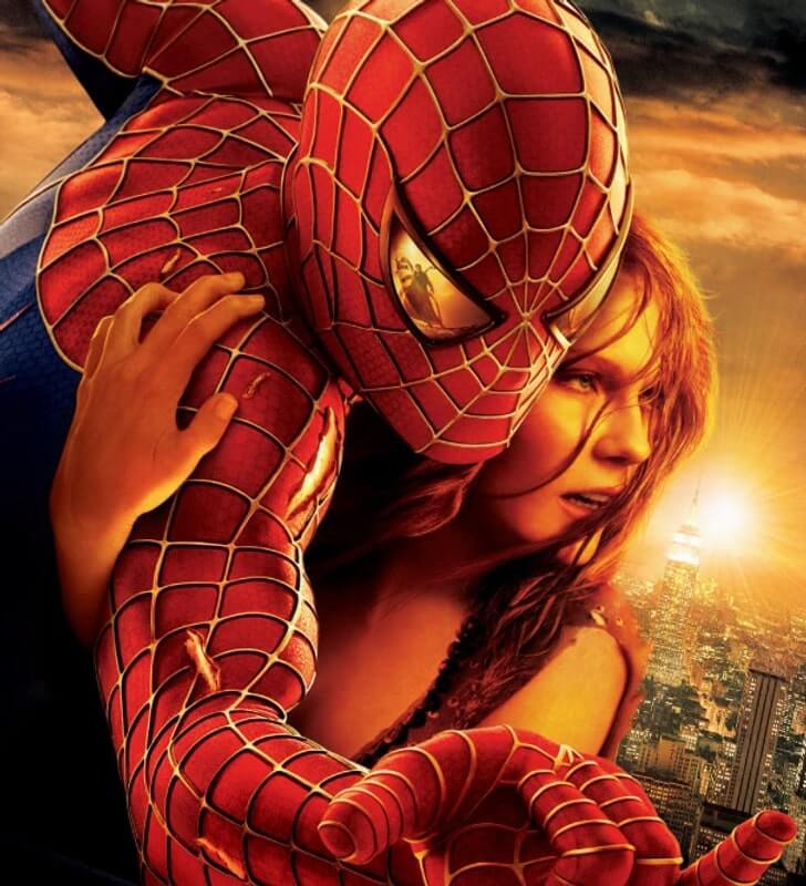 Source: © Spider-Man 2 / Columbia Pictures and co-producers
#2 Pretty Woman (1990)
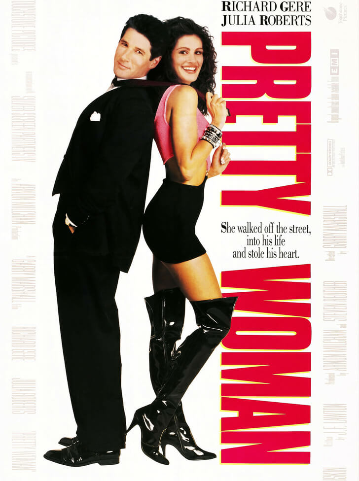 Source: TOUCHSTONE/WARNERS / Album/EAST NEWS
#3 Sex and the City 2 (2010)
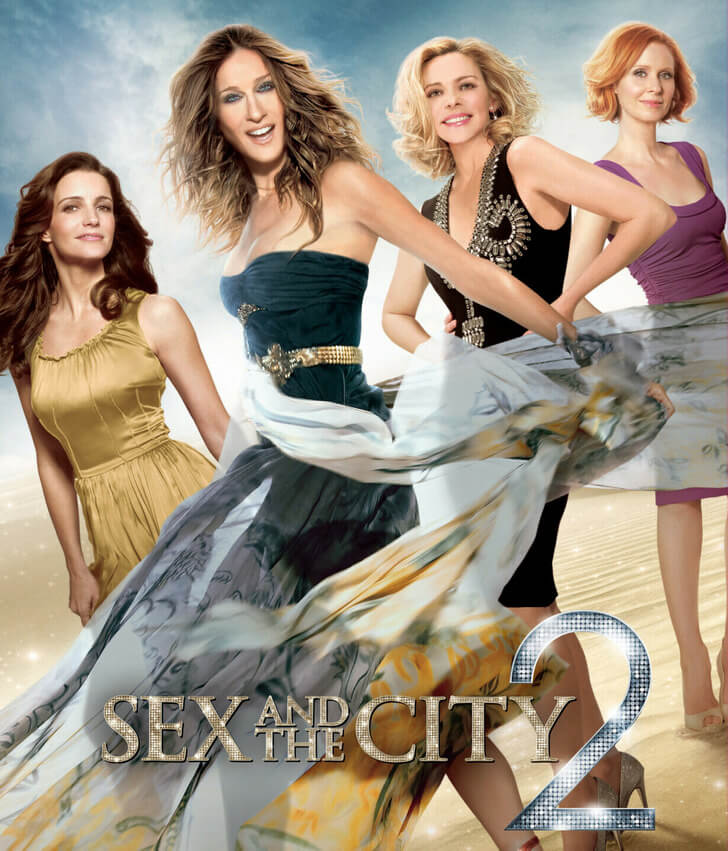 Source: EAST NEWS
#4 Titanic (2023)
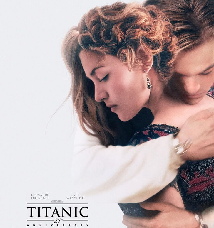 Source: © paramountpics / Instagram
#5 Blonde and Blonder (2008)
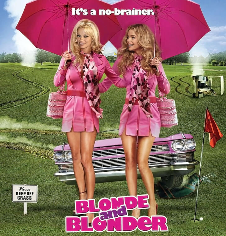 Source: Courtesy Everett Collection / East News
#6 The Bounty Hunter (2010)
 Source: East News
#7 The Legend of Tarzan (2016)
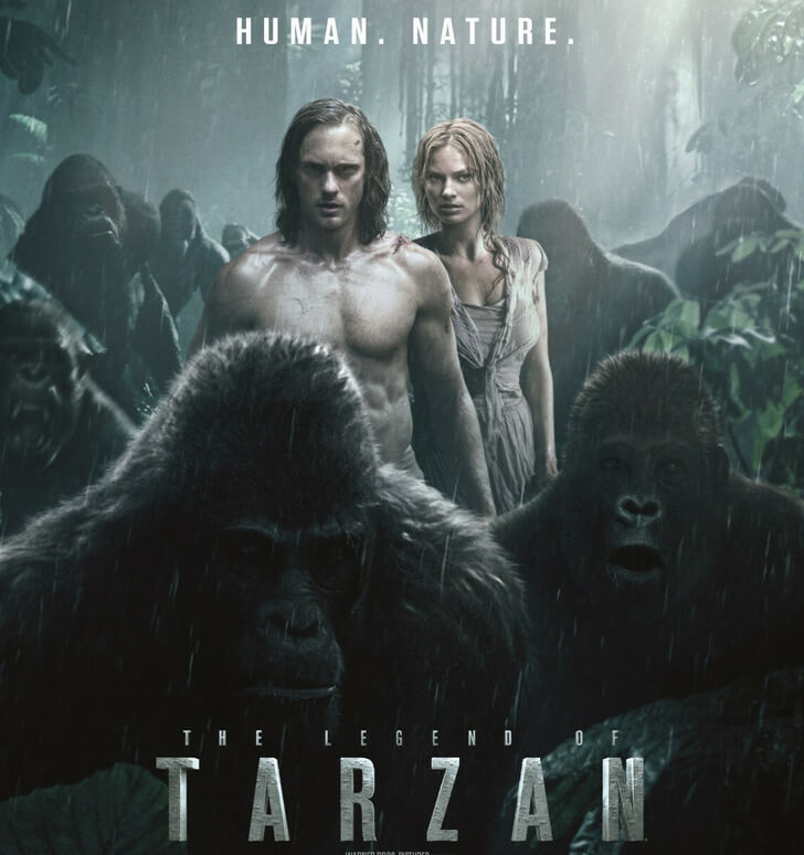 Source: Warner Bros/Courtesy Everett Collection / East News
#8 The Whole Ten Yards (2004)
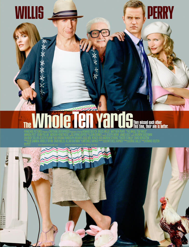 Source: Warner Bros/Courtesy Everett Collection / East News
#9 Heavy Petting (2007)
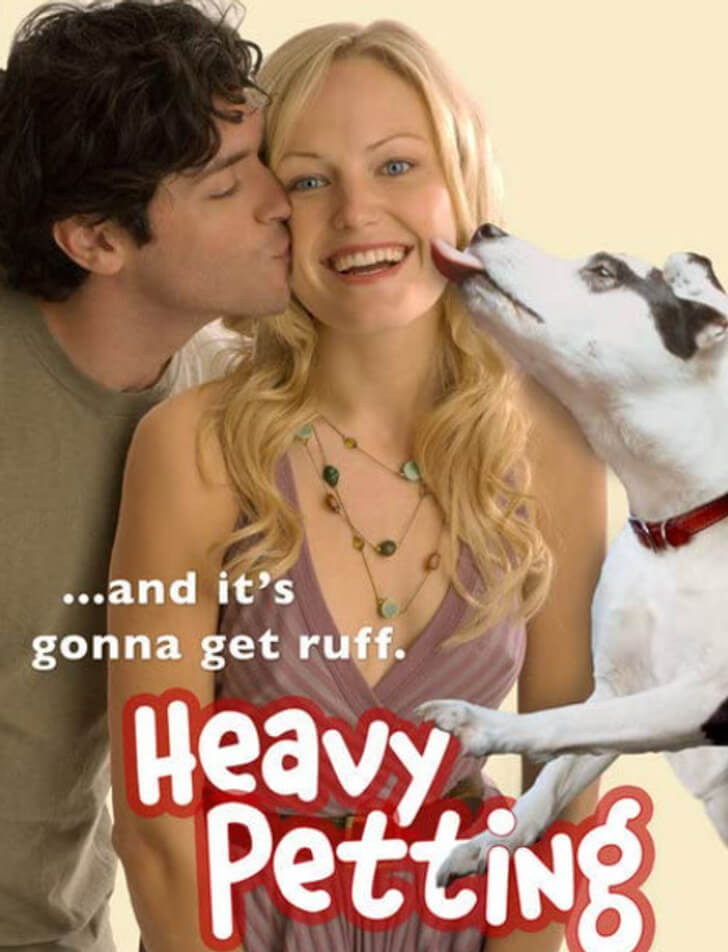 Source: © Heavy Petting / SarcoFilms and co-producer
