This Graphic Designer Redesigned The 9 Worst Logos Ever, And The Final Results Are Awesome
According to marketers, a well-designed brand logo is very important. The reason is simple. An appealing logo tells people the name of the company and it creates a visual symbol that represents your business. Some logos have strong symbolic connections to people's memory. And we have to admit that the 9 brand logos below have attracted a lot of attention from people—not because they are particularly beautiful, but rather because of their weirdness.
Emanuele Abrate, an Italian graphic designer, has thus come up with an interesting project in which he has recreated those nine worst logos. Emanuele has made an effort to replicate these trademarks as though he had ordered them. He shared, "I selected 9 of the worst logos ever and redesigned them, trying to put myself in the context as if they were really commissioned to me." He has employed various typographic techniques, designed aesthetic logomarks, and attempted to maintain the brand's original color palette.
Scroll down to check out his work. And don't forget to share with us which logo you think is the most successful redesign.
#1. The Computer Doctors
 Source: abrate_emanuele
#2. Mama's Baking
 Source: abrate_emanuele
#3. Kudawara Pharmacy
 Source: abrate_emanuele
#4. Institute of Oriental Studies - Santa Catarina University
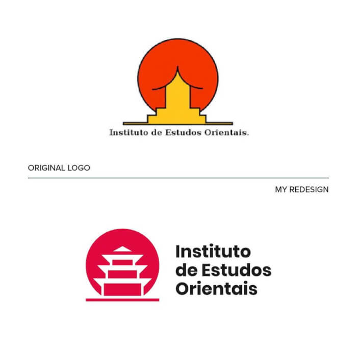 Source: abrate_emanuele
#5. Office Of Government Commerce
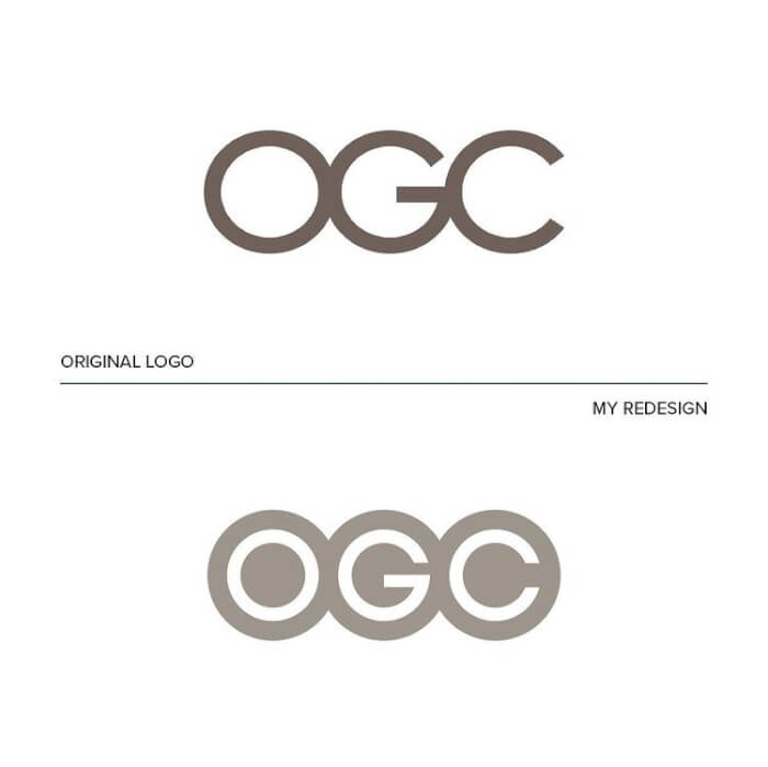 Source: abrate_emanuele
#6. Clinica Dental
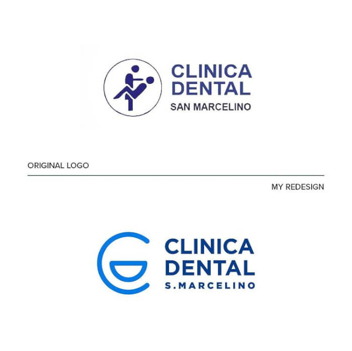 Source: abrate_emanuele
#7. Fire Preventation Products
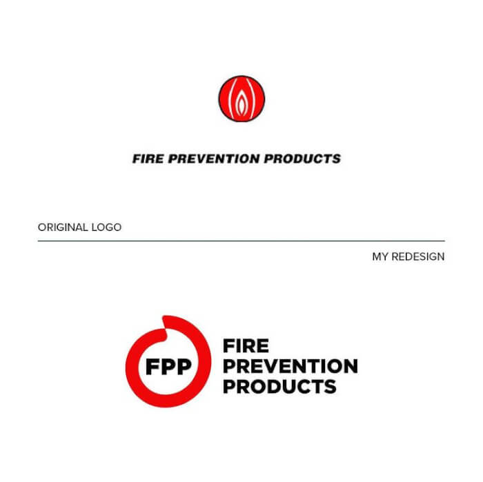 Source: abrate_emanuele
#8. Safe Place
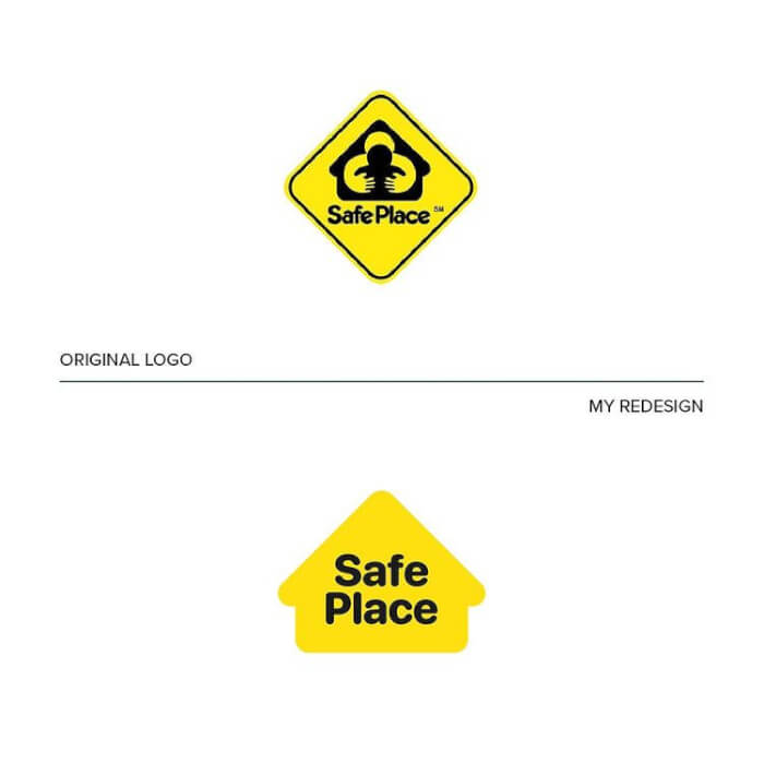 Source: abrate_emanuele
#9. Arlington Pediatric Center
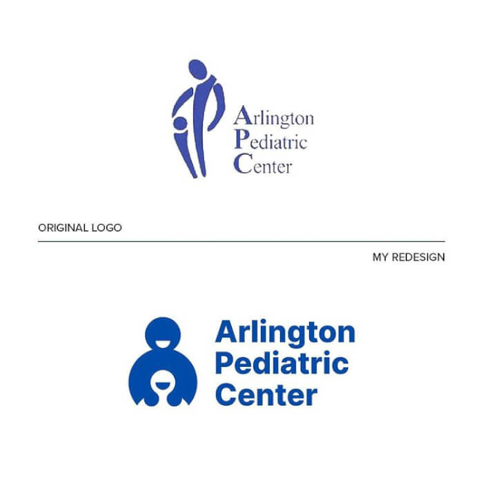 Source: abrate_emanuele
 Source: abrate_emanuele
Share this article
Advertisement