28 Graphic Design Fails That Will Take You One Day To Heal From Seeing Them
Sometimes when we go out in public places, we may spot signboards and posters that will leave us with lots of questions in mind. They either have a stupid look or the craziest idea that no one can ever digest. Those graphic design fails look like a 5-year-old made them or someone was drunk while working on them. Of course, you're not necessarily a professional and experienced graphic designer to shame whoever came up with such terrible ideas for their work because, to be honest, it’s fun to do so. That’s why a special corner on Reddit known as r/CrappyDesign was born with the sole purpose is to roast awful designs that should go straight to hell.
Here we’ve compiled a list of 28 graphic design fails shared by members of this online community. Check them out!
Here we’ve compiled a list of 28 graphic design fails shared by members of this online community. Check them out!
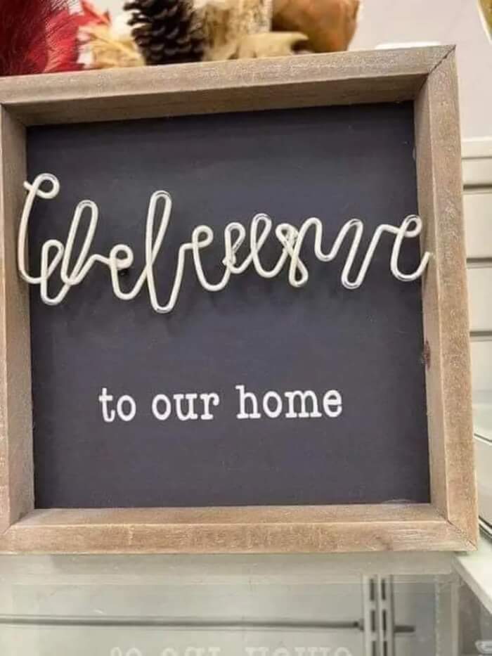
#1. Wbeleusuve to our home
 Source: Singer-Such
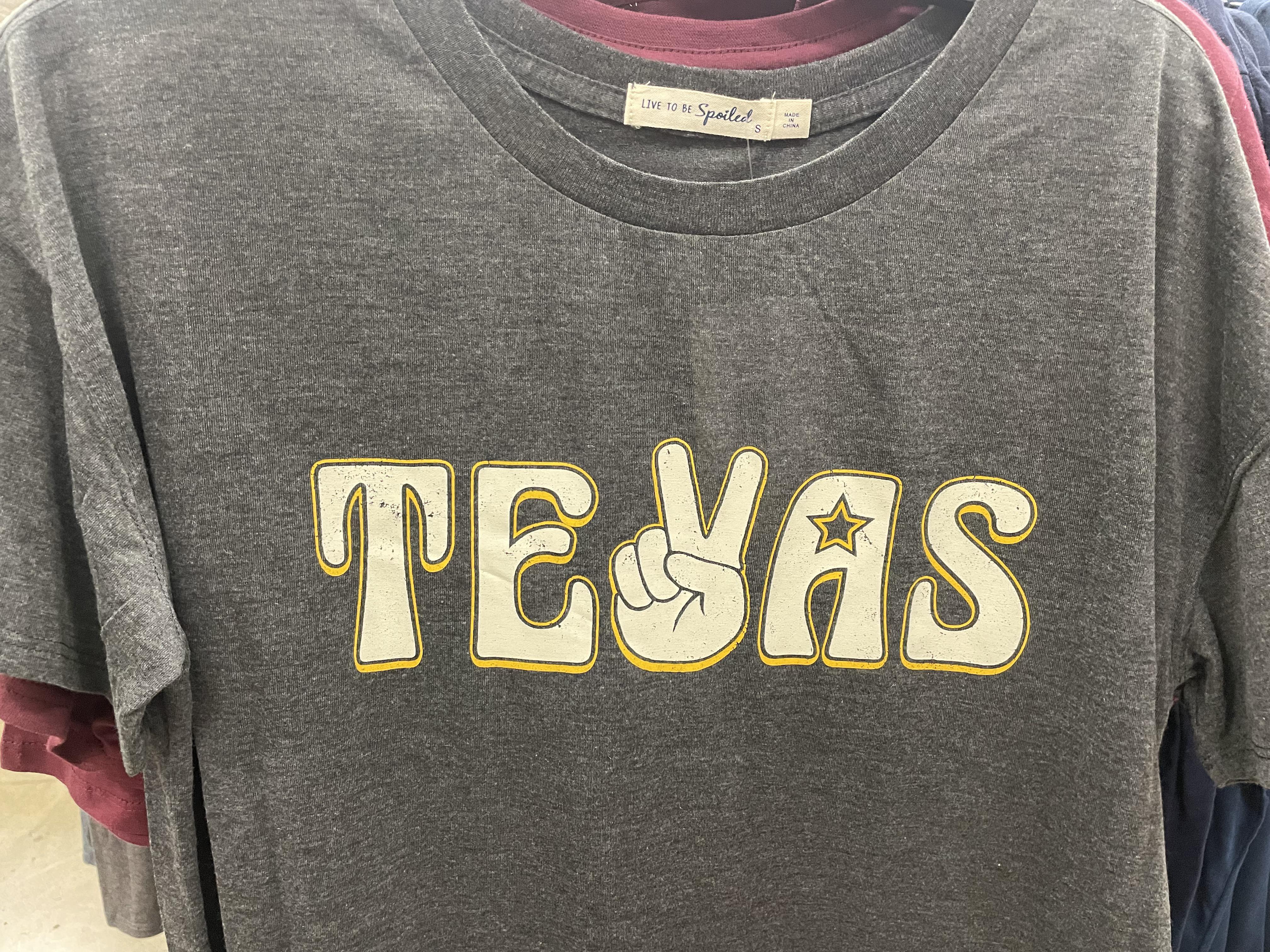
#2. "Mmm yes, I sure do love living in Tevas"
 Source: TheAverageYBAJoe
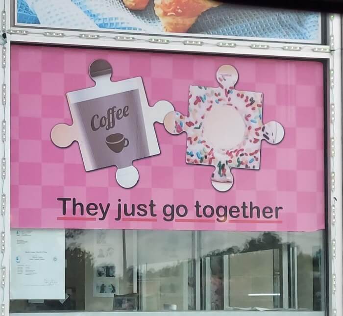
#3. They just DON'T go together
 Source: terbiun
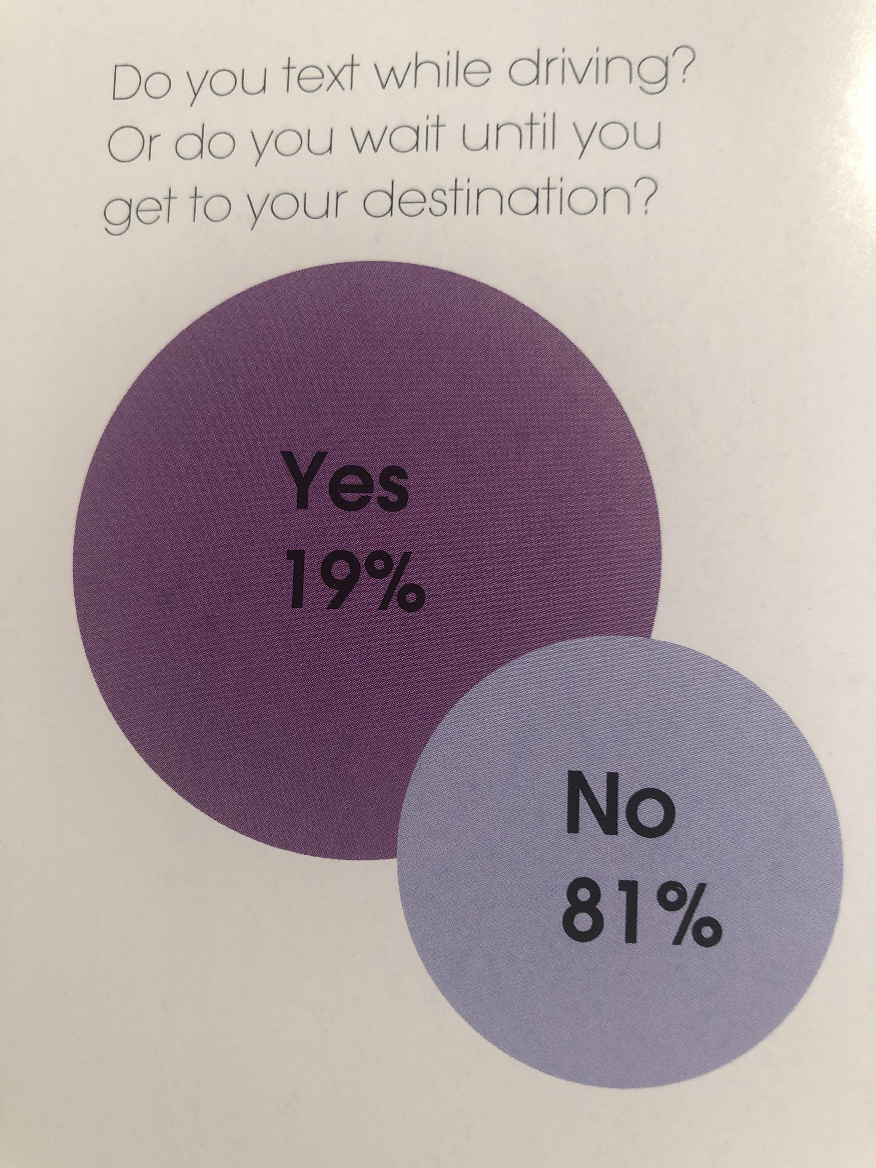
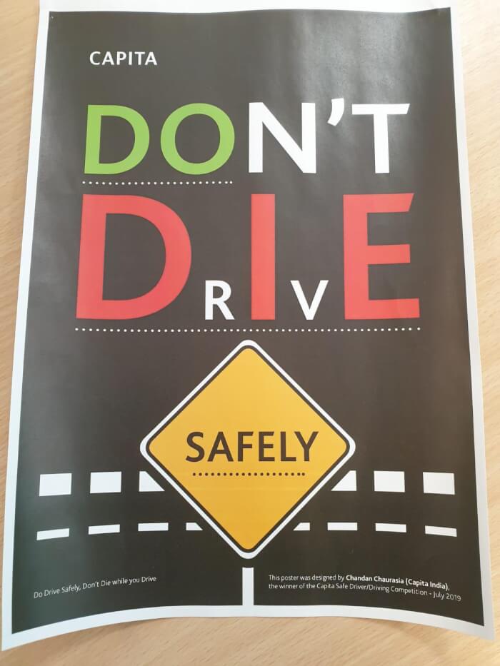
#4. A very easy-to-read graph about texting while driving
 Source: Buddhacream
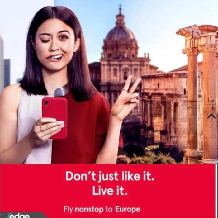
#5. Fly to Europe and have a stroke
 Source: DucksToo22
#6. A life-changing experience
 Source: froopy_doo
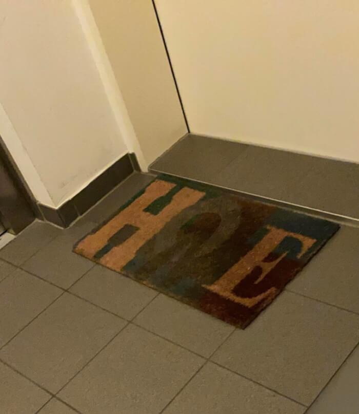
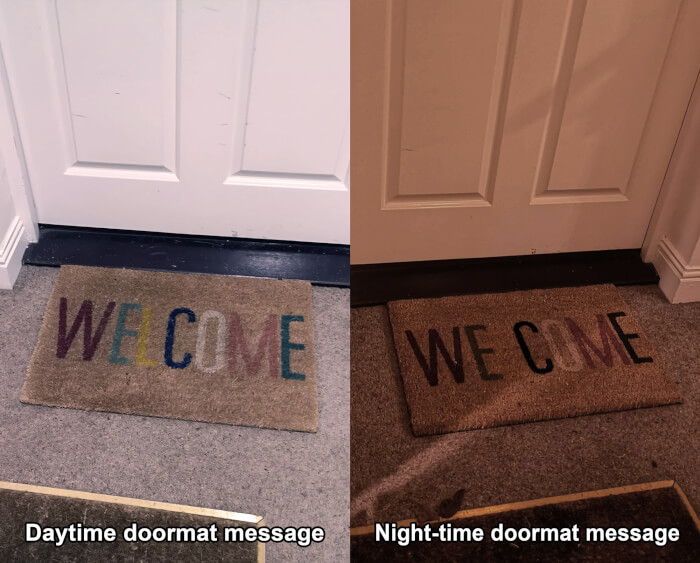
#7. Not the most welcoming door mat
 Source: Kamikapilz
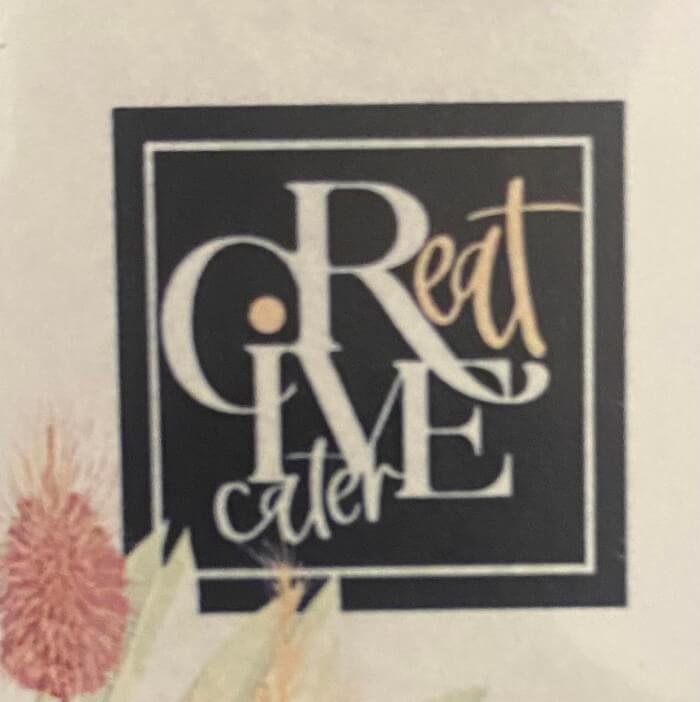
#8. CReatIVE cater
 Source: Lovely_Buns420
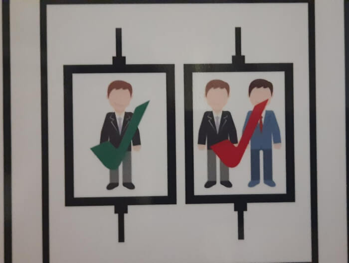
#9. 1 person is OK, 2 people is OK but in Red
 Source: Luis008_
#10. Think inside the box first
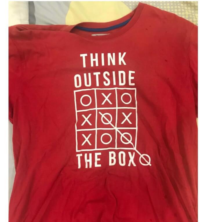 Source: SpeedDreaming
#11. If only there was a letter in flame that could resemble a flame
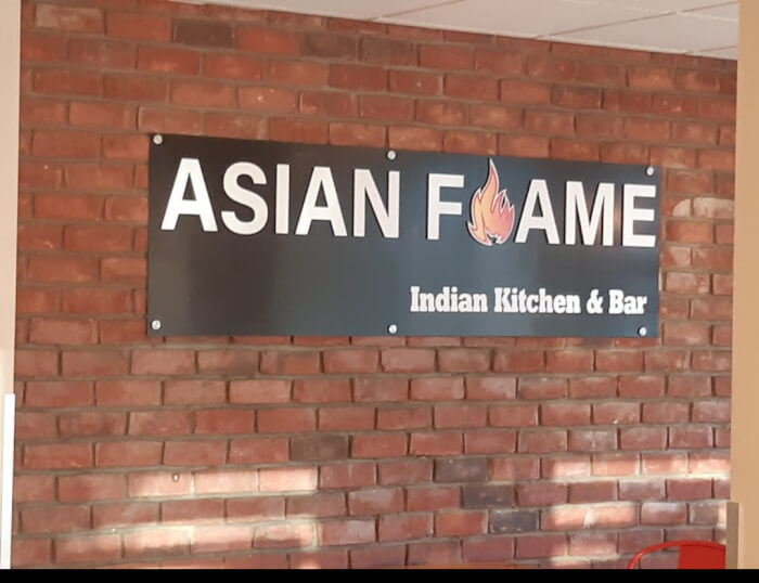 Source: dickb0tt
#12. "It's better than shut up, have a Monday I guess"
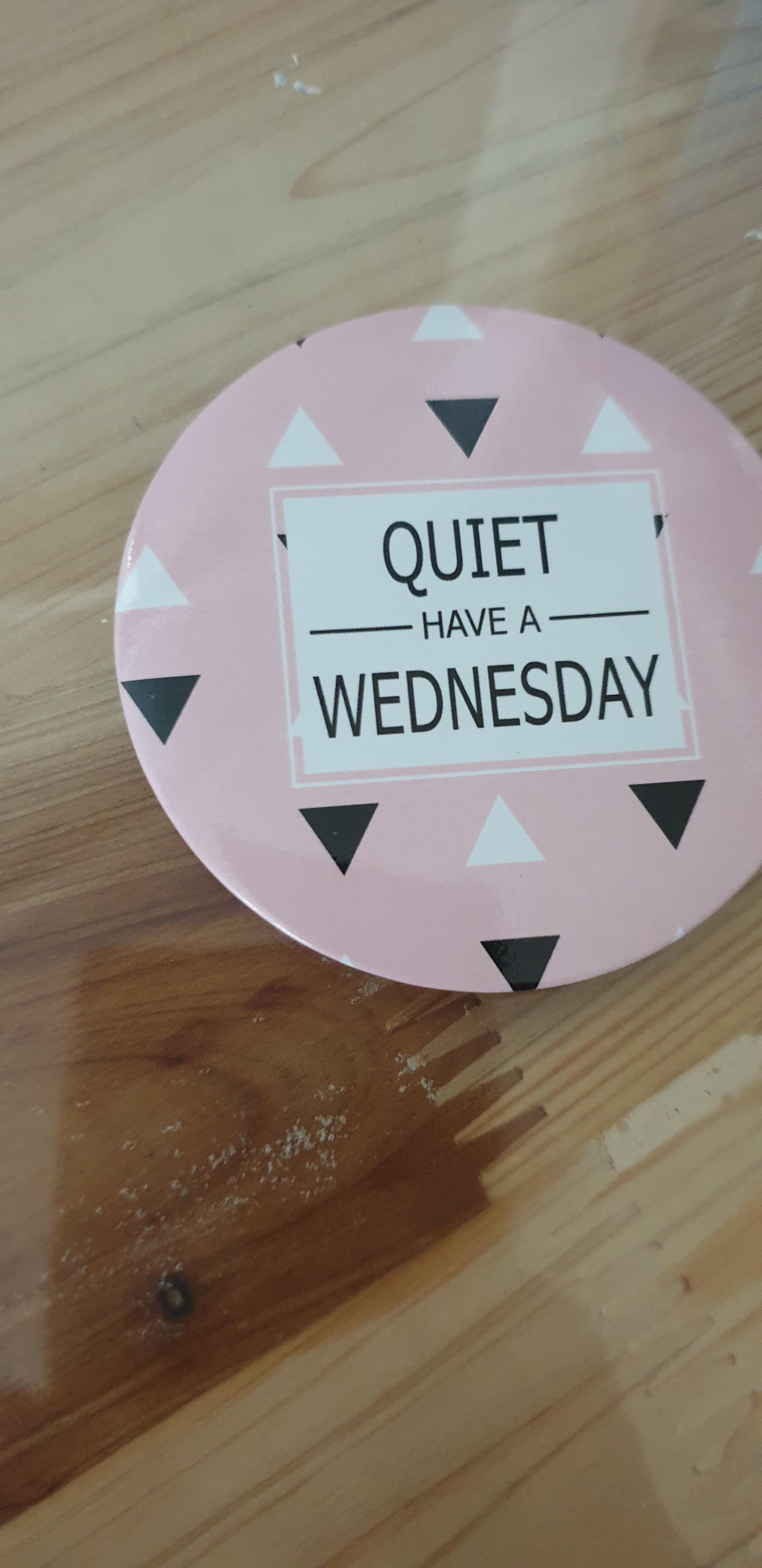 Source: _Goodrandom
#13. "Which floor am I on?"
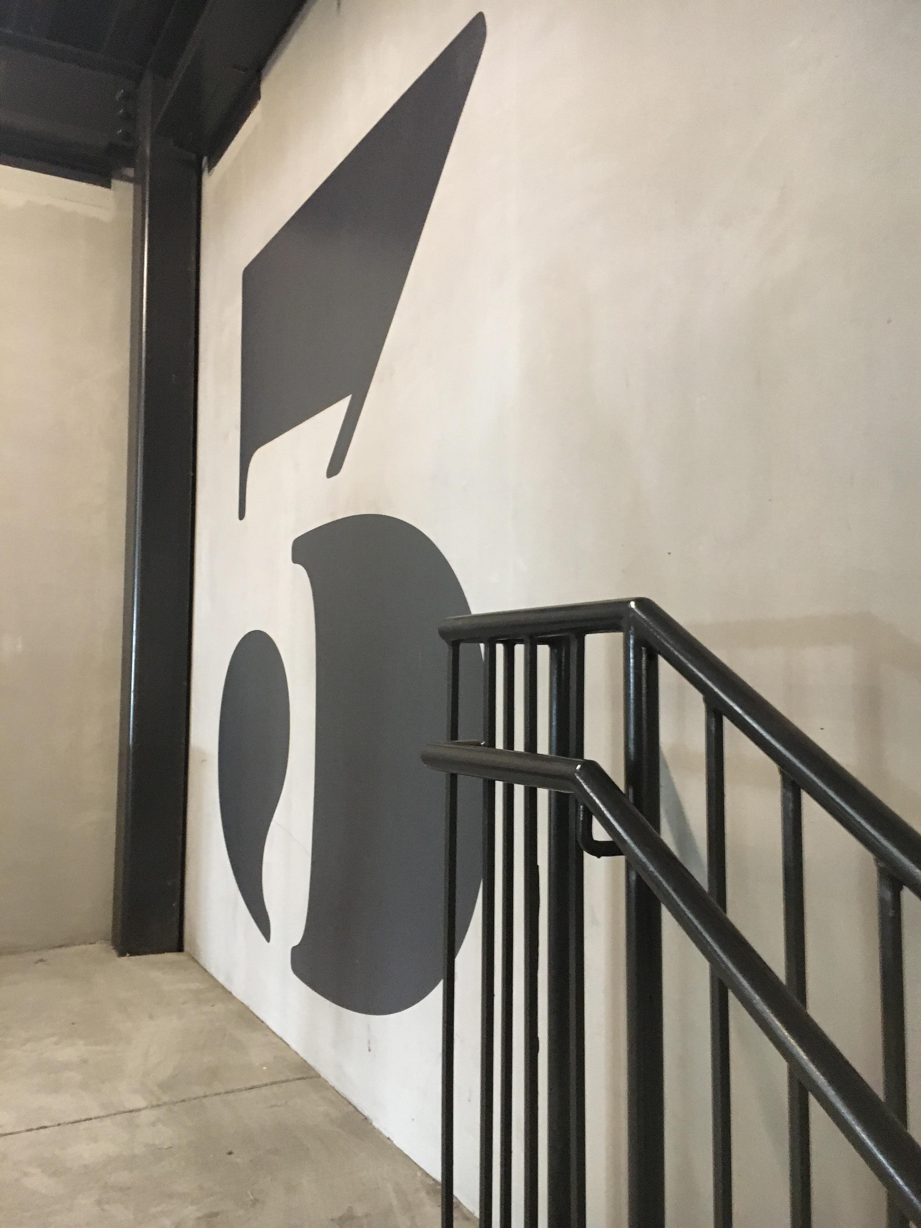 Source: SherbetIndividual128
#14. Orange is the new milk
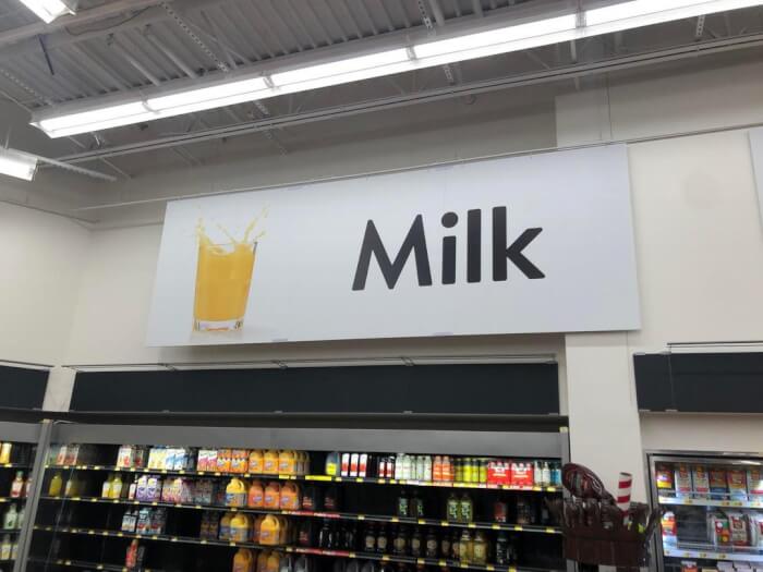 Source: Random_Average_Human
#15. That seems like an "accidentally on purpose" kind of thing, designed to appeal to all those new parents only getting 3 hours of sleep every night
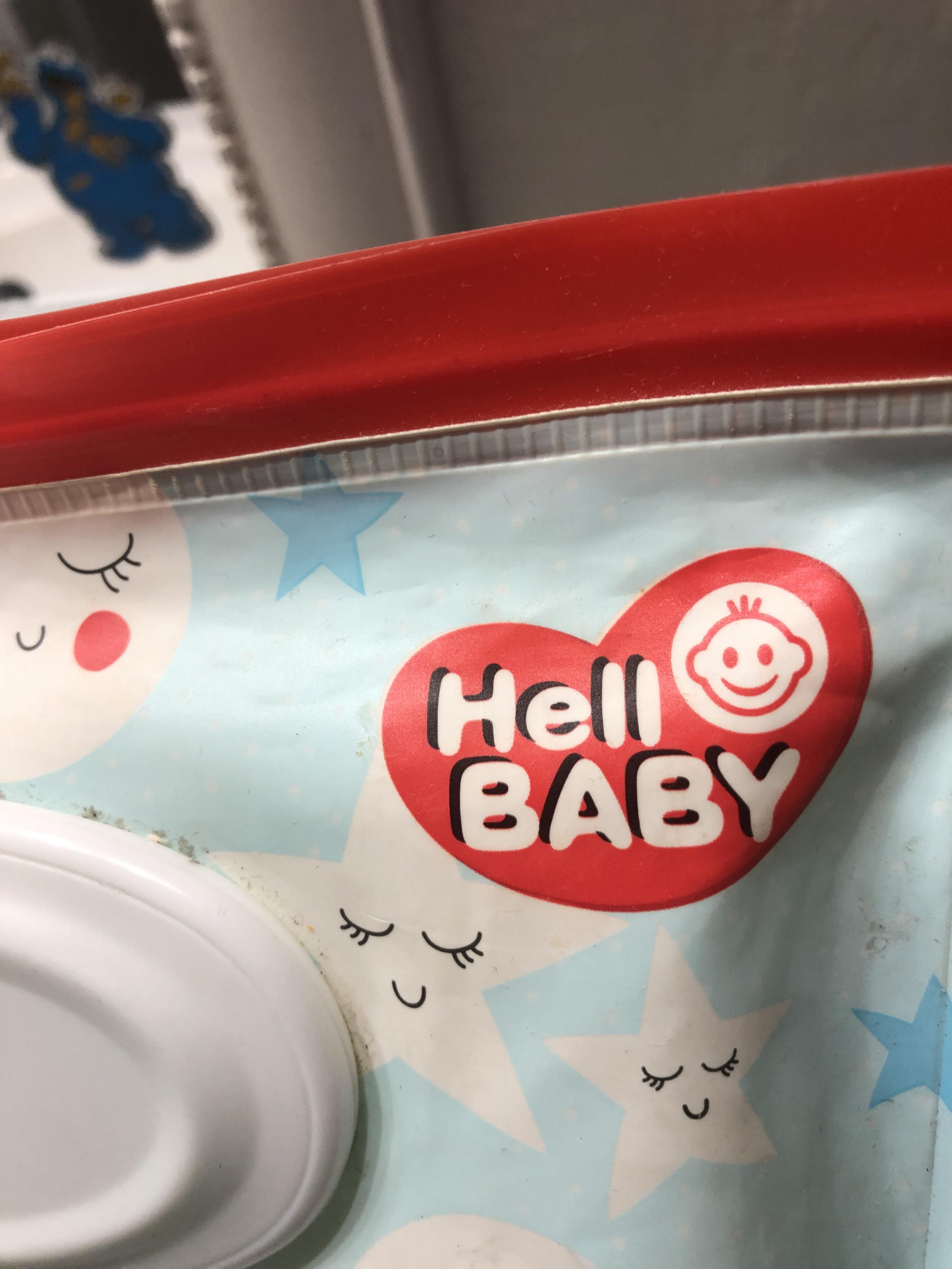 Source: Hopeful_Relative_494
#16. This anatomically correct mural
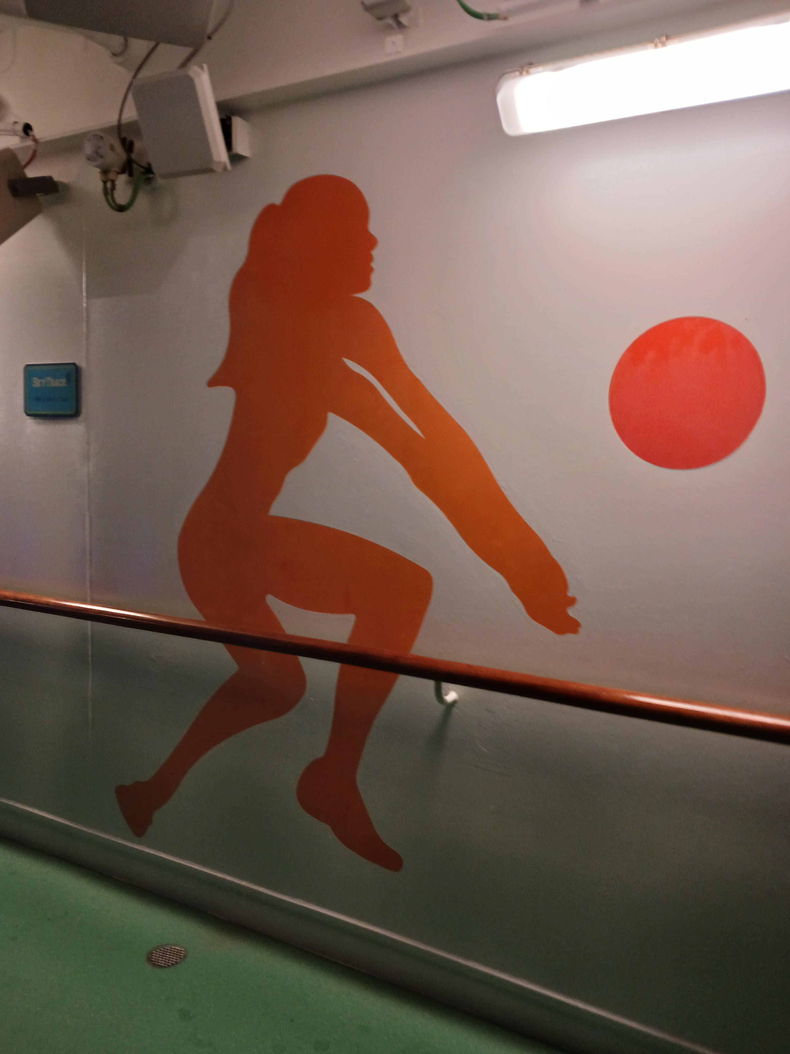 Source: Go_Crazyyy
#17. This shopping bag looks like greasy fast food takeout
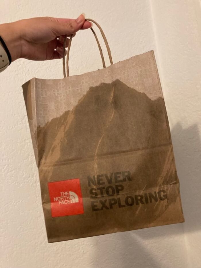 Source: afternoonview
#18. Should PROBABLY put a little more emphasis on the apostrophe
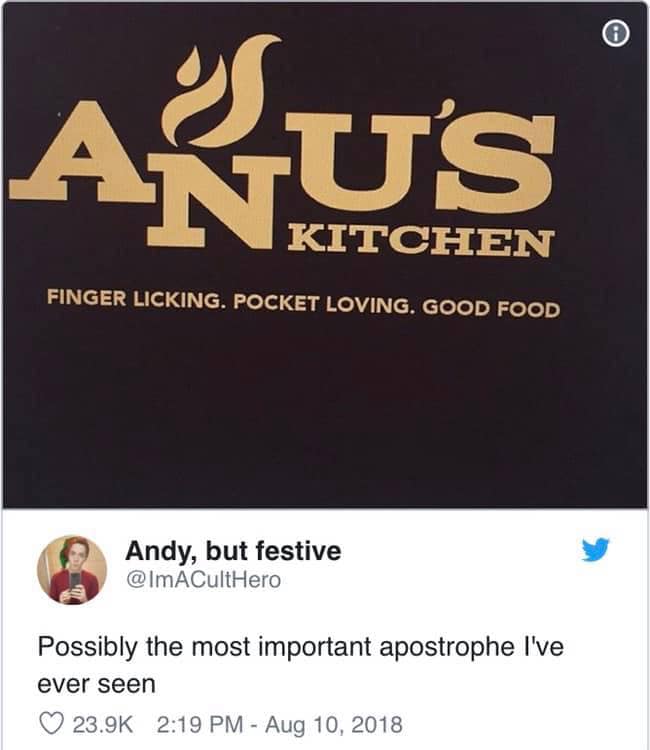 Source: TankRizzo
#19. Hood on vs. hood off
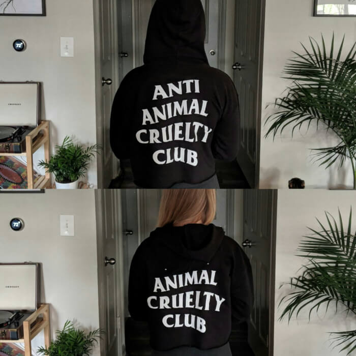 Source: m_delacour
#20. "I appreciate how they felt the need to add the intended interpretation in the lower left"
 Source: chica420
#21. Kix cereal box has a masked out spoon to give the illusion there’s cereal on top
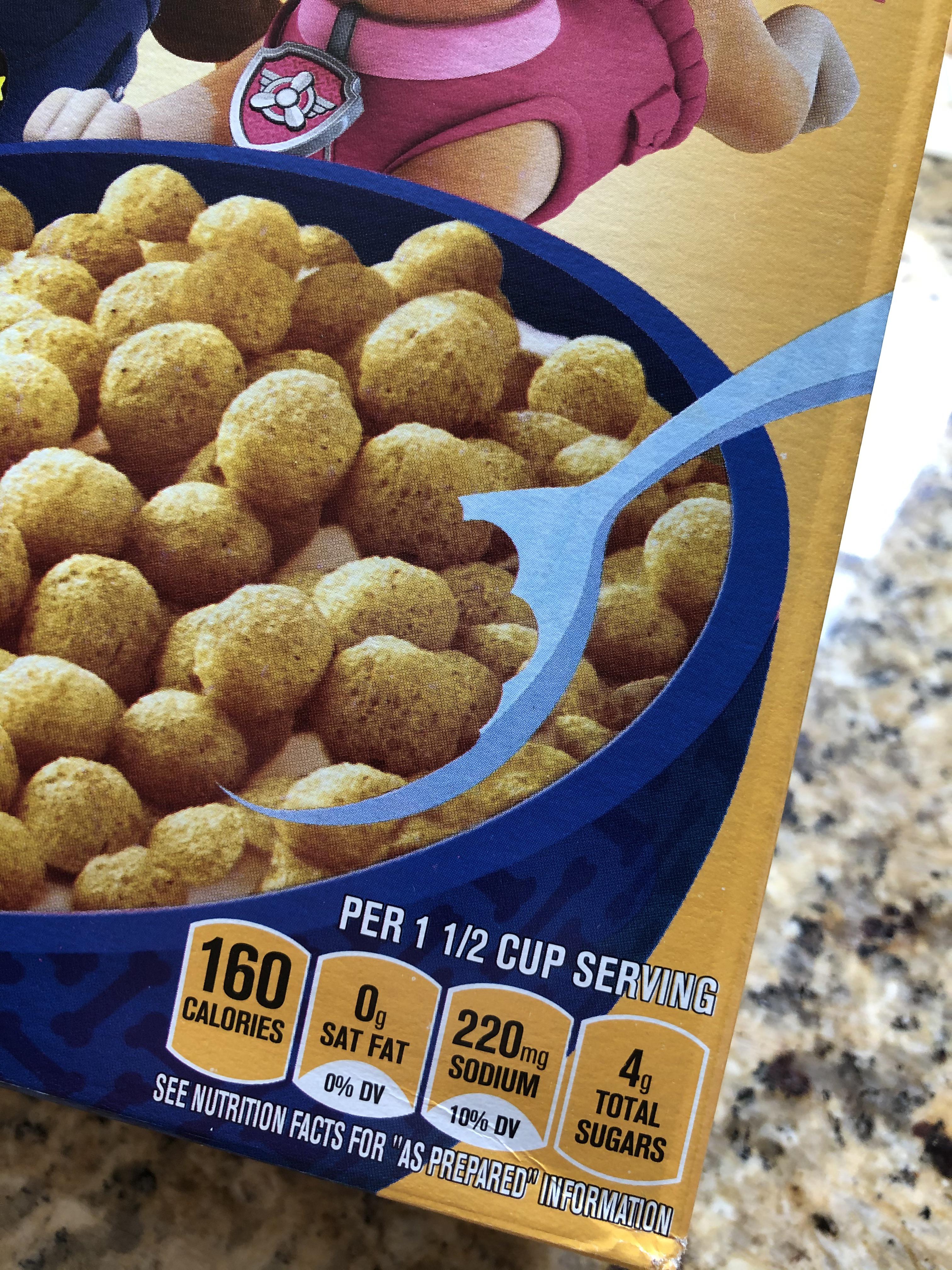 Source: beerguy_etcetera
#22. "I saw this on a box. I don't know how to lift it like the picture said"
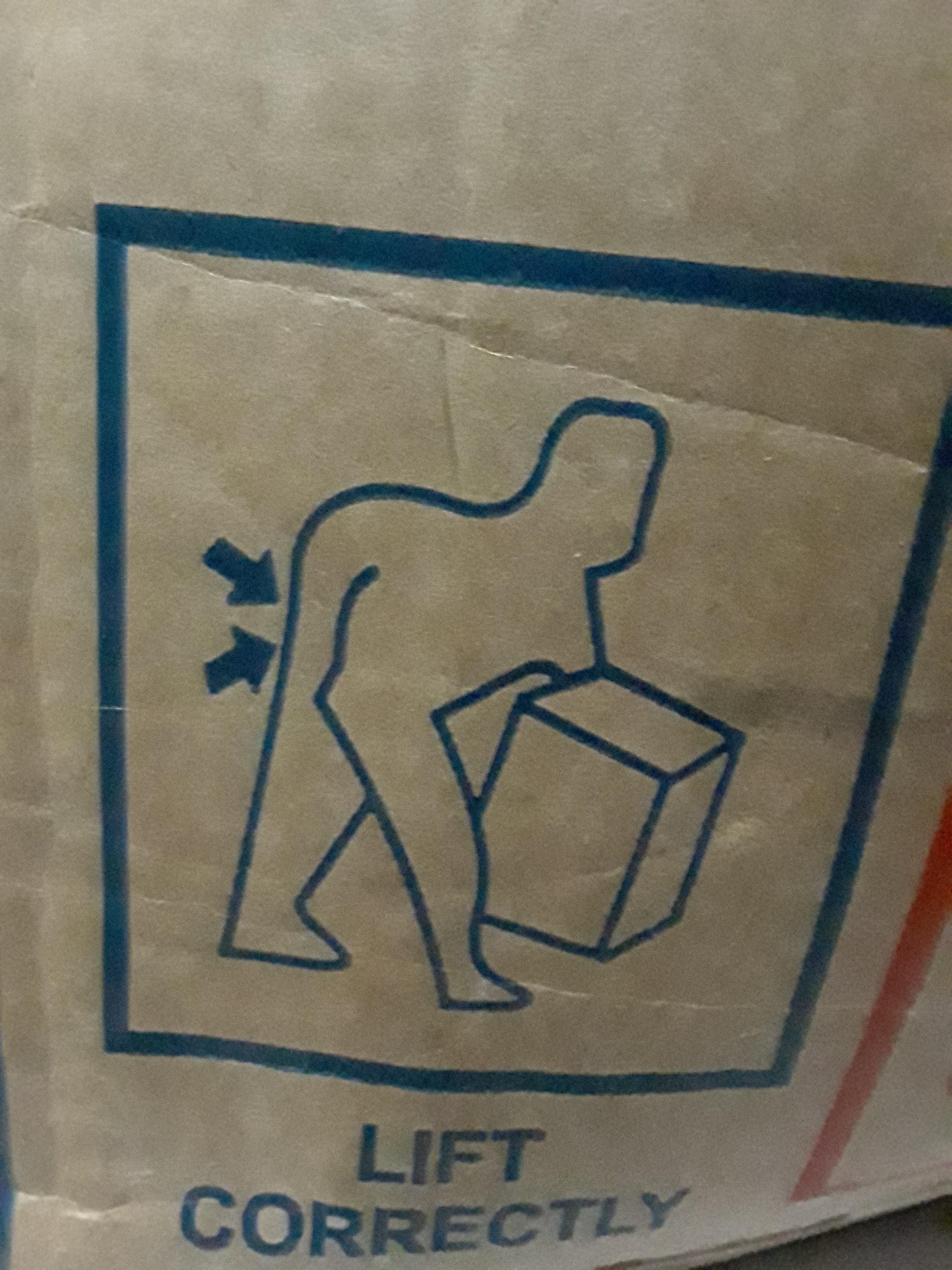 Source: HelloImWeirdo
#23. If you’re going to use the dumbbell as an “I” then you don’t need another “I”
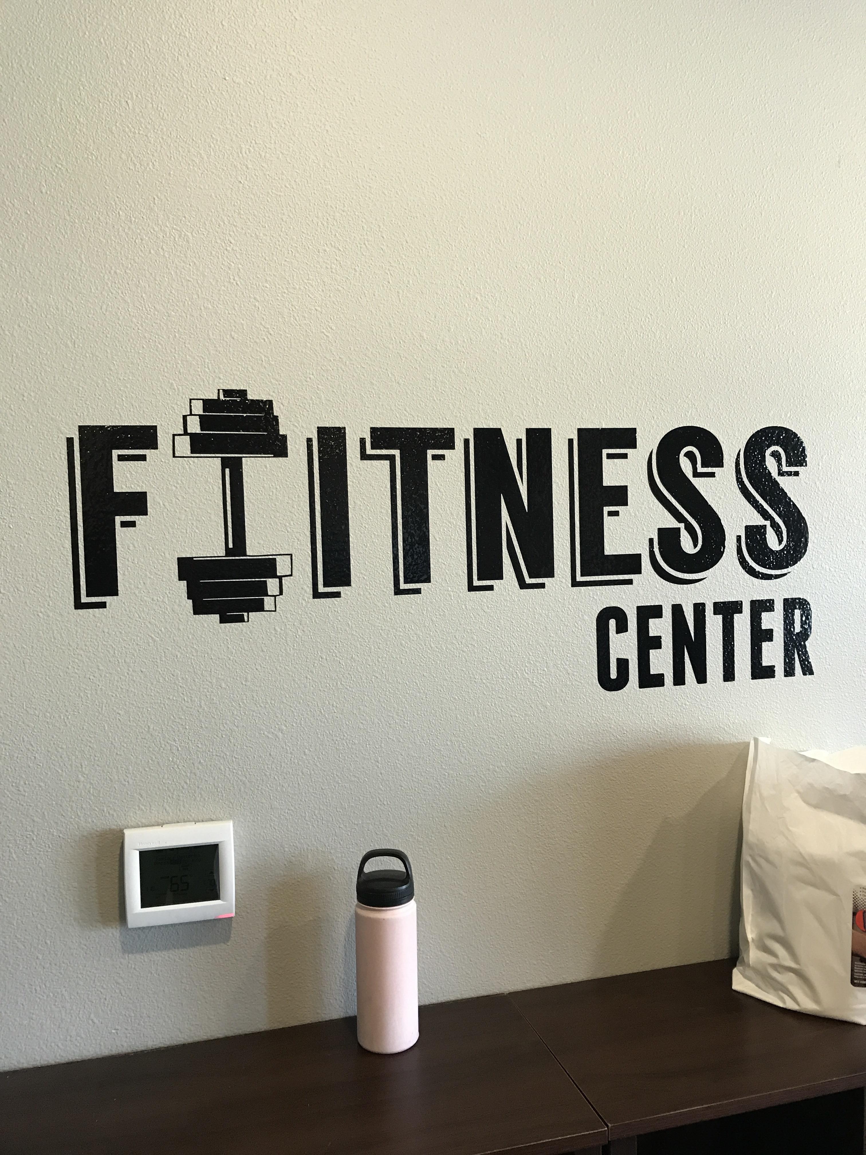 Source: HelloImWeirdo
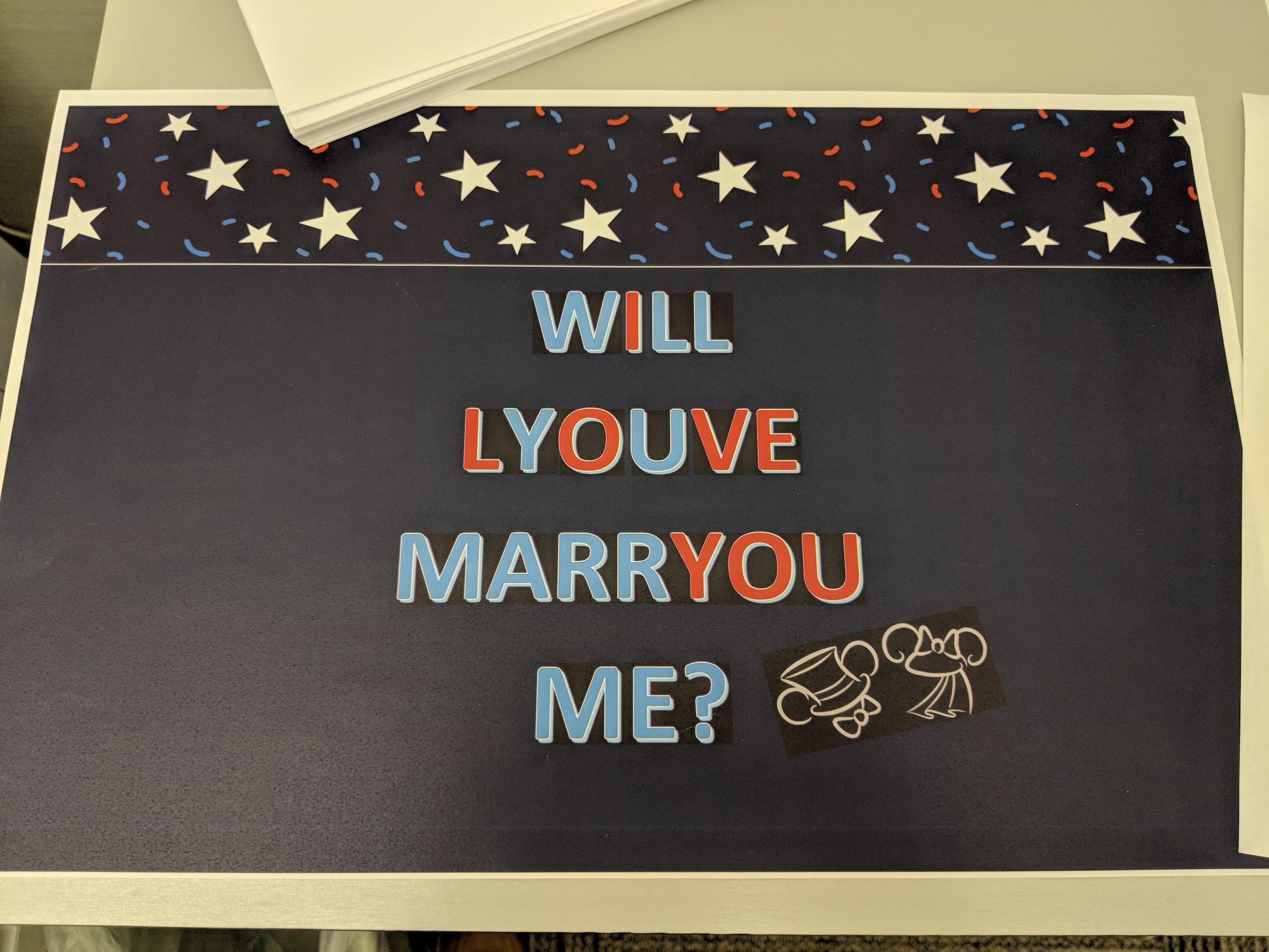
#24. "This doormat belonging to a couple living in my building"
 Source: maxington26
#25. What?
 Source: TakeOnlyFootprints
#26. "I thought the peep was farting. My wife corrected me - it’s cotton candy"
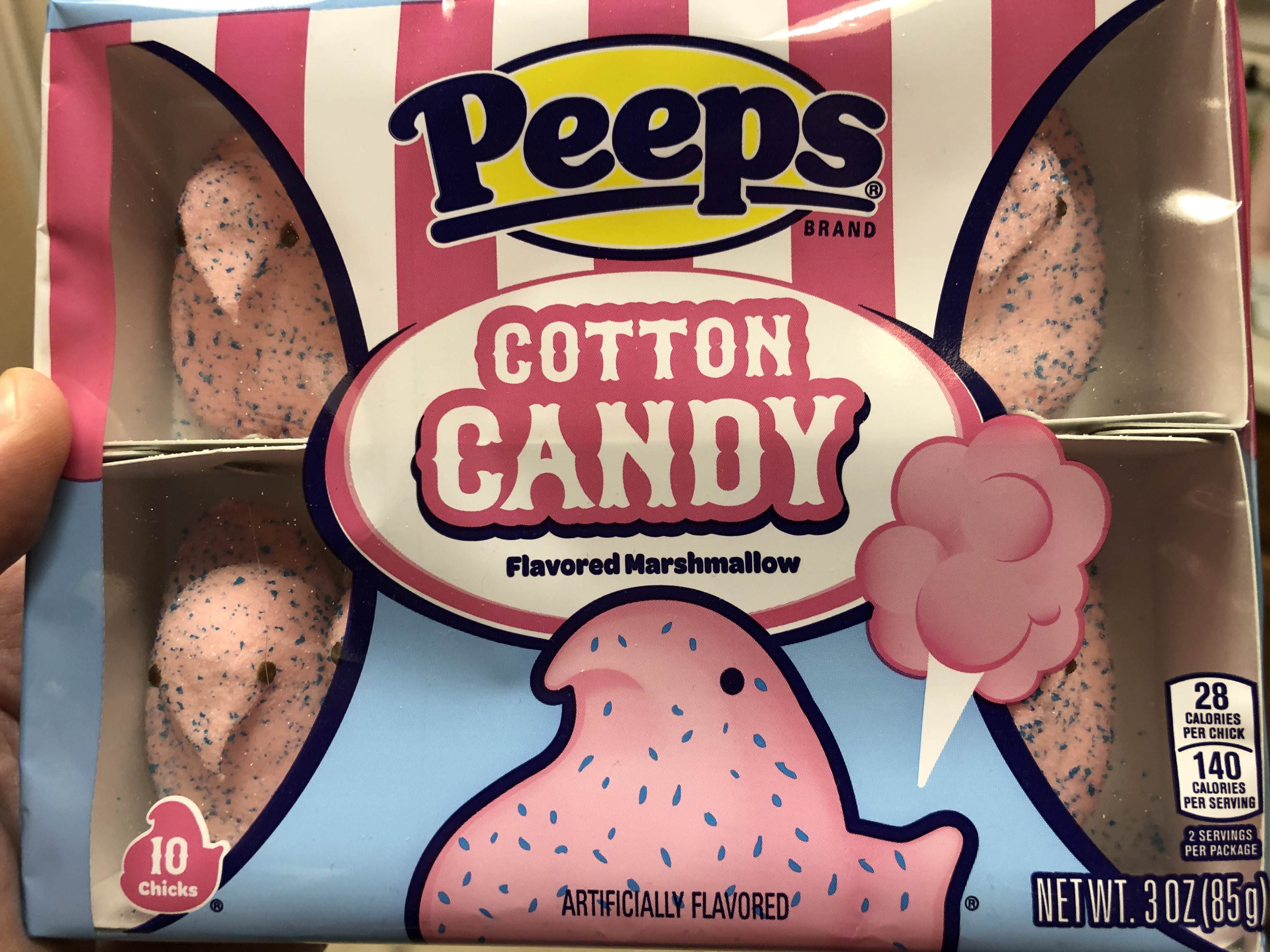 Source: mmcalli
#27. Don't think that could be any worse
 Source: yoziphek
#28. Worst doctor ever
 Source: CosmoInColour
Share this article
Advertisement